| Image |
Comment |
| 04/27/2006 04:30:59 PM |
Enjoying the viewby JudiComment: I like this; My own shot plays wth the idea of the two worlds of the refelected and the transmitted light, as does this. You've achieved more with the graphic relationship of that reflected world to the direct one though. One thing: I would wish for a more involved treatment of it. This comes across as very much a real world thing; perhaps taking this into the black and white world would emphasise those overlaid views a touch more - in effect, make the photograph be about those conjunctions, rather than the tendency of this to make it more of a portrait. I just neither likie nor understand the idea of the photographic portrait, you understand - it may be, to those who appreciate them, that this is a great one.
There's a temporariness about the bed here too - no valance, the shaping of the edge of that 'mattress' almost makes one think of a sofa-bed, or a guest room. I like that transience - and the complexity of those reflections just add to the absorption of the whole scene. Top work. |
 Photographer found comment helpful. Photographer found comment helpful. |
| 04/27/2006 04:18:02 PM |
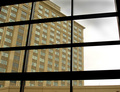
Windows Through The Panesby neophyteComment: I think, as far as this place is concerned, images such as this which depend for their effect on the purely graphic are more liked if they have big bright colours. There is something to the relationship of glass and glass here, but perhaps it needs something to emphasise that first layer of glass? Reflections maybe? Just thoughts ... |
| Photographer found comment helpful. |
| 04/26/2006 04:22:40 PM |
Framed by the Window Dresserby GuGiComment: There is definitely something about mannequins that intrigues, isn't there? This shot doesn't. I'm afraid, add anything to my sense of what that is, but I can't help but sense that its fertaile territory. Photographically, your framing is interesting, but it would perhaps be more relevant to the apparent point of your title if you had included a touch more of the scene? |
| Photographer found comment helpful. |
| 04/26/2006 04:18:39 PM |
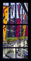
Colorful viewby MelethiaComment: An interesting division of space in that frame; but the 'view' perhaps lacks a sense of harmony, of humanity, for me. Entirely competent work, but it doesn't have that spark of fsacination for me. |
| Photographer found comment helpful. |
| 04/26/2006 04:15:45 PM |
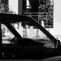
Fountains and Talismanby GeneralEComment: I don't see what this gains from being such a very wide shot - at least, given your title as a guide to your intended subject. For instance - the rear-view mirror would have been enough to suggest 'car' to us, and getting that close would have allowed us a much more detailed view of the fountains. There's a certain interest in tha shapes of the talisman and the water, but it's swamped by the broadness of your frame, i think. |
| Photographer found comment helpful. |
| 04/26/2006 04:12:33 PM |
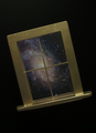
Window on The Universeby dannyleeComment: I think to properly pull off this trick shot you need less full-on front light on the frame - the level of illumination there simply makes this look like exactly what it is. |
| Photographer found comment helpful. |
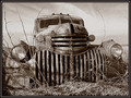
| 04/24/2006 06:05:38 PM |
Past it's gloryby BMacDComment: Well done - you have at least found a sense of the bizarre in this subject; ther's almost an animal grimace in that radiator venting - and the tonality aids that very well. Perhaps slightly too tightly cropped for really comfortable viewing - always beware the edges of frame if you haven't the motion, the relationships to pull the eye back in. |
| Photographer found comment helpful. |
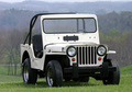
| 04/24/2006 06:02:57 PM |
1947 Willys Jeepby DianaComment: Technically accomplished prtrait of a vehicle - as an illustration it's faultless. In this challenge however ... well, it neither is nor looks that old, and there is little more to the image than its subject - no magic in light, environment, relationships, and no surprise. |
| Photographer found comment helpful. |
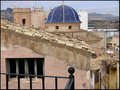
| 04/24/2006 06:00:59 PM |
Old townby imagine74Comment: Very flat light has robbed this of a possible sense of magic, of real age i think. The composition is quite clumsy too - the blue tower/minaret is the obvious draw in this image, and your placement of it in frame doesn't do anything to aid the movement of the eye through the frame; a corner, a thirds line, at a point of joining of the various lines implied by the roofs ... but here the window and the distance have an equal draw and make the whole rather difficult to enjoy. |
| Photographer found comment helpful. |
| 04/24/2006 05:57:30 PM |
Old path into the darknessby Prime_TimeComment: This has an interesting juxtaposition of the organised and the disorganised, in both the progression within the bridge's boards and the surroundings re the bridge itself; however I think your tonality has strayed so far into the pure black/white world, with few greys, that any sense of photographic representation is almost lost. The composition is slightly at odds with your title too - it's the tangle of bushes rather than the darkness that seems the reference point of the motion indicated by the bridge. |
| Photographer found comment helpful. |
Home -
Challenges -
Community -
League -
Photos -
Cameras -
Lenses -
Learn -
Help -
Terms of Use -
Privacy -
Top ^
DPChallenge, and website content and design, Copyright © 2001-2025 Challenging Technologies, LLC.
All digital photo copyrights belong to the photographers and may not be used without permission.
Current Server Time: 08/18/2025 01:06:48 PM EDT.