| Image |
Comment |
| 05/21/2006 08:26:42 AM |
Every morningby BoltiComment: Don't you get soap all over your t-shirt? ;-) I like this - there's a pure ordinariness about it, a refusal to pander to the ideas of DPC's clean set-up photography; and also a sense - because of that lack of pandering, probably - of the genuinely real. I like the crowdedness of this space too - it feels, with the collections of bottles, the precarious towel stack, like a real person's bathroom. And for all that, it's plainly obvious that this must actually be a set-up idea. I like those paradoxes, and the result. |
 Photographer found comment helpful. Photographer found comment helpful. |
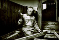
| 05/21/2006 08:22:09 AM |
|
| Photographer found comment helpful. |
| 05/21/2006 08:20:02 AM |
Modern Day Marlborough Manby PedroComment: Fine portrait, with good detail and tonality - the conversion is pretty well done, perhaps the very extreme highlights only causing problems. Good light too. Is the rope alone enough to speak of environment? On balance, I think it is. |
| Photographer found comment helpful. |
| 05/21/2006 08:15:18 AM |
|
| Photographer found comment helpful. |
| 05/21/2006 08:14:42 AM |
Part Inspectorby edmengComment: Nice portrait; the washed-out quality of the equipment is strange though, especially in a challenge that seems to require the interaction with the subject's environment. |
| Photographer found comment helpful. |
| 05/21/2006 07:08:44 AM |
This Is My Lifeby JudiComment: I wish you'd softened your flash just a little, which would have reduced or negated that shadow across his forehead. Fill-flash is absolutely right here, fo course - allowing you to make use of the natural contrast of that heavy sunlight. |
| Photographer found comment helpful. |
| 05/21/2006 07:05:02 AM |
Unsung Hero our Firemenby sherpetComment: Strong sense of character here, which is good. There's a sense, around his face, of some over-processing: the detail there seems rather created than naturally captured - some areas seem slightly blurred together, but that could of course just be compression to get the file size down. |
| Photographer found comment helpful. |
| 05/21/2006 07:00:56 AM |
Housebuilderby TUBORGComment: He needs to be looking at that nail, rather than the camera, surely, or his next portrait will be in x-ray form. It's also a bizarre way to hold a hammer in the first place. Like the details, but not the processing. |
| Photographer found comment helpful. |
| 05/21/2006 06:43:48 AM |
back to the old houseby coldaComment: Nicely done - especially your framing. I get a sense of dissociation between the figure and the background that is a little unsettling - it's simply the depth of field, of course, but it has the effect of making her surroundings feel simply like a backdrop perhaps, rather than a world she is involved in; her berlin 1930's make-up set aginst the nicely ordered georgian architecture perhaps adds to that feeling too. A nice piece of work however, and that point is more interesting than troubling. |
| Photographer found comment helpful. |
| 05/21/2006 06:39:35 AM |
A Farm Girl and her Dogby 3eyedcrowComment: Pretty good, but your dodging and burning are not exactly subtlely done, and to my eye make the image just look like it has dark blotches across it. I don't think you've taken the highlights far enough really - the tonality seems really quite grey to me. More contrast throughout the two figures would really add a sense of depth to it, and more detail, and there is certainly room for that without blowing the highlights. |
| Photographer found comment helpful. |
Home -
Challenges -
Community -
League -
Photos -
Cameras -
Lenses -
Learn -
Help -
Terms of Use -
Privacy -
Top ^
DPChallenge, and website content and design, Copyright © 2001-2025 Challenging Technologies, LLC.
All digital photo copyrights belong to the photographers and may not be used without permission.
Current Server Time: 08/18/2025 10:59:16 AM EDT.