| Image |
Comment |
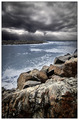
| 01/03/2007 06:23:57 AM |
beconing skiesby drueovComment: Good work; the sky feels desaturated, rather than simply actually grey - there's usually some hints of colour in a scene like this, of blues and yellows, and in a world of toned greys the pure grey seems out of place: but that's a feeling, rather than a criticism. has a feel also of HDR work, but its well controlled. |
 Photographer found comment helpful. Photographer found comment helpful. |
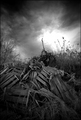
| 01/03/2007 06:21:59 AM |
|
| Photographer found comment helpful. |
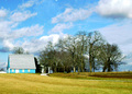
| 01/03/2007 06:21:09 AM |
Sunset over Alkiby Sunshine86Comment: Nice landscape; not sure there's anything one would change - the dark of the stilted building works to contrast the plant thingys, and the greater composition is strong. Progression to dark at top of frame is effective too. |
| Photographer found comment helpful. |
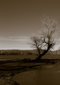
| 01/02/2007 07:03:10 PM |
My Blue Kentucky Homeby photom1946Comment: Very bright this - the sky has gone to something far too pale to be interesting. The composition is OK, but perhaps could be more successful with a variety of zones to attract the eye - this is very much in a single line across frame, and perhaps some foreground, or progression of distance into the shot, would help. |
| Photographer found comment helpful. |
| 01/02/2007 02:40:59 PM |
Firey Sunsetby saiphfireComment: The silhouette skyline in sunset images becomes the second most important thing after, of course, the sky itself. Here I feel it lets your image down a little - its kind of confused and not particularly interesting. |
| Photographer found comment helpful. |
| 01/02/2007 02:38:46 PM |
Time to go Homeby rkligmanComment: Nice groove, but slightly let down by some confusion in some areas. certainly has a sense of moment though, which is important. |
| Photographer found comment helpful. |
| 01/02/2007 02:10:21 PM |
Classical with a twistby MelethiaComment: It's a proper instrument, the button accordion - there are things you can play on one of those that you can't play on anything else. I don't think this is a great photograph - it's OK, but it lacks the elements that would make it more than a simple illustration of an instrument. |
| Photographer found comment helpful. |
| 01/02/2007 02:07:55 PM |
trees and shadows of treesby posthumousComment: Intriguing light here. I like the simplicity of your composition, and the humdrum element of the inclusion of that bench; I think it perhaps lacks a touch of real interest for me - either human or graphical. |
| Photographer found comment helpful. |
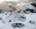
| 01/02/2007 02:05:41 PM |
Buachaille Etive Beagby TallblokeComment: Fine landscape - perhaps could use a touch - just a touch mind - of contrast work in the foreground - it has a slight flatness. |
| Photographer found comment helpful. |
| 01/02/2007 02:03:17 PM |
Who can be against meby Ripcurl5Comment: In such a parade of lookalike pretty images, it's refreshing to find something plain weird. Not to say that I particularly like it - it strikes me as slightly disingenuous - but it remains refreshing. Thankyou. |
| Photographer found comment helpful. |
Home -
Challenges -
Community -
League -
Photos -
Cameras -
Lenses -
Learn -
Help -
Terms of Use -
Privacy -
Top ^
DPChallenge, and website content and design, Copyright © 2001-2025 Challenging Technologies, LLC.
All digital photo copyrights belong to the photographers and may not be used without permission.
Current Server Time: 08/13/2025 11:02:42 PM EDT.