| Image |
Comment |
| 01/03/2007 09:33:38 AM |
Clock Tower at Christmasby docurrieComment: Nice simple composition: even the coiled cable in the right hand tree echoes the circular things on the tower. It's quite a straightforward image though, for a competition: I don't think it has the drama to score really well, nor the absolute composition: the simplicity isn't enough in itself, and it's perhaps rather centred overall. |
 Photographer found comment helpful. Photographer found comment helpful. |
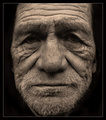
| 01/03/2007 06:55:48 AM |
Bayonne Billby pawdrixComment: Nicely done - perhaps a little lightening around the eyes would help? The obvious thing would be a catch-light, but this has a feeling of a non-studio shot. Without some sense of light in the eyes a face tends to look somewhat lifeless - but in an image that strongly suggests a hopelessness (rather than survival, resilience etc.) that's maybe the more real approach. Doesn't mean in won't just take the edge off your score for many voters, though. |
| Photographer found comment helpful. |
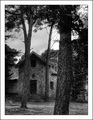
| 01/03/2007 06:52:50 AM |
The house in the forestby MilacroftComment: Pretty good work - like the sense of grain and tonality. Composition is very strong, the progression of those trees leading the eye through to the house. |
| Photographer found comment helpful. |
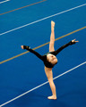
| 01/03/2007 06:47:14 AM |
Tumble Me Blueby jaysonmcComment: Quite nice work - lacks some punch of light, but the lines - both of her body shape and the background - make an interesting element. |
| Photographer found comment helpful. |
| 01/03/2007 06:45:39 AM |
Not Just for Christmasby MatthewComment: Strong pet portrait. Well done - despite, or perhaps because of, breaking the 'rules' about portraits. You've chosen to emphasise the disappearance of his eyes behind his fur (him, her?)and that works well - it makes a point about the reality of the animal, rather than just making him her it look cute. |
| Photographer found comment helpful. |
| 01/03/2007 06:43:47 AM |
But I haven't had my coffee yet...by jrdawsonComment: Fun portrait - despite the strange colour emphasis leant to it by that border colour. Personally, I'd have taken this to black and white, in which form the colours would have less impact - but the pinks and blue don't, to my eye, bring anything to this image anyway. |
| Photographer found comment helpful. |
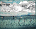
| 01/03/2007 06:42:18 AM |
Slim Pickin'sby EvaanComment: I like the moment - I would, it has similarities with my own entry - but I must say I hate your border: it makes the tonality in the actual image difficult to assess by emphasising that colour in the image. The definition in the water is fine, but one would perhaps like more contrast around the birds, a touch more detail. |
| Photographer found comment helpful. |
| 01/03/2007 06:30:12 AM |
Blueby PedroComment: Nice detail and processing. The bokeh is effective too. As a commercial-type portrait it would be successful, but for me I look for more compositional interest. |
| Photographer found comment helpful. |
| 01/03/2007 06:28:46 AM |
Strutby samnotisComment: Nice groove, strong colours. Probably too close to the abstract for the voters, but a fun and interesting image. |
| Photographer found comment helpful. |
| 01/03/2007 06:27:10 AM |
Nature's Colorsby zaflaboutComment: Strong sense of the granular texture of the butterfly's wings. Great detail, but perhaps more compositional thought might have made for more impact - you've rather just fitted the portrait into frame, no? To give it that stand-out thing that DPC likes, it needs a touch more than this - and the leaves getting in the way will be an issue for some voters too. |
| Photographer found comment helpful. |
Home -
Challenges -
Community -
League -
Photos -
Cameras -
Lenses -
Learn -
Help -
Terms of Use -
Privacy -
Top ^
DPChallenge, and website content and design, Copyright © 2001-2025 Challenging Technologies, LLC.
All digital photo copyrights belong to the photographers and may not be used without permission.
Current Server Time: 08/13/2025 10:58:45 PM EDT.