| Image |
Comment |
| 01/04/2007 01:15:24 PM |
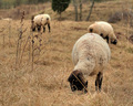
Out to Pastureby SJCarterComment: Well enough done, but more consideration for background elements might pay off - the overlap of your main subject with those behind makes for some discomfort of viewing. |
 Photographer found comment helpful. Photographer found comment helpful. |
| 01/04/2007 01:14:03 PM |
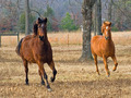
In Stepby izadoodleComment: Your use of the clone-tool is beyond the pale ... er, no, hang on. I would wish for a little more from this - though what, I don't quite know - it's a nice moment captured, and intriguing - especially the near-absolute repetition of forms, but somehow it's not properly emphasised in your image. I don't know: black and white, perhaps? Allow us to get away from the muted winter colours and the horses' own colour and concentrate on the forms more? Perhaps some more contrast work would achieve the same effect? Or simply a darkening overall, but really, anything to devote more of the attention to those parallel forms, and less to the overall environment - perhaps those greens in the background also draw the eye, and deflect from the real point of this? |
| Photographer found comment helpful. |
| 01/04/2007 01:09:42 PM |
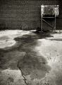
Stainby RKTComment: I like your composition very much, but there are a couple of things bugging me. One is an out-of-place sense of blurriness about the tank-thing - it may simply be the way it looks, or it may be a processing artefact, but it doesn't seem to belong to the same graphical world as the rest of the composition - especially given such a strong sense of fine detail in the stain itself. Secondly a sense of lens distortion that adds a feeling of precipitousness to the image; I might, myself, have tried a touch of correction on that. But I like the shapes very much. Doesn't quite give me enough - it lacks a real sense of photographic fun, I suppose - to really entrance, but it's many times more interesting/arresting than all these pets, kids and landscapes. |
| Photographer found comment helpful. |
| 01/04/2007 12:49:40 PM |
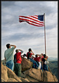
Freedomby AZSnapperComment: Guaranteed to cause a wide variety of responses: mine is unfavourable. |
| Photographer found comment helpful. |
| 01/04/2007 12:44:00 PM |
Beach Memoriesby h2Comment: Neatly done, technically. It rather gives the impression that snails might be made of stone - though that I suspect is accidental. I fear that the simple technical achievement isn't in itself interesting enough, certainly for me. |
| Photographer found comment helpful. |
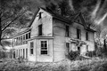
| 01/04/2007 12:42:28 PM |
Lost to Timeby LanceWComment: Nice composition, for me though it has a weird processed feel to it - there appear to be splodges of light all over the boarding, almost arbitrarily, and having nothing to do with the feel of light in the rest of the scene, with the result that the image feels more like an illustration than a photograph. |
| Photographer found comment helpful. |
| 01/04/2007 12:40:50 PM |
|
| Photographer found comment helpful. |
| 01/04/2007 12:39:33 PM |
Aloneby wisieComment: It's perhaps a shame to have placed the figure so that the island is immediately behind him, confusing the two main distant elements of your image. To emphasise the footprints and the progression through frame I think you should have framed that subject further up the frame anyway - the dynamic doesn't quite lead us far enough, really. |
| Photographer found comment helpful. |
| 01/04/2007 12:37:35 PM |
December Beautyby oe8ydqComment: Feels over-exposed to me - though I can understand the wish to achieve a pale winter feeling, I think you've taken things a touch far - especially the line of her nose and her left cheek. The top of jacket interrupting the line of her jaw is a shame too - for a best photo of the month. |
| Photographer found comment helpful. |
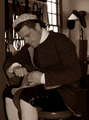
| 01/04/2007 12:35:53 PM |
The Cobblerby missinseattleComment: I think there are a couple of immediate problems with this shot: but first off, I should say that detail, processing and tonality are pretty good. I have an issue with the very direct-seeming flash lighting - it flattens the whole image of the man, leaving very little sense of texture or of form in three dimensions. Secondly, the composition lacks some grace I think: what appears important to me is his expression and his hands - both of which are contained in one small area of the image to the mid-left - and the rest serves little to emphasise anything not contained there. The historical dress is plain from the sleeves of his shirt, and what you have included of background makes little addition to the image. |
| Photographer found comment helpful. |
Home -
Challenges -
Community -
League -
Photos -
Cameras -
Lenses -
Learn -
Help -
Terms of Use -
Privacy -
Top ^
DPChallenge, and website content and design, Copyright © 2001-2025 Challenging Technologies, LLC.
All digital photo copyrights belong to the photographers and may not be used without permission.
Current Server Time: 08/13/2025 04:33:05 AM EDT.