| Image |
Comment |
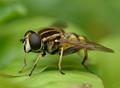
| 07/31/2003 07:45:50 AM |
Helophilus pendulusby UberFishComment: Not sure that such extremely shallow DOF serves this shot well - though it gives god depth to the image itself, it's just a bit much. |
 Photographer found comment helpful. Photographer found comment helpful. |
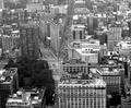
| 07/29/2003 07:01:54 AM |
Manhattanby MarkS224Comment: Hmmm ... Not sure how to vote. I think there would have been more impact to a shot that was entirely filled with buildings - though i can appreciate the thinking behind including streets, trees and a famous building. |
| Photographer found comment helpful. |
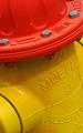
| 07/29/2003 07:00:12 AM |
quell the burnby nbortonComment: I find the angling of this a little disturbing - and not really to any great effect. The colour rendition is fantastic however. |
| Photographer found comment helpful. |
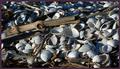
| 07/29/2003 06:54:03 AM |
Driftwood and shellsby RobroComment: So small ... a lity really, because it looks like it'd be a great shot. But at that size, it's difficult to make out any detail. |
| Photographer found comment helpful. |
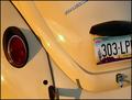
| 07/29/2003 06:52:29 AM |
'67 Beetleby tfarrell23Comment: One of the best car shots I've seen here - and great light. Those details are actually useful - in that they're some of the defining styling of that car. Great work. |
| Photographer found comment helpful. |
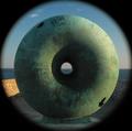
| 07/23/2003 01:19:57 PM |
Round²by mbardeenComment: Matt - your critique club moment is at hand. damn I'm glad to see this one come up, after our convversation about that other shot of yours.
My first reaction is surprise that it only placed 7th, but it does step on the toes of the 'literal representation of others works of art' rule quite heavily.
What I love about this, and what for me perhaps puts it above all the other shots I've seen in the challenge, is the light: not only is it the perfect light to shape this image, and to give a real sense of three dimensions to the do-nut, but you've also caught the colour ttemperatre of it perfectly: the warmness of it on the wall to the left of frame is marvellous.
The circular border effect (however it's achieved) works perfectly too. My first impression of this, on seeing the thumbnail, was that it was an eye - and that feeling still hasn't quite gone away after looking at it for quite a while.
I'm not goig to begin to criticise this technically - there's quite obviously nothing wrong with it: it's the first shot i've added to my favourites in quite a little while. Must be getting picky in my old age.
Congratulations on a fine photo.
ed |
| Photographer found comment helpful. |
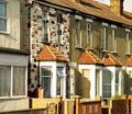
| 07/23/2003 01:02:12 PM |
Trends go in Cycles?by ImagineerComment: I very nearly submitted almost exactly the same photograph for this challenge: this is better than the one i took - but then i didn't submit that. Like the image though - and hope it's better understood than the one I did submit :-)
Good detail, great light, perhaps a little too undramatic for here, but then it is a kind of 'documentary' challenge. |
| Photographer found comment helpful. |
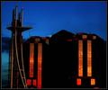
| 07/23/2003 12:55:07 PM |
Modern Architectureby BobsterLobsterComment: Some nasty jpeg artefacts here, and possibly oer-sharpening too, especially around that tower to the left. Great colours, and an interesting image otherwise. |
| Photographer found comment helpful. |
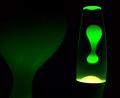
| 07/23/2003 12:42:54 PM |
Lava!by bot_alphaComment: Best lava-lamp shot so far: unfortunately that isn't saying much. |
| Photographer found comment helpful. |
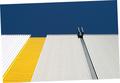
| 07/23/2003 12:30:58 PM |
Building Material Trendsby mzanoniComment: The weird rotation is quite amusing - if only it didn't look like a mistake quite so much. Intersting shot for all that. |
| Photographer found comment helpful. |
Home -
Challenges -
Community -
League -
Photos -
Cameras -
Lenses -
Learn -
Help -
Terms of Use -
Privacy -
Top ^
DPChallenge, and website content and design, Copyright © 2001-2025 Challenging Technologies, LLC.
All digital photo copyrights belong to the photographers and may not be used without permission.
Current Server Time: 08/14/2025 05:35:04 AM EDT.