| Author | Thread |
Comments Made During the Challenge  |
|
|
07/29/2003 10:51:07 PM |
|
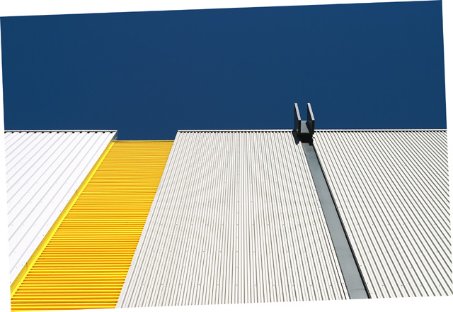
Like the brightness and colors of this one, but the tilt of the photo just doesn't do it for me. Sorry! |
|
|
|
07/29/2003 07:05:37 PM |
|
Great colour contrast and geometry. Contrast between sky and building is good to. I feel the slanted 'frame' is a bit unnecessary. |
|
|
|
07/29/2003 11:31:47 AM |
|
I like the color scheme, but this border is not very good... |
|
|
|
07/29/2003 09:15:29 AM |
|
Nice contrast of white, yellow, gray and deep blue. Is the picture crooked on purpose? |
|
|
|
07/29/2003 08:49:47 AM |
|
actually it's a nice color composition, but i'm confused to see the rotation triangles. Couldn't you crop them away? |
|
|
|
07/29/2003 08:18:03 AM |
|
it took me a while to quote this photo. in my opinion it is so strong as a picture, that the decision not to finish the cropping (you stoppped at turning it, but decided not to crop) is a pitty. But its an opinion, you made a style choice. |
|
|
|
07/28/2003 09:44:18 PM |
|
I guess you forgot to crop your picture ... framed well I think this is a nice picture although I'm not sure it fits the challenge. |
|
|
|
07/28/2003 03:18:04 PM |
|
I like the subject. I love it, in fact, but what's with the slanted edges? I'd give it a 10, but with the border, only a 7. |
|
|
|
07/28/2003 12:17:51 PM |
|
The rotation without cropping looks very strange to me. Otherise a very interesting shot. |
|
|
|
07/27/2003 02:12:24 PM |
|
Great composition and colours |
|
|
|
07/25/2003 11:50:26 AM |
|
I'm not sure what it is, but I like it. Abstract. |
|
|
|
07/24/2003 03:21:14 AM |
|
Don't know if you wanted it that way, but you are allowed to crop out the canvas area after rotating. I really don't get where this fits a trend - the lines moving away? Or is it the use of metal in buildings? Technically a pretty nice photo - colors and lighting are very nice, good focus and sharpness. The lines are sort of interesting. |
|
|
|
07/23/2003 11:08:31 PM |
|
I think you should have cropped after you rotated. |
|
 Photographer found comment helpful. Photographer found comment helpful. |
|
|
07/23/2003 05:23:28 PM |
|
I'm guessing you cropped/rotated your photo like that on purpose, but for me it just throws my view off the photo and onto the white space. |
|
| Photographer found comment helpful. |
|
|
07/23/2003 01:55:59 PM |
|
what's with the tilt? love the angles & the colors though. |
|
| Photographer found comment helpful. |
|
|
07/23/2003 01:18:39 PM |
|
nice shot. i love the graphic feel of this. the border is a bit distracting though. |
|
| Photographer found comment helpful. |
|
|
07/23/2003 12:30:58 PM |
|
The weird rotation is quite amusing - if only it didn't look like a mistake quite so much. Intersting shot for all that. |
|
| Photographer found comment helpful. |
|
|
07/23/2003 11:40:23 AM |
|
It looks like you tried to straighten this but didn't crop. The odd shaped "border" is distracting. Otherwise great colors, and lines. |
|
| Photographer found comment helpful. |
|
|
07/23/2003 11:00:14 AM |
|
I like the colours here very Mondrian (sp?).. Still not sure I like the border, I can see why you rotated it but I would then have re-cropped.. I admire your bravery.. good luck! |
|
| Photographer found comment helpful. |
|
|
07/23/2003 03:32:26 AM |
|
| Photographer found comment helpful. |
|
|
07/23/2003 02:23:17 AM |
|
Different. Not sure what i like about this one, but its simple. Did you tilt the photo on purpose? What is this? |
|
| Photographer found comment helpful. |
|
|
07/23/2003 12:27:15 AM |
|
I absolutely love the framing and composition on this. The light, color, and cool twist with the frame make this a very fun photo to look at. Nice job! 7 |
|
| Photographer found comment helpful. |
|
|
07/23/2003 12:21:41 AM |
|
Unsure as to why you did the crop like this...? I don' think it adds anything. |
|
| Photographer found comment helpful. |
|
|
07/23/2003 12:17:51 AM |
|
| Photographer found comment helpful. |
Home -
Challenges -
Community -
League -
Photos -
Cameras -
Lenses -
Learn -
Help -
Terms of Use -
Privacy -
Top ^
DPChallenge, and website content and design, Copyright © 2001-2026 Challenging Technologies, LLC.
All digital photo copyrights belong to the photographers and may not be used without permission.
Current Server Time: 06/28/2026 01:25:04 PM EDT.