|
|
|
Showing 2541 - 2550 of ~2866 |
| Image |
Comment |
| 08/06/2003 04:35:06 AM | |  Photographer found comment helpful. Photographer found comment helpful. |
| 08/05/2003 05:29:09 AM | Flip Flop Sandalsby stephanComment: Hi stephan - 'revenge' time? Your critique club moment ...
I think this was one of the more memorable photos from the trends challenge: it doesn't quite make it into my favourites, but very nearly.
I guess you won't be finishing things on that TFT screen again then, huh?
I'm not really sure what I most like about it - it's one of those shots that somehow defies my powers of interpretation. The composition is different: using the thirds but in a vertical manner is an odd thing to do, but effective; the intensity of the grass' green is excellent, especially set against the washed-out look of the flip-flops; the slight progression from dark to light up the image is intersting too - allows a dynamic contrast around the subject and still keeps the background as an important element. I did, and still do, find the border hugely distracting: whether that's just me, but I absolutely loathe coloured borders - they feel like they're cheating my eye, saying 'look at this colour', or 'isn't this clever, I can choose a colour from my picture', or more seriously an attempt to fool the eye into processing the colours of an image differently (in which case why not do that in processing?). I can see the use (and use them myself) of black or white borders to emphasise the overall feel of an image - like being able to choose the colour of wall for your art to hang on, but these coloured tricks ... anyway, drifted off-topic a little there.
48th place isn't so bad, I guess. I think that's because it's a pretty static image - besides the points I've mentioned (and I'm not sure a lot of people appreciate that stuff here), there isn't a lot to it: the lighting is very good, but not immediately eye-catching, the composition isn't orthodox, and it has a feeling of your having over-processed it (where did all the red go?), without producing an effect that will really nail people.
Good luck in future
ed | | Photographer found comment helpful. |
| 08/04/2003 08:35:18 AM | Lava!by bot_alphaComment: Hi Wes, from critique club.
Well I meant what i said that it was the best of the lava shots - unfortunately you fell into the common subject hole. It obviously meets the challenge perfectly.
The deformation of the image is a problem: at least for me. It looks like you've got very close to the nearest lamp, and that's added the lens distortion to the further one. If you shoot from further away, this becomes less of a problem - use the zoom! besides that - colour is excellent, focus is fine, and the moment you've captured is a great illustration of the process of the lamp - so no problems there.
As to the final score - and 57th place ... I think that's about right really; there's nothing inspired about it from the lighting or subject angle, and placing higher would be too much to hope. Ideas to get it to do better? I think I'd have tried to light the outside of the lamp a little (difficult, but probably worth it), to give some shape to the image as well as the creepiness of the lava.
Good luck in future
ed | | Photographer found comment helpful. |
| 08/04/2003 08:26:55 AM | Proud Of Preservationby JPRComment: Hi jason - your cc moment
Two technical points first - minor ones, but they bug me a little. First it feels slightly off-horizontal: it's probably one of those shots that will always feel so, but its an impression. Second, I think you've left a little too much to the left of the den entrance - just a fraction, but such a clean shot needs a clean composition I think.
Good shot though - interesting contrasts and situation. I couldn't really place it within the framework of the challenge myself, and I bet this has hurt you in the voting. One of those where the title seems to want to push the idea into the challenge, rather than obviously meeting it. I can see the pride - but if you were pushing the idea of zoos as preservation, then perhaps you need something to put it more obviously in a zoo (Yeah, I know penguins don't live in caves, but ...) like people, or a fence, or something. Tricky, obviously, but it's in that area that I think it doesn't work for this challenge.
Ed | | Photographer found comment helpful. |
| 08/04/2003 08:17:26 AM | Mikeby jimmyn4Comment: Greetings from the critique club Jimmy.
Well, I can second the comments about 107th place - but I guess I can see some reasons for it.
For me, this is excellently done - so difficult to light a plastic object without making it glare and look even more plastic than it is, and you've managed this very well. The focus is spot on, the cropping and framing is excellent too. You mention the blemishes yourself, but I think perhaps the subject matter was your biggest hurdle to scoring better. Firstly the plastic - were this as well shot and made of wood or metal I would guarantee you a whole extra point, and I would also think you've gone too far for most in the closeness of the framing - making too much of an abstract out of it, without the high-tech style that does so well here.
Great work though - really made me smile (I remember voting - it was the first image I saw).
Ed | | Photographer found comment helpful. |
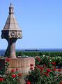
| 08/03/2003 05:24:51 AM | Garden of the Giantsby ArtifactsComment: Great shot - I think though I'd like to see the it tilted to the left a fraction: the only thing to giive any guide to horizontal/vertical, given the convergence of the tree-trunks, is where the people are: I'm sure it would actually be inaccurate to reality, but it would not have the oddness of the feeling of wanting to tilt my head whilst looking at this shot. | | Photographer found comment helpful. |
| 07/31/2003 07:01:56 PM | Where you thought nothing would ever growby jjbeguinComment: This is so typical of M. Jean-Jacques Beguin I'm almost prepared to say so in this comment: I don't know of anyone else here who can capture this kind of tonal quality - and if you're not JJ then this is about the highest compliment I could pay. | | Photographer found comment helpful. |
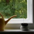
| 07/31/2003 08:05:48 AM | Under Constructionby stephanComment: The reflections of the watering can in the window are a real problem for me here. Otherwise the lighting is excellent, and the composition pretty good. Not completely sure that the window frame and the outside helps or distracts from it though. | | Photographer found comment helpful. |
| 07/31/2003 07:58:17 AM | Lakeside Gardenby erin_m02Comment: very harsh light here: doesn't help with any kind of mood. Feels like a 1960's postcard to me. | | Photographer found comment helpful. |
| 07/31/2003 07:55:44 AM | | | Photographer found comment helpful. |
|
Showing 2541 - 2550 of ~2866 |
Home -
Challenges -
Community -
League -
Photos -
Cameras -
Lenses -
Learn -
Help -
Terms of Use -
Privacy -
Top ^
DPChallenge, and website content and design, Copyright © 2001-2025 Challenging Technologies, LLC.
All digital photo copyrights belong to the photographers and may not be used without permission.
Current Server Time: 08/14/2025 03:35:31 AM EDT.
|