| Image |
Comment |
| 03/21/2007 07:49:04 PM |
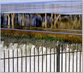
|
 Photographer found comment helpful. Photographer found comment helpful. |
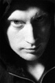
| 03/21/2007 04:37:06 PM |
Whirlygigby faeryComment: But you know how photos of kids tend to get voted here, yes? You hit a nail on the head with this though - anything that gives the sense of needing long exposure - basically, anything that looks like it needed fast film to shoot it - works in our understanding of where photographic grain should be seen. It's a basic, and nonsensical really, reaction. One might quibble with how far you've taken the whites of that dress, but that's all. |
| Photographer found comment helpful. |
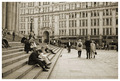
| 03/20/2007 06:39:43 AM |
Killing Time Where Kings & Queens Have Passedby surfinbirdComment: These front steps of St Paul's have a certain appeal - I've never quite been able to nail it, photographically: I'm not entirely sure you've succeeded either. For me, I think the issue is that I don't see a story here, a narrative; nor do I find a particular interest in the groups of people - it's just all so very ordinary. That, of course, has its own appeal in a way, as a kind of document; but it's a photograph that one could take any and every day if one so wished, with much the same results. It is, however, technically unimpeachable - exposure and control is good, and some grain brings something to it. For my taste it could have more contrast. |
| Photographer found comment helpful. |
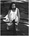
| 03/15/2007 02:32:33 PM |
out for a skate...by ralphComment: Something compositionally discomforts me here; perhaps that she seems to have no space to move into. Whilst the intriguing bokeh and motion in that background is interesting, she - because of the focus - remains the true subject and you've relegated her somewhat. As to the grain ... I'm not sure what it adds to this, why it's relevant. |
| Photographer found comment helpful. |
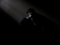
| 03/15/2007 05:58:42 AM |
the Inner Painby MuppetComment: One always feels that dark images benefit better from the use of grain - simply because it was always high speed film where one saw that, I'm sure. The negative space seems a touch overwhelming here, and the title and suggestions of the pose ... well, a little pretentious I'm afraid. The light on the wall is effective though, suggestive of prison, of captivity. |
| Photographer found comment helpful. |
| 03/14/2007 10:08:50 AM |
waiting for the train.. ISO 1600by kandykarmlComment: I wish you didn't find it necessary to include your ISO on your title. The graininess certainly enhances the fell here, and the tilt of the image adds a dynamic that's effective. It could perhaps use more contrast - a stronger sense of the dark, and for a really effective image I would say it is too cluttered along that line of the lightposts - the signs, the seats, the vehicles, the buildings confuse the sense of simplicity that exists in the right side of the image. |
| Photographer found comment helpful. |
| 03/14/2007 08:30:25 AM |
spirited danceby DonaldComment: Extraordinary image - but you'll be hammered for entering it in this challenge I fear. make it black and white, too - it will emphasise the sense of motion without the distraction of the colours. |
| Photographer found comment helpful. |
| 03/14/2007 08:28:36 AM |
Bad dreamby scotthadlComment: In such a smooth, almost rendered feeling image, a couple of little detail really bug my eye - the scoop or whatever below the nose, and the highlight on the left ear - particularly against the black background. The bottom left, the body of the mannequin, also makes the image too busy, in what might have been the more effective for being a simple as possible. The sense of grain suits absolutely though - adding a subtlety of texture to what might otherwise have been simply too smooth, too plastic an image.
It's perhaps the two lightsources that actually upset the purity of this composition. So simple that any extra confusion makes for unneccesary feeling of addition. |
| Photographer found comment helpful. |
| 03/14/2007 08:04:59 AM |
Given upby oskarComment: Good use of the technique - the depth of field and tilt to enhance the composition work well. It suffers, for me, from the usual problem with chess shots, of seeming portentously meaningful, freighted with messages, effortfully significant; whilst it actually lacks humanity, both in subject and in sense, I feel. I suspect it'll score reasonably well. |
| Photographer found comment helpful. |
| 03/14/2007 08:01:06 AM |
The lookby xantangummiComment: Certainly a mood captured here, and the noise works well with the image, rather than seeming simply overlaid. The difficult balance between detail and grain perhaps lets it down a touch for me - in a sense its neither one thing nor the other - not enough interference to approach the abstract, and yet not enough sense of detailed change of light to approach the realistic. |
| Photographer found comment helpful. |
Home -
Challenges -
Community -
League -
Photos -
Cameras -
Lenses -
Learn -
Help -
Terms of Use -
Privacy -
Top ^
DPChallenge, and website content and design, Copyright © 2001-2025 Challenging Technologies, LLC.
All digital photo copyrights belong to the photographers and may not be used without permission.
Current Server Time: 08/05/2025 10:29:10 AM EDT.