| Image |
Comment |
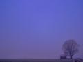
| 01/07/2004 07:53:25 AM |
It´s snow in the air..by Kaja LundComment: Good work. Bringing the hut and tree further into frame wouldn't hurt the composition - you could keep it that close to the bottom, and keep the impact of the negative space, but like this it is really only cursorily in shot. |
 Photographer found comment helpful. Photographer found comment helpful. |
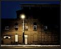
| 01/07/2004 07:43:36 AM |
The Alleyby ToddhComment: Beautiful - I have little more to say :-) Perfect execution, perfect composition. I'd almost buy this, except i think the moonlight edging the top of the building doesn't work for me - have no idea why, even after a long look, but I think it takes away some of the two-dimensional quality of the building's facade. Great work. |
| Photographer found comment helpful. |
| 01/07/2004 07:37:41 AM |
Illusionby Spanish_GreaseComment: Neat trick. Lines at the bottom of frame and where background edges meet are a shame, and there seem to be one or two markes that could happily have been cloned out. Like the colour, and your handling of light is an object lesson. |
| Photographer found comment helpful. |
| 01/07/2004 07:31:05 AM |
Anastasiaby nbortonComment: Of it's type this is well done - but you've taken the skin smoothing trick so far it's reminiscent of the worst kind of over-processed glamour photography, and effectively taken all the humanity out of your subject. It's also left a peculiar shading around the inside of the left eye. Just too much of the selective blurring, really. Lighting is good, catch-light in the eyes is good, naturalness of the model is good. |
| Photographer found comment helpful. |
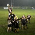
| 01/07/2004 07:11:41 AM |
Wilmslow Wolvesby tomlewis1980Comment: Great shot, great moment - and with a little mystery too (where the hell are the hoops' three-quarters?) - and a great study in effort. 9 |
| Photographer found comment helpful. |
| 01/07/2004 07:08:24 AM |
Sunday Morning Scrumby jonpinkComment: Good work - I'd guess that this is quite early in the game, from the cleanliness of those white shorts, but it has a real feel of the driven-into-the-ground exhaustion of the end of a game, when things almost grind to a halt like boxers who've beaten each other to a standstill. If only it weren't for the guy half hidden behind the no. 17 it'd be a great shot. |
| Photographer found comment helpful. |
| 01/06/2004 06:22:41 AM |
As the World Turnsby dsidwellComment: Lots of good stuff here, though i think the feeling of spinning is actually missing - this looks more like a simple blurring - the feeling is the blurs don't follow the curve of the globe. Neat idea though. |
| Photographer found comment helpful. |
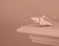
| 12/29/2003 07:02:15 AM |
Pale Outlinesby readmeComment: Almost, almost ... my questions would be: cropping - why so much negative space (or alternatively, why so little)? Why so little contrast range ... I understand what your title implies, but would a touch more light and shade really hurt it so much? the curves and planes of these objects ought to allow for a wonderful range of shade, and I think you've bleached that out of it a little with the lighting. |
| Photographer found comment helpful. |
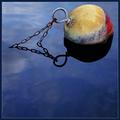
| 12/22/2003 11:11:44 AM |
|
| Photographer found comment helpful. |
| 12/18/2003 01:24:00 PM |
Sunrise by dan_pendletonComment: Well done Dan - the purity and cleanness of that blue is quite extraordinary: and you scored more tens than mine - not enough 9's then? Message edited by author 2003-12-18 13:25:24. |
| Photographer found comment helpful. |
Home -
Challenges -
Community -
League -
Photos -
Cameras -
Lenses -
Learn -
Help -
Terms of Use -
Privacy -
Top ^
DPChallenge, and website content and design, Copyright © 2001-2025 Challenging Technologies, LLC.
All digital photo copyrights belong to the photographers and may not be used without permission.
Current Server Time: 08/14/2025 11:50:47 PM EDT.