| Image |
Comment |
| 02/11/2004 02:32:32 PM |
|
 Photographer found comment helpful. Photographer found comment helpful. |
| 02/11/2004 02:25:07 PM |
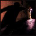
Letting go . . . A little every day.by illit-AfflictionComment: Can't get away from the conjunction of that pillar and his right hand - it does actually look as though he's just let it go - but can't believe from the composition or your title that it was intended. |
| Photographer found comment helpful. |
| 02/11/2004 07:33:47 AM |
Capturing Eleganceby KonadorComment: from the Critique Club
Huh, what's to critique? Quality of light/shade on the car is advertising standard (as I should hope, reading your notes), though i guess one could argue that the top rail has disappeared a touch too far into the high-key background. Placement of shadow is perfect, photoshopping work is seamless (again, as I should hope, given the lighting situation to work with). Distribution of 'weight' across frame is spot-on.
Given it's quality, I wonder why it wasn't you second blue? It has that same surprise element as the winner, without it being so slap-you-round-the-head obvious, is blatantly competent, all the hallmarks ... I wonder if perhaps its a touch too good, that car being so very professionally lit and everything ...
More top work, Ben
E |
| Photographer found comment helpful. |
| 02/10/2004 10:50:49 AM |
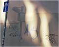
Cork Screwby JackoComment: Exytaordinarily un-sharp, when seen so close. I like the graphical element to this image - the contrasting weight of the curves and the straight line in the background. DOF is obviously correct, perhaps even too extreme, or at least maybe too sudden - the fringe of field seems very abrupt to me. |
| Photographer found comment helpful. |
| 02/10/2004 10:37:23 AM |
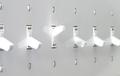
Dissentby ScottKComment: I like the idea: find the execution of it a bit lacking however; somehow the impact of that single reversed switch has been lessened - probably by your choice of crop and composition. The obvious placement would, of course, have been to exclude the left-most switch entirely, which would have given the odd one out a stronger position within frame - however, as you've also cropped across the right-most switch, I guess you were trying for an impression of continuity - as though there were a vast bank of these switches. I think also you could have been more creative with your lighting - the first thing I'd have tried would be some kind of soft light from beyond the switches - to give a greater degree of light and shade to the individuals - basically, more contrast. That said, you've achieved a suitably anti-septic, 'scientific' feel here, which is by no means out of place - I just think that you could have used the reflectiveness of the surface to good effect also. DOF os effective, though in an ideal world might have been even shallower - but I guess one doesn't necessarily have the means ... definitely an above-average shot, though. 6 from me, for now. |
| Photographer found comment helpful. |
| 02/10/2004 10:29:32 AM |
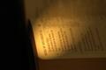
Solomon's Songby LafaminitComment: I'm kind of surprised there weren't more text-based entries for this challenge - it seemed a quite obvious subject to illustrate DOF. Some good stuff here - I love the (presumably torch) light, and the exposure. I do find the positioning of the book in frame a bit arbitrary - gives me an intense desire to turn it, to angle it more into shot, which might allow a more pleasing placement of the important text, perhaps. You seem almost to have cropped more for the light than for the subject, here. But interesting work, nevertheless. A 6 from me. |
| Photographer found comment helpful. |
| 02/09/2004 07:45:27 AM |
|
| Photographer found comment helpful. |
| 02/09/2004 07:31:04 AM |
Light and Shade: Paint on Canvasby ImagineerComment: Take heart from the quality of the people that bothered to comment, Jon; and thanks from me for putting up something more intersting than the run-of-the-mill. I was one of the 7's, but I scored nothing higher in this challenge. Good to see challenging stuff. |
| Photographer found comment helpful. |
| 02/09/2004 07:09:10 AM |
Lazy Susanby Crafty SueComment: There are one or two areas that just about get out of focus, adn to a kind eye just about validate it for the challenge - a very kind eye, I should add. The background, the lighting (that horrible over-exposed section) and the very ordinary presentation of a pretty ordinary subject lose you marks - the randomness of the cropping doesn't help either - it isn't centred, it isn't very far off either - all give the impression that no care has been taken with this shot at all. For all those reasons, and because it really doesn't fit the challenge, I score you a 1. |
| Photographer found comment helpful. |
| 02/09/2004 06:57:25 AM |
White on Blueby agwrightComment: Now this is lighting. A rather beautiful image too, although I can't see it getting very far past the flower police, but I've been wrong many times. great depth and texture to the flower, great use of the technique. |
| Photographer found comment helpful. |
Home -
Challenges -
Community -
League -
Photos -
Cameras -
Lenses -
Learn -
Help -
Terms of Use -
Privacy -
Top ^
DPChallenge, and website content and design, Copyright © 2001-2025 Challenging Technologies, LLC.
All digital photo copyrights belong to the photographers and may not be used without permission.
Current Server Time: 08/15/2025 03:37:53 AM EDT.