| Image |
Comment |
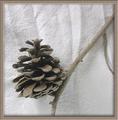
| 02/19/2004 05:24:33 AM |
Pineconeby CDSComment: Great sense of feel. Tonal work is fabulous, lighting perfect - though some might argue that a less creased background would be preferable in such a controlled composition. The slightly strange 'extra' bit of twig on the right gives a kind of 'alien' (in the sense of 'strange') fel to the composition, adds just that touch needed to balance the cone itself.
Missing some detail in the cone itself - your focus is far better on the background and the twig - which loses some sense of texture from it.
The border - especially the shading added with it, is quite posibly outside the rules I would think - you've used it to add a degree of three-dimensionality to the image which was not there out of the camera I would suggest. If you had placed the shading from the border in the same direction as the shading in the image it would be more convincing. |
 Photographer found comment helpful. Photographer found comment helpful. |
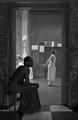
| 02/19/2004 05:13:12 AM |
Guitar Playerby Geo_GriffinComment: The strong lines of the hand/arm and the guitar strings make a difficult composition here. White outline of instrument moving in and out of frame, especially on the right, is disruptive: the real area of texture is the fold of the jacket and the othe bit of clothing, but that isn't composed to be very important in this image, and ther's not much sense of the smooth, shininess of the guitar's laquering. |
| Photographer found comment helpful. |
| 02/19/2004 05:06:50 AM |
SkinStoneby sergutComment: Rather a good photograph. Semi-naked man's arm appearing from black woman's head is odd seeming, but in a slightly surreal image like this it doesn't offend me. Oh to dodge and burn a touch though - compositionally, that near-silhouette pulls the eye so strongly, and she (he?), being not quite silhouetted my eye is searching for detail there that is difficult to see - kind of unsettling, but not in a good sense. Like it though - softness of toning on the walls through the door add a great sense of marble, and rich stone-work, and then that oddly posed figure to add some more disruption. Almost great. |
| Photographer found comment helpful. |
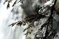
| 02/19/2004 04:58:46 AM |
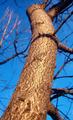
The Hidden Faceby torrenzanoComment: Took some looking to see it, and only when I focussed on that darker line of shade in the water did it come to me - I was looking for something larger. I like this composition - like the movement through the frame produced by the rush of water and the lines of the fir tree, and I also like the tonality. The 'point' of the shot, especially given your title, doesn't seem to be a texture though, which makes it an odd thing to submit to this challenge, perhaps. There is perhaps some suggestion of tactility in the water, but only at a stretch. |
| Photographer found comment helpful. |
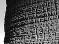
| 02/19/2004 04:55:10 AM |
Palm Surfaceby BupuComment: The movement from light to shade, and the broken nature of that surface is well captured. Photographically, a difficult composition - one's eye searches for patterns in near-abstract images such as this, and there is a sense of two stonger horizontal lines in this surface, but they lead me only to the silhouetted edge of the tree - I think I'd have tried a wider aspect ratio thatn this 4:3, to bring those lines closer to top of frame, then the combined lines of the edge and those two would produce a triangular feel with the brighter area of bark: might (only might) find that the eye moved through that more happily. |
| Photographer found comment helpful. |
| 02/19/2004 04:47:40 AM |
Shaggyby neilmwilsonComment: As with almost all animal shots, the immediate point of interest for the viewer's eye is the subject's eye - it's almost a photographic maxim that so long as the eye is in focus it doesn't matter too much about the rest of the subject. Shooting it half-masked like this produces a sense of confusion, I think. Along the line of the nose, and some of that fringe there is certainly a sense of texture, but your composition of this has unbalanced that, for me, and i find my eye wandering through the frame without finding a point to hold it. |
| Photographer found comment helpful. |
| 02/19/2004 04:43:22 AM |
Untitledby NukktaComment: Little variation in light across the in-focus areas of the hat - leaves little impression of the feel of the surface. The out of focus line of the brim where it curls up really pulls the eye, to poor effect I fear. There is far more texture visible in the extreme top right of frame, but your composition has relegated that area so far that it barely registers without a deliberate search. |
| Photographer found comment helpful. |
| 02/19/2004 04:40:17 AM |
Oxidationby QuadrajetComment: Interesting choice of subject for this challenge, certainly. There's an odd sensation of there being a lack of detail in this, though close inspection reveals that there is no significant processing or pixelation going on: I think it's to do with the light you've chosen. This has the feel of a very uniform light, like an overcast day when there are no real shadows: something more directional, even if it were soft, would bring out the texture of the rust more - would produce those small shadows that the eye percieves as texture. Here, you have good work on tones and shapes, but little feel of the quality of those surfaces. I also find this a touch random compositionally. |
| Photographer found comment helpful. |
| 02/18/2004 03:49:21 PM |
Scalyby illywikinikyComment: Very little sense of light and shade within the actual subject - it all seems lit the same, which almost by definition removes any great sensation of texture. The reflection of the sunlight also seems a bit odd. If you were to photograph this from an angle, so that the sun is not directly behind you, you might find that the unevenness of the surface is emphasised more by the light slanting across it. This way, the very small areas of shade that are created by that slanting light, and that are the things we see as 'texture', are not visible. |
| Photographer found comment helpful. |
| 02/18/2004 03:46:12 PM |
Rest Stopby MazerComment: Nicely done. Doesn't have the real presence of detail that the top shots have, and sense of texture is a touch diluted by that. |
| Photographer found comment helpful. |
Home -
Challenges -
Community -
League -
Photos -
Cameras -
Lenses -
Learn -
Help -
Terms of Use -
Privacy -
Top ^
DPChallenge, and website content and design, Copyright © 2001-2025 Challenging Technologies, LLC.
All digital photo copyrights belong to the photographers and may not be used without permission.
Current Server Time: 08/15/2025 01:22:57 PM EDT.