| Image |
Comment |
| 02/20/2004 05:38:44 AM |
Atificial Flowerby GoodEndComment: Like the apparent sunlight effect on this - and yet with what appears to be a very direct light you've still captured a good sense fo tactility. Compositionally though it's a bit awkward - very centred, and there isn't enough interest created in that 'flower' to hold the eye all by itself - too many different planes taking the eye of indifferent directions without anything to bring it back. Not bad though. |
 Photographer found comment helpful. Photographer found comment helpful. |
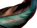
| 02/20/2004 05:15:49 AM |
feather texture and colorby neenee1999Comment: Actually doesn't communicate much sense of texture to me - perhaps the way you've poushed the levels and contrast don't allow for that sense of fine detail that would do that. It's an interesting and very assured photo, don't get me wrong, but leaning a touch too much towards the graphic (and therefore two dimensional), than the photogrphic, if that makes sense. |
| Photographer found comment helpful. |
| 02/20/2004 05:11:59 AM |
Flowerworksby ShelleyComment: Interesting image - even if that's a printed background, or an in-exposure zoom out, it removes the real attention from the flower and promotes that explosion as the main source of interest. Nice shot though, nice graphic. Surprised not to see a validation note on this by now. |
| Photographer found comment helpful. |
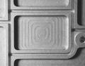
| 02/20/2004 05:08:11 AM |
Scrap Metalby C_Steve_GComment: Worth pausing to look longer at. I find the composition a touch dull - and the clipping of that circle to the right very annoying - why cut off the only thing that interrupts that flow of rounded squares? It wa a gift for this image, and you've disregarded it. Good sense of feel, but the weighting of areas of interest within frame leaves something to be desired for me. |
| Photographer found comment helpful. |
| 02/20/2004 05:05:28 AM |
textile textureby HeidieComment: Looks to have been taken with on-board flash, which is absolutely a recipe for wiping out the texture here. All we see is patterns, no sense of the feel of the materials. Looks absolutely flat, so sense of a third (depth) dimension. |
| Photographer found comment helpful. |
| 02/20/2004 05:03:58 AM |
From the Beachby JeileenComment: Black background is well done. The only place I really feel texture in the shot is on the extreme edge of the top right shell, which should tell you something about the lighting and what you could do better here - very very close, and I would have thought that the contrast of those textures would be interesting, but that too head-on light lets you down. |
| Photographer found comment helpful. |
| 02/20/2004 05:01:53 AM |
Ezekielby dsrayComment: Don't 'get' the title, but who cares? Good photograph, just a little let down by the moment of light you've chosen - seems a very very general light, without much shadowing, and therefore without much communication of texture. I do like it graphically, very much however. Has great balance and flow. |
| Photographer found comment helpful. |
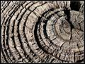
| 02/20/2004 04:59:52 AM |
Rough & Readyby boomerComment: The best composed of the concentric rings shots that I've seen so far. Good sense of texture, especially where the light becomes more shallow toward the right of frame - I think to really communicate the feel of the wood you could have used a shallower angle of light throughout the image, perhaps, as right on the edge of frame you've really caught it, just a bit too far out of frame to really focus the attention there. Good toning and detail. |
| Photographer found comment helpful. |
| 02/20/2004 04:53:01 AM |
Copper Shineby KentuckyGalComment: Too much of a direct reflection, and too much brighter than the rest of the coins - in short the balance of the light you've used to reflect, and the ambient lighting is too heavy. Wiped out almost all details in that bright coin, which because of its brightness is what really draws the yee in this shot. And with the detail goes the texture. |
| Photographer found comment helpful. |
| 02/20/2004 04:51:15 AM |
Another Brick In The Wallby garrywhite2Comment: The light is perhaps too direct to give a good sense of texture to this shot - too harsh, I mean. The patterning of the brickwork is well expressed, and you've found a strong subject and used those textures well, but the detailing is lost in that light, the sense of variability of surfaces, which would otherwise have made this a wonderful shot. |
| Photographer found comment helpful. |
Home -
Challenges -
Community -
League -
Photos -
Cameras -
Lenses -
Learn -
Help -
Terms of Use -
Privacy -
Top ^
DPChallenge, and website content and design, Copyright © 2001-2025 Challenging Technologies, LLC.
All digital photo copyrights belong to the photographers and may not be used without permission.
Current Server Time: 08/16/2025 04:11:43 PM EDT.