| Image |
Comment |
| 02/20/2004 10:34:03 AM |
The Golden Wallby tyt2000Comment: excellently done. The fan of the light really aids the composition, whilst never detroying the impact of that texture. real movement of light through the frame too. Looks like a floor and rotated image to me (no bad thing). Good colour too, not overwhelming the central idea of the shot. |
 Photographer found comment helpful. Photographer found comment helpful. |
| 02/20/2004 10:30:25 AM |
The Enduranceby GPComment: Like the suggestion of your title very much. Would like to have seen more definition in these surfaces, which is just a function of the moment of light you've employed. The patterning of the sets isn't enough alone to hold my interest, whereas the depiction of the surface texture migh have added that element. |
| Photographer found comment helpful. |
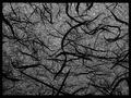
| 02/20/2004 10:26:42 AM |
Lamp Shade Labyrinthby ozaibakComment: Interesting abstract - though as with very many shots here its subject is patterning arther than texture: I get no sense of the three-dimensionality of this subject here. Like the exposure very much though, and the detail is excellent. |
| Photographer found comment helpful. |
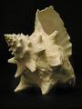
| 02/20/2004 10:25:05 AM |
Sea Shellby carrieannComment: Good work on the texture. Shot has the feel of an exhibition catalogue, and seems purely representative to me. Anentirely competent representative shot, but still just that. |
| Photographer found comment helpful. |
| 02/20/2004 09:55:22 AM |
Ropeby briphotoComment: Very good on the sense of feel. I'd maybe suggest that the light is touch too even - that you've filled a little too far and removed any sense of the dramatic from the image by that. Minor point though. |
| Photographer found comment helpful. |
| 02/20/2004 09:54:23 AM |
Trapped Airby MarieWComment: Exquisite shot of the glass, great use of the paper background, though perhps that low quality paper gives too grainy and confised looking a patterning to complement the smoothness of the glass. Like the depth of field on the bubbles enormously, and your control of this exposure. Very clean too, and the black surface of the water is marvellous. I would perhaps have suggested just using a single light panel to one side of the glass, not for illumination, but perhaps too provide a clean reflection to suggest the three-dimensionality of the glass a touch more - just in consideration of this challenge topic. Such a pure silhouette doesn't really give a reat sense of texture; but it remains an excellent shot. |
| Photographer found comment helpful. |
| 02/20/2004 09:49:54 AM |
Timeby frateComment: Some impression of the quality of these surfaces, though really quite an ordinary illustration of the clock face. Lacks that dynamic that comes from good lighting, from a less straightforward approach. Good exposure, and accurate colours and sense of the object itself, but the shot hasn't placed the emphasis on the textures really - would need more careful consideration of the affect of light on a surface in that area. |
| Photographer found comment helpful. |
| 02/20/2004 09:46:34 AM |
Work Hatby PopcornheadComment: Oh - there is some feel of surfaces here, hough almost despite the shot rather thanbecause of the way you've done it. It's a very dull exposure - quite accurate to life in a way, I would suggest, which doesn't necessarily make for a good shot. Bland compositionally - there's just no sense of the dramatic to it, though in its sense of the absolutely mundane it has some appeal. |
| Photographer found comment helpful. |
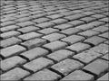
| 02/20/2004 09:29:35 AM |
Concreteby weavercComment: Interesting trick - to have found ameans of communicating that texture pof the concrete, and the shape of the fleur-de-lys without any seeming variation in the brigher areas of the stone, just by shadow. Other than the bang-centre placing of the device. I rather like this. Perhaps fractioanlly heavy on the contrast - or rather perhaps fractionally too intensely direct a light to have chosen, but pretty good nevertheless. |
| Photographer found comment helpful. |
| 02/20/2004 09:24:59 AM |
Garden Potpourriby perempuanComment: Such a small image size makes it difficul to comment, indeed it's half the allowable maximum dimension. Nevertheless, some texture shows, albeit in what seems quite a disorganised composition. |
| Photographer found comment helpful. |
Home -
Challenges -
Community -
League -
Photos -
Cameras -
Lenses -
Learn -
Help -
Terms of Use -
Privacy -
Top ^
DPChallenge, and website content and design, Copyright © 2001-2025 Challenging Technologies, LLC.
All digital photo copyrights belong to the photographers and may not be used without permission.
Current Server Time: 08/17/2025 03:48:26 PM EDT.