| Image |
Comment |
| 02/20/2004 12:39:36 PM |
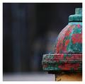
weary warriorby nbortonComment: Nice image. Composition, colour, exposure, framing all very assured. as a minor point, in such a regular composition, i think i might have tried to get more precisely level with that collar, the slight perspective on it seems out of place, but that counts for very little against such a top shot. |
 Photographer found comment helpful. Photographer found comment helpful. |
| 02/20/2004 12:37:26 PM |
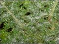
Prickly Abstractby LucidLotusComment: Abstract it may be, but I get little sense of prickliness from it, nor, to be frank, of any other texture very much. Very flat lighting, I fear. |
| Photographer found comment helpful. |
| 02/20/2004 12:32:55 PM |
Leafby paynekjComment: Never quite convinced about the high-key approach for textural shots - the brightness of the white always seems to overwhelm the ability to see the detail. That is slightly the case here - though I think you've got prety close to getting over it. Good on the surface of the leaf, rather more tricky toward the edges. It does allow those tones to come through very well. however. |
| Photographer found comment helpful. |
| 02/20/2004 12:26:23 PM |
The smoothest fabric : Silkby rameviComment: You haven't communicated much of that smoothness here - the lighting is quite head on, no? That takes away from the sense of texture in the shot. Good colour, but your positioning of the tie is a bit arbitrary seeming - doesn't give much for the eye to follow through the picture. |
| Photographer found comment helpful. |
| 02/20/2004 12:24:31 PM |
A Modest Vegetable.by jjbeguinComment: And a beautifully photographed one at that. Great sense of texture - I almost took the same shot myself. Great light, perfect exposure, functions well in black and white, though might still function well in colour I would think - has the look of being that very dark green that is so appealing. I do feel you might have allowed a touch more room between it and your frame, it feels just a bit cramped to me. Top work |
| Photographer found comment helpful. |
| 02/20/2004 12:16:00 PM |
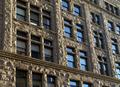
facadeby fluxnComment: Ah, You se, people can understand the subject of the bloody challenge. Forgive my cursing. Excellent demonstration, enhanced by the blueness of that reflected sky. Suffers a touch from that optical illusion of making the corners of the images not appear quite square, qhich confuses the eye a bit. Like the balance of the transparent windows and the reflective ones too, and all of which complements that excellently photographed facade. |
| Photographer found comment helpful. |
| 02/20/2004 12:13:06 PM |
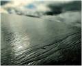
Muddy Watersby geewhyComment: Like the steely grey tones, and that patch of blue; like the compositional shaping of this too. There's a solidly triangular construction through the frame, and that always makes for a satisfying process for the eye. Good sense of texture throughout too. Not quite making it to the top if the list for me, I suspect, but very close |
| Photographer found comment helpful. |
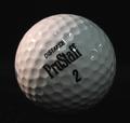
| 02/20/2004 12:10:35 PM |
Golf Planetby frodobagginsComment: Neat idea, not great execution. The warmer top-side light is effective, but your fill from the right is too general, and perhaps too far to the front of the subject to provide real shaping. Those bright white reflections of the lamps are a shame too - might be worth experimenting with covering them a sheet of paper, to make the light softer, or even to reflect the light off apiece of white board (styrofoam, as the Americans term it, works very well for that. That should give you a more pleasing illumination, and even if there are still reflections, they should have that more professional feel to them. You have caught some texture here - follow the line of the text to the left and it's really quite well shaped there - if you could get that effct everywhere you'll really notiv=ce the improvement, Finally, it's a pretty ordinary subject, no? Great for experimenting with light actually, but in terms of a photographic presentation, not one of the more intriguing things. |
| Photographer found comment helpful. |
| 02/20/2004 12:01:18 PM |
Anglesby pitsamanComment: Nice shooting. There is some sense of the smoothness of what you've caught here, but little actual sensation of texture, for me. Not to say it isn't a very good image - just not quite doing what was asked for. Stilla worthy entry though. |
| Photographer found comment helpful. |
| 02/20/2004 11:34:11 AM |
Deadly Warmthby littlegettComment: Don't know what's going on here, so I'll ahve to treat this as an abstract shot. There is a little sense of texture, despite your use of flash here, which has taken away a lot of the sense of depth and feel to this shot. That diagonal is a classic compositional technique, but there really isn't enough going on here to hold my attention for very long I'm afraid. I'm certain you had some sort of impact in mind, but it isn't clear to me. |
| Photographer found comment helpful. |
Home -
Challenges -
Community -
League -
Photos -
Cameras -
Lenses -
Learn -
Help -
Terms of Use -
Privacy -
Top ^
DPChallenge, and website content and design, Copyright © 2001-2025 Challenging Technologies, LLC.
All digital photo copyrights belong to the photographers and may not be used without permission.
Current Server Time: 08/17/2025 09:13:45 PM EDT.