|
|
|
Showing 1981 - 1990 of ~2866 |
| Image |
Comment |
| 04/08/2004 07:58:36 PM | Chaotic Reflectionby russiComment: Colourful and pretty, though a little bit bland, in a greetings-card kind of way. Chaos? Well, I'm finding it impossible to vote with my own sense of that in mind, but this doesn't meet my sense of it. To counter that, I can see its presence here in a mathematical sense. Overall, a highly competent shot, just lacking a touch of inspiration. And I slightly wish you'd cropped out the top of the hull, but that's a personal preference. |  Photographer found comment helpful. Photographer found comment helpful. |
| 04/08/2004 07:51:05 PM | Rush Hour Trafficby garrywhite2Comment: As, I should imagine, with so many shots on this subject, it's a question of where you draw the line between chaos and complicated order - which is my first impression on seeing this. Any well composed photo is bound to suffer perhaps from seeming too irganised to represent chaos - perhaps explains the small number of entries. A fine photograph, although it really doesn't speak of chaos to me - nevertheless, a 7. | | Photographer found comment helpful. |
| 04/08/2004 12:15:40 AM | Sugar Mountainsby ImagineerComment: One of the best captures of light there is on the site - second perhaps, only to the Sydney Harbour Bridge shot. Didn't see it in voting unfortunately, but would have been a certain 10. | | Photographer found comment helpful. |
| 04/07/2004 07:27:48 AM | "New Landmark"by eagleone03Comment: Such a small image ... a shame perhaps, especially when the amount of compression artefacts present. Looks like it might have been intersting tonally, on those wall panels, but it's really so little bigger than a thumbnail it's impossible to tell. | | Photographer found comment helpful. |
| 04/07/2004 07:23:13 AM | Hopelessby alternaruleComment: I'm not certain that the colour noise is effective, certainly in such a near black and white shot. The capture is good, the scene is good, and it's well composed however ... a decent photojournalism shot. Porcessing is lacking to my view though - the figure seems overly lightened, without putting back any contrast much, and as I said the noise (which doesn't work like grain for me, being colour noise). | | Photographer found comment helpful. |
| 04/07/2004 07:20:52 AM | Magical waterby nicklevyComment: Good toning - there's a serenity to those tones of brown and grey - and a smoothness that's appropriate to product photography, especially perfume. can't say that I find iit to be anything out of the ordinary, though. | | Photographer found comment helpful. |
| 04/07/2004 07:19:11 AM | The birds are backby pcodyComment: Nice portrait - like the colour contrast here with the reflected sky. I would personally have cloned out the glass mark bottom left ... I keep trying to read what it says, and can't, quite. | | Photographer found comment helpful. |
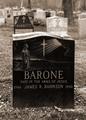
| 04/07/2004 07:00:56 AM | Too Young to Belongby LtHousLadyComment: Of course there is sadness in the death of a child, that almost goes without saying.
Your photo, however, is really very blunt. It is entirely a portrait of a tombstone - what sense of location there is is simply entirely of a graveyard, exactly as one would expect, and makes no contrast, comment or difference to the view of the stone. As a study of the texture of the stone, the light is not useful - there is little sense of smoothness, or roughness, and the framing and depth of field does not allow for a perception of contrast with the grass, trees, and what surroundings are visible. This is what I mean by 'blunt' ... there is nothing else going on here, in photographic terms.
Had it been my own project, I think I would have tried to show something of the atmosphere of the cemetary/graveyard, or perhaps tried to contrast the heaviness, solidity and smoothness of the stone with the surrounding grass, leaves, or whatever. Those choices would depend on the nature of the location. Colour might have been effective in that task - it seems to be a black stone, and to contrast that with a vibrant green in the grass, or perhaps the leaves of the tree (shooting upwards from the ground), might have made colour a good choice for the shot - black and white is not necessarily the only way to 'do' sombre moods.
Just some thoughts.
Ed
| | Photographer found comment helpful. |
| 04/07/2004 06:48:39 AM | Factory Accident? by JackoComment: Technically, of course, wonderfully executed - attention to detail is aastounding, even the scalloping of the edge of the tin's lid is organised. Would it be ungracious of me to point you at this photo of mine?
Many congratulations on the ribbon. | | Photographer found comment helpful. |
| 04/07/2004 03:48:18 AM | | | Photographer found comment helpful. |
|
Showing 1981 - 1990 of ~2866 |
Home -
Challenges -
Community -
League -
Photos -
Cameras -
Lenses -
Learn -
Help -
Terms of Use -
Privacy -
Top ^
DPChallenge, and website content and design, Copyright © 2001-2025 Challenging Technologies, LLC.
All digital photo copyrights belong to the photographers and may not be used without permission.
Current Server Time: 08/18/2025 10:35:22 AM EDT.
|