| Image |
Comment |
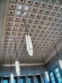
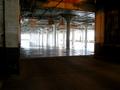
| 05/30/2004 02:40:44 PM |
At The Train Stationby NicNic101Comment: I find the angling of this shot odd - neither one thing or another: not extreme enough for impact, too much for accident. Can't see what it gains from excluding part of some of the hanging fittings. Has a level of interest in tonal difference, and some play of light on that ceiling ... I just get a strong feeling that it would have made a happier composition were it straightened and were those fittings fully included: it has the distinct impression that this was the only way you could exclude some major distraction from frame. |
 Photographer found comment helpful. Photographer found comment helpful. |
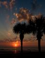
| 05/30/2004 02:36:06 PM |
Florida Sunriseby GallatinComment: I personally feel that this is outside the challenge stipulations - but it's such a nebulous and debateable area (clouds, reflections) that I guess I'll let you off. Some technical problems around the sun, over-saturation etc., which could probably have been sorted out (were you given the advanced editing rules) and I'm not convinced about this framing. 7 |
| Photographer found comment helpful. |
| 05/28/2004 06:25:37 AM |
Lights at the House of Johnby tlchambComment: Size issue - you've used way under half the available pixels, under two thirds of the available file size. Even without great software, I would think you could get this image larger. I think I quite like the image, though I always have the feeling with these small shots that something is being hidden by that re-sizing, that maybe the fine detail is missing and just doesn't register so much at this size. 5 |
| Photographer found comment helpful. |
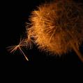
| 05/28/2004 06:22:53 AM |
Leaving the Restby ColeyComment: Strong impression that what detail there is here is forced, through processing, rather than captured. I know it's a very tricky subject to capture, with there being such an amount of fine detail here, and display of very fine white lines on the internet, given the pixels, is tricky. But for me, here, there are too many jagged edges, and too much of the head of the dandelion is out of light or out of focus or just plain dark. Don't get any sense of multiple light sources either - there amy well be reflectors used etc., but we were asked for it to be 'obvious', and I fear that here it isn't - I'm certain this will hurt your score more from others than from me, however. 5 |
| Photographer found comment helpful. |
| 05/27/2004 08:06:06 AM |
\\\\by frumoazniculComment: Like the composition, though I'm not such a fan of the grain of the shot. I also think that missing the brightest area of the tines with you chosen dof might be a mistake - it leaves a conflict between the natural draw of the brightness and the opposing draw o the focus that doesn't allow the eye to settle at all. But there's a feel I like here very much. |
| Photographer found comment helpful. |
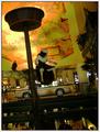
| 05/27/2004 06:39:13 AM |
Casino Colorsby tfarrell23Comment: This has to be one fo those shots that is so bizarre it's not fake. Certainly meets the challenge, but I think a number of people are going to do you down for being too strange. |
| Photographer found comment helpful. |
| 05/26/2004 05:21:21 PM |
At Night The Silent Monks Returnby boomerComment: Good eye. Would dearly love to see something done about the noise in the blue here, but I appreciate your dilemma with the black umbrellas and any kind of darkness. |
| Photographer found comment helpful. |
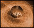
| 05/26/2004 05:15:31 PM |
voodoo: getting out of the spellby KiraComment: Intersting cropping and composition. A sense of dried staw in that light painting, somehow, which also somehow seems apt to the image. Neat work. Has a sense of 1970's design to it also. |
| Photographer found comment helpful. |
| 05/26/2004 05:13:10 PM |
Brightby rockfishComment: ahem. So much flash that it's difficult to tell if there actually is another light source. Obviously you've done this deliberately, from your title, but I don't find anything of interest here. |
| Photographer found comment helpful. |
| 05/26/2004 05:12:04 PM |
Sun v. Sodium - There Can Be Only One!by mpburtonComment: Like the exposure here - the controlled blowing out of the highlights from the sun really add impact to the sense of suffusion of light through the space. In my experience people will comment on that as a bad point, but don't believe them - it's a fascinating and useful trick, well pulled off here. |
| Photographer found comment helpful. |
Home -
Challenges -
Community -
League -
Photos -
Cameras -
Lenses -
Learn -
Help -
Terms of Use -
Privacy -
Top ^
DPChallenge, and website content and design, Copyright © 2001-2025 Challenging Technologies, LLC.
All digital photo copyrights belong to the photographers and may not be used without permission.
Current Server Time: 08/19/2025 11:21:00 AM EDT.