| Image |
Comment |
| 06/29/2004 02:55:24 AM |
sophisticatedby hopperComment: Lighting excellent - maybe just a tiny bit flat on the hands, but excellent for the face. your crop, especially on the hands, is odd, as is the posing of them - why cut half of them out? 6 |
 Photographer found comment helpful. Photographer found comment helpful. |
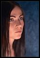
| 06/29/2004 02:53:19 AM |
Photographers portraitby birgirComment: like the style - well, I don't, personally, but I like your execution of it - has a certain meanness to it. White shirt issue though - makes the face look dark, pulls the attention away from subject, and the background highlight is not helping that being in the same area of frame. 6 |
| Photographer found comment helpful. |
| 06/29/2004 02:50:58 AM |
I can hear musicby RUEDISCHMUTZComment: Background issue here - looks like someone's living-room. Good light, good pose and capture - apart from that background couldn't criticise at all. 6 |
| Photographer found comment helpful. |
| 06/29/2004 02:49:29 AM |
Dreamerby NazgulComment: The uplighting is a touch strong for me - gives a slightly sinister quality, especially in the way it accentuates the eyebrow ridge. A good attempt though - quite enjoy the different poitioning within frame. A touch of shininess too - but minor. 6 |
| Photographer found comment helpful. |
| 06/23/2004 01:20:32 PM |
"Julia"by grigrigirlComment: Very fine portrait indeed, depite the contrived-looking pose. great definition, good use of de-sat, and wonderful tonality. Just pushed a touch too far in the self-consciousness stakes for me to put it in my faves, but it's close. |
| Photographer found comment helpful. |
| 06/23/2004 01:17:15 PM |
Blue skyby MotoCycleBoiComment: Good capture - shows patience, I suspect, and perseverance. Good tones in both the black and white and colour areas, and a great moment of light on the flag. Whilst I suppose it follows the thirds rule, I think it does so too slavishly: the out of focus area of the pole has become too dominant in the image for my liking, and the placement of the flag seems low in the frame: that space towards top and left seems unuseful. 6 |
| Photographer found comment helpful. |
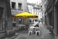
| 06/23/2004 01:07:15 PM |
Street Bistroby RUEDISCHMUTZComment: Goood work. There are strong leading lines in this shot which don't quite work with your choice of desaturation subject - rather against: they pull my eye toward that brighter area behind the guy at the table ... I wonder if that bloke himself might have made a stronger subject than the sunshade? The black and whie element is strong, and the colour is good also - I just have those small reservations. |
| Photographer found comment helpful. |
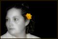
| 06/23/2004 06:07:11 AM |
Yellowby cbellerComment: For me, your yellow key line in the frame here is a mistake - it amkes the frame part of the picture, rather than something to isolate the picture from its surroundings, precisely because you've used that colour as your choice in the image. The remaining colour in the eyes looks so unreal too - I really do think you should have desaturated those areas also. There's also a pull introduced by your cropping between the face and the flower and the negative space image right - but I don't see a purpose of that negative space here, other than to place the flower on the cntre of image, which I think is weak, compositionally. I like the softness of the image, has a suitability for what feels quite old-time, but I also think you could have found some more definition with your lighting - more depth. All of which sounds hyper-critical, but actually to my eye you're not far off something rather nice here. 6 |
| Photographer found comment helpful. |
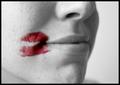
| 06/21/2004 01:41:26 PM |
A Kiss in the Corner of Her Mouthby JesuispeureComment: Overtones of lesbianism here? Somehow I'm not sure - it's such a placid shot, such a gentle tonal range and gentle focus, I would perhaps have expected something more heavily worked. But I like that dichotomy, anyway. Good work. 7 |
| Photographer found comment helpful. |
| 06/21/2004 01:37:26 PM |
The Color of Summerby nbortonComment: Fun action shot - but I don't think the de-sat actually works for this subject: to my eye, the fun of the shot is in the guy's expression, and the spray of the water. The colour in the inflatable puts the subject there, and this creates a conflict which to me doesn't help the shot. 5 |
| Photographer found comment helpful. |
Home -
Challenges -
Community -
League -
Photos -
Cameras -
Lenses -
Learn -
Help -
Terms of Use -
Privacy -
Top ^
DPChallenge, and website content and design, Copyright © 2001-2025 Challenging Technologies, LLC.
All digital photo copyrights belong to the photographers and may not be used without permission.
Current Server Time: 08/19/2025 04:28:08 PM EDT.