| Image |
Comment |
| 08/11/2004 02:12:25 PM |
... Trough The Seaby empauloComment: The tilting of the image is rather more of annoyance than a feature for me. I would have thought that taking a wider shot and then cropping, rather than accepting your cameras framing as it stands would have been more effective - as the image is precisely 640x480 I'm guessing that's what you've done, but I can't see another reason for it ... the angle just isn't dramatic enough, nor does it contribute enough impact. Some of the grandness of the sweep of that ccauseway is lost here also - a little more height would perhaps have been effective - not necessarily possible, but nevertheless ... a small stepladder or something, such as many landscapers carry would have done it. |
 Photographer found comment helpful. Photographer found comment helpful. |
| 08/11/2004 02:07:43 PM |
Powerful Pointby L1Comment: Close to being a fine photograph - though for me one or two things let it down. Firstly your organisation of those pylons within frame - I can't help thinking that taken from a touch further left the movement through the image might have been more defined (although the looping of the wires is well shown here); secondly, an overall lack of contrast, especially in the greens. I expect this had to be pushed somewhat to get that area visble, but I think more definition in those areas could have helped ... whether that's possible in basic rules, I'm not sure :-) There's an evening quality here, perhaps from the slight suspicion of mist around the ground, but it's rather lacking in impact. 6 |
| Photographer found comment helpful. |
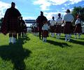
| 08/11/2004 01:17:53 PM |
Little Groupieby skylenComment: Perhaps rather desperately needs some work with blancing the highlights and midtones. The eye is drawn rather more to the gazebo at the end of that line between the band than to the child - due to the inevitable leading line phenomenon - and as there's little discernable there it loses a good deal of impact. That and the poor exposure score you a 4 |
| Photographer found comment helpful. |
| 08/11/2004 01:15:46 PM |
Night Walkby cassilda_terryComment: Odd title. There is something to the light on your model, but the vanishing point seems incidental to the composition. Not to the scene, you understand, as the extension of that bridge/alleyway thing is obviously useful in giving locational information, but the fact of the distance and convergence suggested by the distance seems entirely incidental to the scene. 6 |
| Photographer found comment helpful. |
| 08/11/2004 01:13:37 PM |
Dusty Blindsby pottersclay75Comment: Dusty, really? Those bright reflections and stars make them look shiny and clean. Quite like the motion through the frame, but that's perhaps only a good thing because that's all there is. Some balance of the two sets of reflections adds some balance, and prevents it from being just another misguided 'abstract', though it does little for me as it stands. |
| Photographer found comment helpful. |
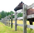
| 08/11/2004 01:11:17 PM |
Don't fence me in.by s2fraserComment: One of the diffficulties about this challenge, is that this (somewhat obvious) use of the technique also involves the other compositional trick of 'leading lines' - which have the effect of drawing the viewer's eye to their meeting place - in this case, the extreme left edge of your frame, and that partially visible shed. Kind of a shame, because you've captured a moment of light moderately well, even though the hugely blow-out sky is rather an annoyance. There are ways t avoid that, however. A 4 |
| Photographer found comment helpful. |
| 08/11/2004 04:40:12 AM |
|
| Photographer found comment helpful. |
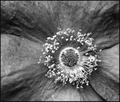
| 08/10/2004 05:12:37 AM |
Rosaceae Minutiaby adineComment: Love this - it's like a crowd of sightseers gathered around a pool, or some weird experiment. To me this is exactly what a top macro photograph should be - whilst it keeps the fascination of seeing something larger than life, which is the obvious attraction of the genre, it is actually a landscape photograph, using and obeying the strictures of that genre too. Wonderful wonderful stuff - and a ridiculously unsatisfying score in my eyes, even if many folks would love to achieve it. The shot warrants so much more. |
| Photographer found comment helpful. |
| 08/10/2004 04:43:46 AM |
le petit et le grand by strangeghostComment: Good subject choice, neatly carried out, and ideally lit - but it has the look of a catalogue shot, an illustration rather than a dynamic presentation. I think people will regard it as a bit ordinary - competent technical work only takes you so far as regards impact. 6 |
| Photographer found comment helpful. |
| 08/09/2004 12:46:31 PM |
Catch upby k4ffyComment: Something very odd happening with colour balance here - that fade to very stronf yellow in the background, and the 'oranging' of the big tomato. I don't like this composition - don't see the point or use of the large area of dead space at top. |
| Photographer found comment helpful. |
Home -
Challenges -
Community -
League -
Photos -
Cameras -
Lenses -
Learn -
Help -
Terms of Use -
Privacy -
Top ^
DPChallenge, and website content and design, Copyright © 2001-2025 Challenging Technologies, LLC.
All digital photo copyrights belong to the photographers and may not be used without permission.
Current Server Time: 08/19/2025 04:30:16 PM EDT.