| Image |
Comment |
| 09/10/2004 03:28:42 PM |
Historic ‘Niagara On the Lake”by rileyComment: When you select areas to brighten, like tthe shadowed edge of those flowers, two things are really useful: firstly, use increased contrast to hide some of the effect, so that black areas don't become grey, and also the 'feather' control, which fades the edge of the selection and makes it much less of a hard line like that. It lets down what was otherwise a very fine shot, I think - ideal for the challenge. |
 Photographer found comment helpful. Photographer found comment helpful. |
| 09/10/2004 03:23:35 PM |
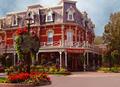
Historical manorby rhipsterComment: Don't know if it's the glass f wine I'm in the middle of, or whether there's something slightly odd about this shot. The perspective distortion seems a little strong, and maybe the black point is a touch bright: I like the smoothness of tone that gives, but at the same time I miss the contrast. A touch more shadow might have removed some of the two-dimensional feeling from the image. Can absolutely see it in print, though. |
| Photographer found comment helpful. |
| 09/10/2004 03:18:40 PM |
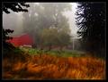
Breath the fresh air of the Adirondacksby GBServisComment: Would really like to see more definition worked into the hills and the trees; for me, this is too close to being a sky shot rather than a place shot. It would have been a fairly easy trick in post, too. Good shot though, but I don't quite think it nails the challenge enough. 7 |
| Photographer found comment helpful. |
| 09/10/2004 03:16:05 PM |
The Mists of Coquilleby mocabelaComment: This is wonderful. A monumentally well controlled and processed shot. Love the tones particularly, in the grasses, and the progression of light in the mist. Not quite sure it really fits - it isn't the kind of big bright shot i'd expect to see in a guide. Want to give it a ten, but that consideration is just going to cost you a point. |
| Photographer found comment helpful. |
| 09/10/2004 07:06:18 AM |
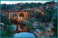
Yorkshire, United Kingdom by p_johnsComment: Very nicely done - all the appropriate qualities fro the type of shot. I find the blue cast of the light a touch too cold though, but that's my only gripe. Excellent composition all round. |
| Photographer found comment helpful. |
| 09/10/2004 07:02:19 AM |
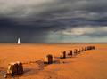
Go With the Wind by ImagineerComment: Wonderfully dramatic photo, excellent composition, good colours - most things about this are rather fine. Don't know that I could see it in a travel guide. Where is it? What's so distinctive about it as a location? But maybe ... so I don't mark you down. |
| Photographer found comment helpful. |
| 09/10/2004 03:55:34 AM |
A Manhattan Nightby graphicfunkComment: Bottom right - weird cloning artefacts? Great technical detailing, enough sense of place to suit challenge, just perhaps lacking real ping - some foreground element might help, give a sense of depth to the image? But very very clean photography, apart from the poor cloning thing. |
| Photographer found comment helpful. |
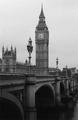
| 09/10/2004 03:48:50 AM |
London Walksby PixelstateComment: Quite like this composition, although I find the shot from further along toward the Eye is an easier one - the bridge and St. Stephen's Tower organise themselves more happily. Also like the quality in the shot - the graininess adds wonderfully to the stone textures, despite the probably out of place (for this challenge) effect in the sky. It doesn't have the feel that I would expect from a guide book - most seem to prefer big bright clean images - but there's a lot to like here. |
| Photographer found comment helpful. |
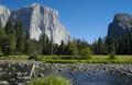
| 09/07/2004 07:54:10 PM |
Exploring Yosemiteby photomComment: Spot on. The inclusion of a single figure seems a bit odd for the travel guide market - crowds of folks yes, sometimes, but the one person lends a sense of a personal photograph, rather than an illustration. Great sense of scale, great composition. I would have liked the light a little warmer. 7 |
| Photographer found comment helpful. |
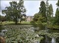
| 09/07/2004 07:49:32 PM |
Wakehurst Placeby marboComment: Something just doesn't quite ... Don't know, maybe just the light. You've plainly tried hard to bring some interest back into the sky, almost successfully, though it still seems a touch over exposed. Maybe composition - I appreciate the desire to show the lillies, but not convinced that they add to enough to warrant demoting the interest in the house and it's framing trees. The quality of light on the stone seems really good, which just makes it a bit more annoying that you haven't concentrated on that. The masterful shot, it seems to me, and for this challenge, would be the house and the trees. Close though, for all my griping. |
| Photographer found comment helpful. |
Home -
Challenges -
Community -
League -
Photos -
Cameras -
Lenses -
Learn -
Help -
Terms of Use -
Privacy -
Top ^
DPChallenge, and website content and design, Copyright © 2001-2025 Challenging Technologies, LLC.
All digital photo copyrights belong to the photographers and may not be used without permission.
Current Server Time: 08/20/2025 01:01:03 AM EDT.