| Image |
Comment |
| 12/09/2004 11:40:59 AM |
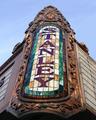
Stanley (1928) Jersey City, 2nd largest Theater E. of Mississipi Riverby graphicfunkComment: I guess that depends exactly how far east you're prepared to go, really. I can see the appeal of this light and tonality, which is well captured. I don't get the use of the odd angle, which seems neither a deliberate tilt nor an advantage. I like that you've tried a detail shot, rather than a dull full-on shot of as much of the building as you could get in ... but this seems oddly isolated. I think it's a composition thing: might you still have held the sign as your primary subject, but used the lines of the rest of the frontage, or rather 'some more' of the frontage, to bring the eye more strongly to that subject? |
 Photographer found comment helpful. Photographer found comment helpful. |
| 12/09/2004 11:37:17 AM |
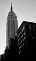
High and Mighty...The Empire State Buildingby charmayneComment: Not sure about the perspective distortion, and you angling of the shot to keep the Empire State vretical at such expense to the other buildings. I think that more compsromise would have been acceptable, but that's difficult to be certain of without trying it. There are also tools to help correct such phenomena, though they can be tricky to use.
And something's gone badly wrong ith the processing somewhere, I feel - or even if it's deliberate, it just looks like a mistake. All those jagged lines, and compression artefacts ... and using just under a third of the available data. |
| Photographer found comment helpful. |
| 12/09/2004 11:34:02 AM |
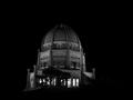
The Bahá'í House of Worship, Wilmette, Illinois, U.S.A.by fotodudeComment: Well exposed, and there's good detail, and a good capture of the light. I find the composition very weak however - so centred, so much negative space, so little else to guide the eye, and all of that with a quite 'ordinary' seeming viewpoint - sure, it could be the most difficult view to get at in the world, but we don't know that. You need, I feel, and especially with such architectural shots, to add some element of difference, or of the spectacular, of of the location. the building is interesting - that doesn't automatically make the photograph interesting. |
| Photographer found comment helpful. |
| 12/09/2004 11:30:51 AM |
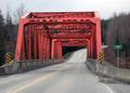
If you come to the Kitimat River Bridge, you've gone to far.by spillerComment: My first thought here is to wonderr why you shot this from this point fo view: it seems to me thhat it doesn't allow us much sense of the bridge at all. The head-high shot means that the intricacies of tthe 'roof' are squeezed into very little space in your shot, and your angle to the thing means thhat the sides are similarly stuck for space - there's almost more road here than brisge, and yet you haven't given much impression of where it is at all - a bridge over what? How big is that river? How deep is the drop? There's a strong sense of the bright colour of it, and that is well done, and the overall exposure is good - low enough for the colour to pop, but not so as to lose detail. Some experimentation with angles would help I think - even getting down on one knee to shoot can give an image just that bit of difference it needs to stand out. Good luck. |
| Photographer found comment helpful. |
| 12/08/2004 07:28:18 PM |
The Drakeby banmornComment: Interesting shot - though your yellows might have been saturated a touch too much for me: that sense of partial over-exposure in the brickwork. The noise in the sky is a pity, though I expect in the building areas it's actually helping you. |
| Photographer found comment helpful. |
| 12/08/2004 07:25:10 PM |
|
| Photographer found comment helpful. |
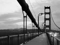
| 12/08/2004 07:13:44 PM |
Golden Gate Bridge and Sutro Towerby faidoiComment: The lines of the cables are fun - the lines of the streetlights are not so much. There's some good feel here, in the steelwork, but I do wish the streetlights weren't quite so intrusive. |
| Photographer found comment helpful. |
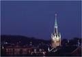
| 12/08/2004 07:11:34 PM |
Standing Tallby jpochardComment: Looks to have suffered from rather heavy processing - whether or not in camera is impossible to tell, but to my eye it harms the shot a great deal. I think there might have been a strong sense of serenity, of early evening peace to it - that shade of blue - but it does need that cleanliness of image to go with the clean (and strong) composition. |
| Photographer found comment helpful. |
| 12/08/2004 07:09:38 PM |
Providence State Houseby nico_blueComment: Classical, neatly organised - filling the negative space with trees is always effective, and makes a useful lead into the top of the dome. Clever composition, and strong sense of plasticity in the dome itself. |
| Photographer found comment helpful. |
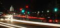
| 12/08/2004 07:08:00 PM |
13th and Pennby blemtComment: Hurrah hurrah - some context at last. I feel like giving you extra points just for that, after the last few images. I wonder if you haven't relegated your landmark too much for most tastes - and if the forground isn't too cluttered and busy. I think that would be my personal criticism of it too - whilst you've captured the sense of the way it dominates the streets, I wonder if you haven't just taken it too far. Good work. |
| Photographer found comment helpful. |
Home -
Challenges -
Community -
League -
Photos -
Cameras -
Lenses -
Learn -
Help -
Terms of Use -
Privacy -
Top ^
DPChallenge, and website content and design, Copyright © 2001-2025 Challenging Technologies, LLC.
All digital photo copyrights belong to the photographers and may not be used without permission.
Current Server Time: 08/21/2025 06:04:17 AM EDT.