| Image |
Comment |
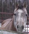
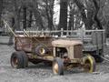
| 12/16/2004 06:05:13 AM |
if he ain't broken, don't sitby DonaldComment: A very poor shot, I'm afraid. Motion blur from camera, colouring is weak and uninteresting. The horse appears friendly and gentle, rather than powerful and intimidating which is what your title implies. Has the feel of a snapshot entered in a hurry. |
 Photographer found comment helpful. Photographer found comment helpful. |
| 12/16/2004 06:01:50 AM |
Gone To Potby SteveJComment: The on-board flash, which under normal circumatances is a light I absolutely loathe, and which does absolutely nothing for almost all subjects, has given a glow to this image which I like. Strange composition - that top line of fracturing doesn't reada sbroken without some looking, and the obviously broken parts of it are so relegated in the frame. But I like it - it's more about survival, but that by it's nature implies some kind of breakage. Interesting |
| Photographer found comment helpful. |
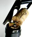
| 12/16/2004 05:57:33 AM |
Broken...I hate when that happens!by SweetlipsComment: I've been avoiding this shot as i don't know what to say about it. it's absolutely fine - other than that the 'break' is somewhow lost in the composition. I think the lines of the bottle and crkscrew and whole part of the cork are so strong, the take the attention away from what ought to be the real area of interest for this challenge - and the screw appears twisted and that feels so unlikely that one gets a strong sense of distortion rather than illustration. Technically a fine shot, although in such a clean set-up I wonder that the noise mightn't have been reduced. |
| Photographer found comment helpful. |
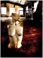
| 12/16/2004 05:54:46 AM |
broken or bust?by whiteroomComment: Wonderful - love those dirty reds and brown tones. A minor point, but might not the figure have had a greater relation to her environment? It would add to the surresl nature of the shot if there were some sense of interaction rather than simply location? Like I said, a minor point. This is wonderful stuff though, I shall come back to it. |
| Photographer found comment helpful. |
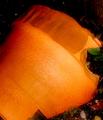
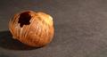
| 12/16/2004 05:38:40 AM |
Toroby GolferDDSComment: This is one shot where selective desaturation really feels like cheating to my mind. Without it, your subject would presumably have merged into the background so much more, and separating it by use of a processing technique (read 'trick') feels like laziness to me. Also this is a very straightforward documentary shot - it tells me very little, asks me to find my own interest in the object, rather than showing me yours. It's taken from head high, it neatly includes all of the subject, and doesn't communicate anything of your feelings, likes, dislikes, interests in this subject, and it isn't such a very unfamiliar type of thing that it's simple presence is going to have impact of itself. |
| Photographer found comment helpful. |
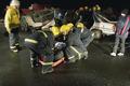
| 12/16/2004 05:33:08 AM |
Broken car, spine and clavicle - An exercise in extractionby kremkexComment: Extraordinarily staged quality those work lights allow one to capture, no? I'm not certain about your framing - or cropping. There seems to be undue dead space at the bottom of frame, and a claustrophobicly close crop at the top. No visible head to the victim - a step to the right might easily have fixed that - and my immediate feeling would have been to get lower, allow the elements to distribulte themselves throughout the shot more. |
| Photographer found comment helpful. |
| 12/16/2004 05:28:41 AM |
Broken Homeby Geo_GriffinComment: I think it would work more effectively had you framed the shell to the right of frame, and allowed your primary shadow to fall into the left of frame, which would give you some balance across the image - here, the constant movement of the eye is out of frame, following the shadow, and that doesn't help maintain interest in the viewer's eye. Neatly done however. |
| Photographer found comment helpful. |
| 12/16/2004 05:25:58 AM |
Collisionby thatcloudthereComment: Wonderful documentary work. That blated out feeling to the processing is entirely appropriate, the juxtaposition of the ... oh, hang on, are those markes where the car's been pulled out of the ditch? The baby carriage adds an almost too good to be true element of the sentimental (no, that's not an accusation, just a wondering whether it doesn't over-egg the puddding). fine fine work - that over-exposure of the road allows the distracting elements there to become insignificant. I wonder though, for a scene which of itself holds great power to affect, if a vvery staightforward treatment wouldn't be the more effective for making the audience more familiar with the world it contains? I mean a muted but full colour treatment, keeping the full control of exposure everywhere? But I like it this way too. A strong contender in my book (though I expect that's a book that many won't find agreement with). |
| Photographer found comment helpful. |
| 12/16/2004 05:20:31 AM |
Crrrrrr...by GabrielComment: I'm not certain about this - it's such an abstract kind of shot. The subject is clear, however, and the treatment quite effective, if a touch simple for my eye. In so many senses it seems more about design than about photography. Solid work though. |
| Photographer found comment helpful. |
| 12/16/2004 05:18:30 AM |
Shattered Dreamsby BeetleComment: Strange. I can see the point of the desat leaving the rings coloured, but the pen? Really, though, it's so blatantly set-up that I think it undermines any sense of the emotion that might have been found here. Confidently done technically, compositionally, but lacks impact for me. |
| Photographer found comment helpful. |
Home -
Challenges -
Community -
League -
Photos -
Cameras -
Lenses -
Learn -
Help -
Terms of Use -
Privacy -
Top ^
DPChallenge, and website content and design, Copyright © 2001-2025 Challenging Technologies, LLC.
All digital photo copyrights belong to the photographers and may not be used without permission.
Current Server Time: 08/22/2025 12:54:24 AM EDT.