| Image |
Comment |
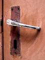
| 12/18/2004 08:43:50 PM |
Portrait of a broken door handleby GinaRothfelsComment: Difficult to achieve I know, but there could be more sense of texture in the material of the door itself, no? Just to add that real edge of contrast to the metal of the handle? It has a feeling of a half-stop or so over-exposure, and that that has leeched away some of the tonality and finer detail in those textures. Nice work all the same. |
 Photographer found comment helpful. Photographer found comment helpful. |
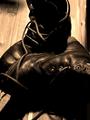
| 12/18/2004 08:41:46 PM |
|
| Photographer found comment helpful. |
| 12/18/2004 08:39:02 PM |
Broken Inby dsb_macComment: Good light, good tonality (although it seems to very oddly across the frame). Strong sense of texture and age - composition seems a touch forced though. |
| Photographer found comment helpful. |
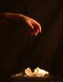
| 12/18/2004 08:37:32 PM |
Lights Outby Prof_FateComment: Nice composition - although I think your prcessing, certainly in terms of the darkening of the background, could use more work - it's really quite visible, and it looks like a mistake rather than deliberate. Likewise there seems t be a lighter area around the lightbulb that smacks of selection inaccuracies. Not badly lit at all - some real shape here. |
| Photographer found comment helpful. |
| 12/18/2004 08:35:01 PM |
Broken, Beaten, and Abandonedby JEFFJSBComment: Good shot, though ti's a shame about the jaffies around the screen frame. It's a neat compsition too, and I think you do very well not to fall into the common trap of trying t show the whole car. |
| Photographer found comment helpful. |
| 12/16/2004 08:45:23 PM |
|
| Photographer found comment helpful. |
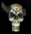
| 12/16/2004 07:58:34 PM |
broken hornby speaseComment: This is so very much only a record of something - photography used as a way of making that. The light is very flat, the background, whilst well executed, makes that documentary element even stronger. Give the light some angle (i.e. don't use on-board flash), and you have some sense of three-dimensions to this, and that alons would add a whole element of interest. |
| Photographer found comment helpful. |
| 12/16/2004 07:56:04 PM |
Pencil's broken...Spirit is not!by glad2badadComment: Well, I'm a real hater of this kind of border, I fear. I just don't get the point of it., and it seems to serve only to distract from the actual photograph. |
| Photographer found comment helpful. |
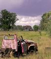
| 12/16/2004 07:54:16 PM |
Neglected and Run Downby HeavyComment: Good work - love the sense of location, so important to these shots. I think you could have darkened the foreground a little, and added impact thereby - it would have brought out the yellow tones in the grasses, and complemented the sky quite efffectively. |
| Photographer found comment helpful. |
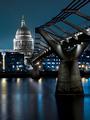
| 12/16/2004 07:52:01 PM |
Pride of London by ImagineerComment: ... and lurking in the haze just to the right of the Cathedral, is the vague outline of one of the towers of the Barbican Centre: so make that three iconic bits of british architecture. That last, of course, doesn't get quite the plaudits of the others. |
| Photographer found comment helpful. |
Home -
Challenges -
Community -
League -
Photos -
Cameras -
Lenses -
Learn -
Help -
Terms of Use -
Privacy -
Top ^
DPChallenge, and website content and design, Copyright © 2001-2025 Challenging Technologies, LLC.
All digital photo copyrights belong to the photographers and may not be used without permission.
Current Server Time: 08/22/2025 03:10:06 AM EDT.