| Image |
Comment |
| 12/20/2004 09:43:39 AM |
|
 Photographer found comment helpful. Photographer found comment helpful. |
| 12/20/2004 09:38:16 AM |
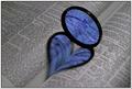
Broken Loveby GautiComment: Nicely executed, though I'm surprised by your decision to shoot the book upside down - it's good work, obviously, but just doesn't quite do that extra thing for me, even with the broken thing. |
| Photographer found comment helpful. |
| 12/20/2004 09:34:35 AM |
Red and White (Remie #4621)by docpjvComment: In amny senses this is a wild improvement on the original, which actually suffers from big technical problems. What you don't have, for me, is the big bright punchy over-exposed feeling (good thing? bad thing? don't know), and this to my eye suffers a bit for that - in a way it's too realistic this, rather than having the disgned edge of the original. As a variation - well, the set-up itself is so very designed, that I'm not certain of the benefits of this approach. |
| Photographer found comment helpful. |
| 12/20/2004 09:31:11 AM |
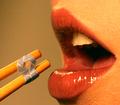
A Tasty DPC Ribbon Served Up On Chopsticksby neesa108Comment: Nice idea. I think it needs the high contrast feel of the original, and the massive sense of detail in that shot to really make the impact. This ishowever plainly a tribute, and reasonably effective - it's just that background colour which doesn't have the stylish impact of the original. |
| Photographer found comment helpful. |
| 12/20/2004 09:29:20 AM |
|
| Photographer found comment helpful. |
| 12/20/2004 09:27:37 AM |
Visual Poetryby NonageComment: Without going back to the orignal, and whilst this is a fine copy of that image, I feel that the fade to white is too sudden here - whether I felt that about the orignal I don't recall. Nicely done. |
| Photographer found comment helpful. |
| 12/19/2004 07:28:43 PM |
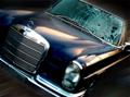
Drivenby bpickardComment: Is this about editing or photography? I can't decide, for myself. The base photo is OK, but it's difficult to say that the impact of the shot is not primarily down to that motion blurring - and why doesn't it affect the radiator grill, and the badge, and the headlamps ... sorry, I don't like it. |
| Photographer found comment helpful. |
| 12/18/2004 08:51:37 PM |
Stop Whiningby PhilosComment: Almost lovely, and almost wonderful execution - it would be faultless without having taken the sharpening quite as far as it has been. Proper high-key work, solid composition. Dramatic certainly, but in terms of substance ... I'm not sure. |
| Photographer found comment helpful. |
| 12/18/2004 08:48:14 PM |
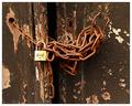
Limited Warrantyby sparklyComment: Great colour, strong composition. It lacks something for me - just that edge of real shape from light perhaps. Nice work. |
| Photographer found comment helpful. |
| 12/18/2004 08:46:39 PM |
My Country Tis of Theeby MJENNIComment: Broken colouration too, is that it? A technically fine shot, although I have a resistance to the subject matter which won't cost you anything - but I have a stronger resistance to the wacky colouring: it makes the flag an unfamiliar thing, and yet your title suggests that it should be an immediately familiar one. Maybe the impression of confusion is one you wanted to sow, but to my mind it is incoherent. |
| Photographer found comment helpful. |
Home -
Challenges -
Community -
League -
Photos -
Cameras -
Lenses -
Learn -
Help -
Terms of Use -
Privacy -
Top ^
DPChallenge, and website content and design, Copyright © 2001-2025 Challenging Technologies, LLC.
All digital photo copyrights belong to the photographers and may not be used without permission.
Current Server Time: 08/22/2025 03:10:22 AM EDT.