|
|
|
Showing 1311 - 1320 of ~2866 |
| Image |
Comment |
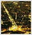
| 01/21/2005 07:02:13 PM | Grenobleby cheekymunkyComment: Great compositional eye. Good detail, nicely balanced exposure, even with that squre being so burnt-out. Available presentatin size doesn't help you, of course, but one can sense tthe detail. |  Photographer found comment helpful. Photographer found comment helpful. |
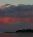
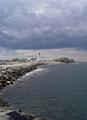
| 01/21/2005 06:58:47 PM | Summer Stormby StagoleeComment: it's not bad at all - though I'm not sure you've made the correct decision about your cropping: whilst that bright band at the top of the image should serve to emphasise the darkness of the clouds, I think it is unueccesary - as the contrast with the lighthouse serves that purpose anyway, and that build-up of cloud, and the red under-lighting, would be the more powerful for istting in stronger parts of the frame compositionally. More than anything, i think the file size of the submission lets you down - you've used around a fifth of the avaiable file size, and that's severely restricted your level of detail in such a large image, and detail is important in such a small image size as we get here. | | Photographer found comment helpful. |
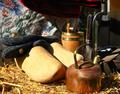
| 01/21/2005 06:54:23 PM | Autumn Sketchby lytaComment: A lot of things to like here - the light on the kettle, texture in the cloth. It feels slightly over-bright, whether exposure or processing I don't know, but I would have the levels of the clogs toned down somewhat - they seem almost out of place - and whilst there is detail there, it feels blown out. Also i think the composition is too crowded, especailly the upper right of frame: things there are indistinct, and the confusion of that for me unsettles the rest of the image. | | Photographer found comment helpful. |
| 01/21/2005 06:51:43 PM | By the Seaby snackwellsComment: Now. There's an almost cut and paste feel to this, almost like an old-time sea-seide shot where someone posed in front of a backdrop. Purely light of course - and very well handled. The style is slihgtly eastern in feel, fitting to the subject. I like it - photographially, it has a certain stance. | | Photographer found comment helpful. |
| 01/21/2005 05:16:04 PM | Helping Hands (C-Section)by cloudsmeComment: Wonderful documentary work. Impeccable - catches that sense of delicacy and brutality of the operating theatre. I would expect, however, that many folks wil find it too bloody for here; a great shame. It should be published. | | Photographer found comment helpful. |
| 01/21/2005 05:12:38 PM | Stepping Backby muur88Comment: Special light here - though there's a sneaking suspicion that it's very careful editing and use of contrast. I like the composition, although the black triangle of the shop awning to image left adds an unwelcome structural note, i think, especially being so close to the horse's head. A really great travel shot. | | Photographer found comment helpful. |
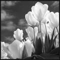
| 01/21/2005 05:03:40 PM | Red and Yellow in Grayby AzrifelComment: Interesting shot, I think. This is a parallel of that classic really poppy colour study - presumably, from your title, it would have bright punchy reds, yellows, greens, blues ... so, of course, to present it in B/W is intriguing. However (and there's always a however, isn't there?) ... I'm not sure whether it's the knowledge, the familiarity of that referred to image, or whether it's a genuine thing, but this seems to be lacking real texture, and is more of graphic image - but of course you've invited that comparison with the big colour shot ...
There is a strong sense of fragility on the petals though - that translucency. I'm not quite sure what to make of it at the moment. | | Photographer found comment helpful. |
| 01/20/2005 08:13:25 AM | STORM COMINGby DArcy10Comment: I'm unsure about this one. You seem to have fallen betweentwo subjects, really: a shot that extends from the foreground to the lighthouse, with the suggestion of the dark sky above it, which would concentrate on the tones on the water and the rocks, and a shot of the dark sky looming over the lighthouse. Placing the lighthouse so central in the vertical leaves my eye switching between the two, without ever finding a place to concentrate. I think you could happily have extended the range of the mid-tones here too - the darkness of the sky isn't threatening, and the water has become almost the same tone throughout: it is those areas that give these shots their impact, and a faster exposure, or processing to bring the levels down in those areas would have given much more drama. You've also cropped out, or framed out, the foreground rocks, which would give your image a far greater sense of depth had you included them. It has real potential, this scene, I think, but it is unrealised. | | Photographer found comment helpful. |
| 01/18/2005 09:02:33 PM | Stillnessby BudComment: There are strong elements of a classic stock image here - the boats on still water is an image I think we have all seen on occasions and to that extent part of our mental furniture - and that places particularly high standards for such a shot tot meet: after all, you're competeing with images in people's memories, rather than referencible images. This, I think, misses the absolutel simplicity - that branch, the perfect organisation of composition that half hidden boat, their organisation across frame, and lacks drama in the background - which you have nevertheless included. I wonder if perhaps a more powerful image might have been found within this scene, rather than in the entirety of it? The boat with the superstructure and it's neighbour look promising ... but it certainly has potential. Have you tried simply cropping out the boats to the right? It would, i think, be much stronger compositionally. Just some thoughts. | | Photographer found comment helpful. |
| 01/18/2005 08:54:37 PM | Constrainedby jbeazellComment: The classically staggering, yet bleak landscape, with it's extraordinary frame of the most humdrum brick, yet coupled with a strange sense of perspecive distortion to hwta we know should be a flat wall makes this image throw away presumptions on three levels. Yet somwhow it fails to move me particularly. I wonder if that odd sense of distortion on the wall, doesn't actually work against the simple weirdness of the scene itself, and draw the mind away from that very simple contrast and it's effect. | | Photographer found comment helpful. |
|
Showing 1311 - 1320 of ~2866 |
Home -
Challenges -
Community -
League -
Photos -
Cameras -
Lenses -
Learn -
Help -
Terms of Use -
Privacy -
Top ^
DPChallenge, and website content and design, Copyright © 2001-2025 Challenging Technologies, LLC.
All digital photo copyrights belong to the photographers and may not be used without permission.
Current Server Time: 08/22/2025 05:49:40 PM EDT.
|