| Image |
Comment |
| 02/03/2005 08:16:59 AM |
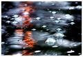
There's Beauty In The Breakdownby sherComment: Excellent metallic tones here, very strong composition. Reminds me somewhat of the work of Catherine Jamieson, but she hasn't submitted in nearly a year, so i'd be surprised. Strong photograph. |
 Photographer found comment helpful. Photographer found comment helpful. |
| 02/03/2005 08:15:03 AM |
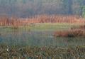
Beaver Lakeby ellamayComment: Enormously subtle, this - and a strong sense of the real. The gentleness of the tonality, and yet the evident care in exposure and processing, makes me wonder if it isn't one from Mr Ward. Excellent compositional balance, and very non-dpc: most I suspect, will struggle tofind a subject, think it lacks sharpness, think the tonal range is too narrow. There's a sense of the Monet Lily-pond in some of the colours in the water. |
| Photographer found comment helpful. |
| 02/03/2005 08:11:35 AM |
Flight of the Vernal Limbby bledfordComment: Splendidly daft, both image and title. Just wonderfully bizarre - frmo the unbelievable frame, the butterfly ... but the title just tops it all. Made me laugh. |
| Photographer found comment helpful. |
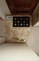
| 02/03/2005 08:08:00 AM |
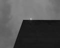
Harshby PeterCComment: The upsetting of one's expectations of zones in photography is strongly done here. Muted sense of progression of light, and of texture in the roof (?) lend just enough contrast to the absolute lines. The almost pointless seeming light adds that moment that is all that is needed to tip it into the real. Lovely work. |
| Photographer found comment helpful. |
| 02/03/2005 08:05:11 AM |
Marqueeby banmornComment: One of those shots that seems to have more impact as a thumbnail than as a full image - I think there are graduations in the tone across the frame that aren't so apparent at full size. Strong composition, obviously, but just lacks any other major point of interest for me. |
| Photographer found comment helpful. |
| 02/03/2005 07:59:45 AM |
Crossing Lightby m2iwComment: Kind of like this. I can see your choice in cincludding the shadow, but I think you've pushed the structure of the lights and their pole too far out of frame in order to include it, and cropped some of the other fittings on the pole - not suggesting that you include every light on the stand, but I think moving the pole into a stronger plane in the image would make it feel less releated - and the colour, the rust, the texture there, set against the moving train, would be rather fine, i think. |
| Photographer found comment helpful. |
| 02/03/2005 07:00:20 AM |
"Light" Weightby slindenmanComment: This is a great fight shot, even without the beam of light. Now do tell - you have surely added that in, haven't you? The trouble is, no-one even in their wildest moments in the lighting indistry would use a light of such narrow beam to light boxing - and from what i can see here it looks like a PAR lamp anyway, which simply cannot produce a beam that narrow (it must be six inches across where it 'hits' the boxers face). Also, thing that should be behind it have become brighter in that line, which should not happen (the red roof beam). If you wanted to be more accurate, then the beam should spread considerably as it approaches the ring, cerrtainly seen from this angle. Aside from which, as i said, it was a good enough shot anyway - especially with the sweat flying like that, the sense of controlled power from the fighter on the left, the wonderful look of the referee (and his hands in his pockets). |
| Photographer found comment helpful. |
| 02/03/2005 06:49:58 AM |
A Light's Point of Viewby fifieldComment: Strong sense of composition, just that little touch of mystery form those two whatever-they-are's. The natural light is good. |
| Photographer found comment helpful. |
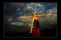
| 02/02/2005 05:16:51 PM |
lumière de soiréeby Ecce_SignumComment: Certainly eye-catching, although I never got to it in the voting. I agree in general about the border - would have been worth a .something on the score I think - though inmy opinion some work to bring out the rest of the landscape would have made it feel less PS'd. Not saying it is PS'd, but it feels like it's been deliberately darkened to isolate the 'mill. More definition (not masses, but enough to see that horizon properly), and even some lightening of the sky toward the horizon would have added to that massive sky feel that is so imperative in communicating the feel of the Broads). Check out some of Tom Mackie's stuff - feature thhis month in Practical Photography of just this territory. |
| Photographer found comment helpful. |
| 02/02/2005 01:16:05 PM |
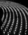
Striped Lightby gajmajComment: Shooting from the same vertical angle as the striped light has negated a real possibility of ehhancing the sense of shape, of three dimensions here: given the background straight lines, some sense of curve might have really been useful across the petals of the flower. The texture is good, and the tonality, and the grey backing especially effective to set off those tones ... but it cries out of missed opportunity to me. |
| Photographer found comment helpful. |
Home -
Challenges -
Community -
League -
Photos -
Cameras -
Lenses -
Learn -
Help -
Terms of Use -
Privacy -
Top ^
DPChallenge, and website content and design, Copyright © 2001-2025 Challenging Technologies, LLC.
All digital photo copyrights belong to the photographers and may not be used without permission.
Current Server Time: 08/22/2025 08:29:41 PM EDT.