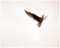
| Image |
Comment |
| 02/06/2005 03:57:55 PM |
|
 Photographer found comment helpful. Photographer found comment helpful. |
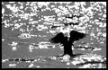
| 02/06/2005 03:56:13 PM |
Floating Angelby RedOakComment: Unsure about this shot; I like the basic idea of it, but there seems a lack of variation through frame in tonal terms - it's almost entirely black, white, or mid grey, and i think that's isolated the reflections too much; they don't quite come across as sparkle on water, but rather as an abstract patterning. Otherwise, lots of good stuff here. |
| Photographer found comment helpful. |
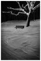
| 02/06/2005 12:43:43 PM |
Winter Benchby BeagleboyComment: I've been avoiding commenting on this one. There are a number of everso effective elements to it - the general strength of composition, the vignetting (whether edited or natural it is very useful). But there are elements of the composition that don't really sit very comfortably for me - chiefly your positioning of the bench/tree relative to one another, relative to frame: it leaves me wanting some element toward image left to provide a touch to re-balance things, or perhaps just to balance the composition more to the left, which I realise would mean croping out the end of that branch, but I think that wouldn't hurt in the same way as that slight upsetting of the balance of things does; these are very minor seeming details, but i think they have an exaggerated impact on the final composition. That hut and background behind the tree I think i would have tried to work/process out of the image too - or, if they're wanted, to give them more prominence. For dpc certainly, using levels or whatever to black them out would be preferred. |
| Photographer found comment helpful. |
| 02/06/2005 12:35:32 PM |
Pink Pongby FalcComment: Almost, almost very beautiful. I think you've restricted the graduations of light too much for this to be really effective - the highlights are blown, and the transitions into the black areas seem to happen pretty quickly, especially toward the bottom of frame. A little more care in the organisations of the balls, to prevent the seams showing, would have added a touch more neatness too. It could I think, have been a very beautiful shot, but needed a bit more care and attention to the finest level of detail and composition/organisation of elements. |
| Photographer found comment helpful. |
| 02/06/2005 12:32:12 PM |
Sourceby gaurawaComment: Very strong sense of both detail and light, as well as obviously meeting the challenge - a good still life. I wonder if a tiny touch of front fill light would have been useful - or might simply have added unhelpful reflections. It might also have added a yseful sense of plasticity to the main subject, of three-dimensionality. I like your background too - the uneven light there, the texture of the paper(?). Excellent work. |
| Photographer found comment helpful. |
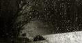
| 02/06/2005 12:28:02 PM |
Low Lightby gthbComment: Like this very much: the mystery of it, the compositional strength, the strong sense of light. I oftenwonder, with this kind of tonal rnage in an image here (i.e. dpc, or web display generally), whether it isn't more effective to enhance the low-end curve - from around 0 up to around 20: the variety of different moitor settings and types on which it is going to be viewed have the greatest difference in that kind of range, and it ouwld give you more control over what folks generally see in areas like the left of frame here. |
| Photographer found comment helpful. |
| 02/04/2005 06:28:13 PM |
Electric Glowby KonadorComment: Like the evident sharpness of a naturally blurry subject. Nicely executed, nicely composed - though I suspect many will think it's centred because of the poitioning of the element; your composition makes the dark (of course a necessary companion to the light) just a strong a part of the shot. |
| Photographer found comment helpful. |
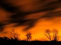
| 02/04/2005 06:25:44 PM |
By the Light of the Moonby tazzaComment: You title throws me: is this really moonlight? Looks like the looming of a distant city rather. I like the effect nevertheless. I don't get a great deal from it though - against the starts the effect of the moving clouds is effective, but the horizon is a bit ordinary, and whilst obviously necessary to the shot, I'm left wanting more of something. 6 |
| Photographer found comment helpful. |
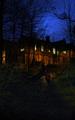
| 02/04/2005 06:22:27 PM |
Night Lightsby RosskoComment: There's a spooky element ot this shot, which is very strong. The cropping seems arbitrary at top and bottom - bottom more so - I'd be interested to know your thinking about that: I wonder if you've tried too hard to keep both the ethereal sky and the hauntedness of the foreground pathway? The figures add a strong edge too - a sense of careful departure. Like this a lot. |
| Photographer found comment helpful. |
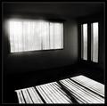
| 02/04/2005 06:19:15 PM |
Sunlitby mocabelaComment: Hm. I had something along the same lines myself, but didn't upload it. Compositionally this is very strong, and there is a sense of atmosphere to the empty room. I think you've done a good job wiith the balance of exposure, in a near imposible situation, without taking obvious processing artefacts to a noticeable amount. The impression of haze around the window, the unevenness of it, bugs me just a little: I like the idea of it, but the non-regularity of it somehow makes it seem unsuited to the room, unnatural, almost, out of place. Unless of course that is a processing artefact :-) |
| Photographer found comment helpful. |
Home -
Challenges -
Community -
League -
Photos -
Cameras -
Lenses -
Learn -
Help -
Terms of Use -
Privacy -
Top ^
DPChallenge, and website content and design, Copyright © 2001-2025 Challenging Technologies, LLC.
All digital photo copyrights belong to the photographers and may not be used without permission.
Current Server Time: 08/23/2025 12:01:48 AM EDT.