| Image |
Comment |
| 02/15/2005 04:24:58 AM |
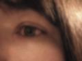
My one half is darkby JoziComment: I rather like this - there's a strong quality of glass about it, and the grain/noise is effective. Not wholly convinced about the composition, however. I expect you'll get slaughtered in the voting however. |
 Photographer found comment helpful. Photographer found comment helpful. |
| 02/15/2005 04:17:32 AM |
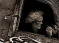
One Careful Owner, Needs Some Attentionby Mr_PantsComment: Fun shot: I would imagine you've achieved pretty much exactly what you were after - apart perhaps, from the comparative saturation in the prints, and those slight jaggies around the hand and top of head. I like the mad quality of it a lot. |
| Photographer found comment helpful. |
| 02/14/2005 05:55:40 AM |
|
| Photographer found comment helpful. |
| 02/14/2005 05:53:06 AM |
Me and My Canonby stragsComment: Not bad at all, although i'd have worked on that shiny line down the nose - after a moment oor two it becomes a major distraction in the image for me. Light otherwise is excellent, and there's a good sense of 'honesty' about it, which i like. |
| Photographer found comment helpful. |
| 02/14/2005 05:50:55 AM |
Just Meby gtroiaComment: On-board flash problems: makes the light very flat, and ends to over-expose things nearer to the camera, such as the near shoulder. You background is also very close, which in this case just serves to show a very strong and hard shadow, and the direct flash has caused unfortunate shiny areas on the face, and a lack of a sense of texture. |
| Photographer found comment helpful. |
| 02/14/2005 03:48:38 AM |
|
| Photographer found comment helpful. |
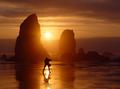
| 02/07/2005 07:28:04 PM |
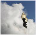
Lostby instepsComment: I really can't believe that this only just scraped a 6. Sure the angle has probably cost a few points, but really. My suspicion is that simply because it looks so photoshopped (and I mean very skillfully photoshopped) ... but that vote curve is pretty evenly centred around the 6 point. I think you have perhaps suffered from the fact that this was an advanced editing challenge.
+fav |
| Photographer found comment helpful. |
| 02/07/2005 02:39:21 AM |
Aperture by ZoomdakComment: Great work Thomas - now and then there's an obvious winner in a challenge. You nailed it. |
| Photographer found comment helpful. |
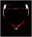
| 02/06/2005 06:58:01 PM |
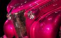
Red, Red, Wineby TranquilComment: neatly and carefully done, as far as the glass is concerned. There seems to be an added line of near-black each side of the image which annoys ne slightly - why not make it the same shade as the rest of the blackness? Given such extreme care with the lighting, it feels a slight let-down. |
| Photographer found comment helpful. |
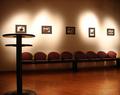
| 02/06/2005 06:54:31 PM |
Lights of fame :)by rhipsterComment: Normally, I would say that there's all sorts of things wrong with this shot - your placing of that table directly beneath the first photo, the burn-out of the light on the wall, the slightly stange crop (bottom of table, edge of seating), slight sense of barrel distortion; but actually I feel something kind of pleasing in it; I think there's a strong compositional motion in it, from the table, along the line of seats and scross the uneven row of light. The erraticness of those lights, and the one missing, add a sense of intrigue, either of unfinidhed-ness, or of desertion. Interestingly engaging. |
| Photographer found comment helpful. |
Home -
Challenges -
Community -
League -
Photos -
Cameras -
Lenses -
Learn -
Help -
Terms of Use -
Privacy -
Top ^
DPChallenge, and website content and design, Copyright © 2001-2025 Challenging Technologies, LLC.
All digital photo copyrights belong to the photographers and may not be used without permission.
Current Server Time: 08/22/2025 09:14:18 PM EDT.