| Image |
Comment |
| 03/22/2005 05:14:54 PM |
A Wind Blown Dawn At The Death Valley Sand Dunesby fulgentComment: Very pretty. i have a big issue with your placement of that wood in the foreground, and your cropping of the shaped sand around it that would really draw the eye is only you'd ncluded enough of it. Surely just crouching down would have enabled you to place that part of your composition more closely to the background, and to thus give some sense of continuity to the scene rather than this dissociation - an effect only enhanced by the very weird light around the wood.
The reason that very low placemtn is a problem is one not often understood, I think: and not as simple as a 'rule of thirds' thing, but more to do with how easily your viewer's eye will wander out of fframe if you give it half a chance - and that placement is just the half-chance needed. |
 Photographer found comment helpful. Photographer found comment helpful. |
| 03/22/2005 05:10:03 PM |
Make the Right Moves!by Moose101Comment: I get a sense of none of this being quite in focus - as though you've AF'd on the exxtreme front edge of the fallen piece, with a very shallow DOF, and so missed most of the actual subjects: the lines on the board are a give-away. I like the sense of light, however. Such images as this - fundamentally using the chess pieces to replace people as subjects - are so very common, that I think the highest technical virtues are absolutely necessary to their success. |
| Photographer found comment helpful. |
| 03/22/2005 05:04:41 PM |
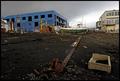
Soft Reflectionsby phreakonComment: My immediate thought is that you've missed the opportunity for a really good composition here - those three buildings with collonades are perfectly placed relative to one another for a very striking picture - but who knows whether you had the zoom etc. to do that? This seems confused - in sense of period, composition (the gridge and bright lights way off image right - and negative space above and below - makes the sky and foreground almmost seem like a border top and bottom, but it's just black, pretty much. |
| Photographer found comment helpful. |
| 03/22/2005 05:01:29 PM |
Lemon slicesby GinaRothfelsComment: Confusing, I think. The lemon lacks colour - it looks green, more than anything, and washed-out, muddy, and surely for stock that should be bright punchy yellow? whatever tthe container is draws far too much attention, especially as it contains the brightest highlights in the image. |
| Photographer found comment helpful. |
| 03/22/2005 04:59:55 PM |
Fresh Pickedby bongoComment: Basically very good - certainly pretty competent; though for this 'buyer' you've over-done the fill light (kills some of the shaping of the pears), and the shadows look forced in processing - kind of unnatural, a bit sudden. The key-light is very effective however, especially on the water drops. Not an image I like very much, but then this is a stock challenge, so i didn't expect to like the good ones really :-) |
| Photographer found comment helpful. |
| 03/22/2005 04:55:08 PM |
First Taste of Gardening - Literallyby JamesterComment: Even without the hugely overblown highlights on the child's face and head, I'd have my doubts about the suitability of this for stock. Add the no-composition element (subject placement in frame, half a watering-can, random nature of disorganised background), and the snap-shot nature of the overall look, and I can't see this doing anything at all here. Looks like it was shot with a high-quality camera, or at least carefully re-sized and presented though. 2 |
| Photographer found comment helpful. |
| 03/22/2005 04:52:00 PM |
Abandonedby gudbjargarsonComment: Knockout. I don't suppose there's much to say about it - everything you hoped it could be, it is, I suspect. Proper grown-up, modern photography. |
| Photographer found comment helpful. |
| 03/22/2005 04:21:58 PM |
In gearby LevTComment: Wonderful depth of field, definition, neat composition, colour tones perfect, great light. Hate the way you've bordered it - really hate it, but am trying not to let it affect my vote. I think it would sell. |
| Photographer found comment helpful. |
| 03/22/2005 04:18:45 PM |
Lazy Sealby justinbrookComment: I wonder if this is really close enough to serve: sure it shows location, but there is nothing specific about that location. There are strong elements I really like in it - the texture and depth of the rocks, the poses of the seals - but as successful stock: hell, I don't know. |
| Photographer found comment helpful. |
| 03/22/2005 06:41:41 AM |
Precisely by aznymComment: Excellent stuff Aznym - breaking the top three is such company as this challenge is an achievement. |
| Photographer found comment helpful. |
Home -
Challenges -
Community -
League -
Photos -
Cameras -
Lenses -
Learn -
Help -
Terms of Use -
Privacy -
Top ^
DPChallenge, and website content and design, Copyright © 2001-2025 Challenging Technologies, LLC.
All digital photo copyrights belong to the photographers and may not be used without permission.
Current Server Time: 08/22/2025 10:32:00 AM EDT.