| Image |
Comment |
| 04/08/2005 05:18:44 AM |
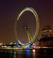
Eye "Q" by MatthewComment: We need a lens or sensor clean here? Shame the basic rules prevent cloning out of those spots. Great title - made me smile straight off. This must be a hellish long exposure - just looking at that light trail across the water. The spots at the top of the travel of the eye are presumably the flashes of automatic cameras? I'm no fan of this very straightforward composition, though - I think I would personally have balanced it in frame more with the shell building to its right - that conjunction here leaves the entire image feeling kind of weighted to the right. |
 Photographer found comment helpful. Photographer found comment helpful. |
| 04/07/2005 08:36:31 AM |
|
| Photographer found comment helpful. |
| 04/02/2005 06:53:11 PM |
First Bladesby autoolComment: Effective - I can feel myself flinching at the impact ;-)
(And shouldn't she have pads on her elbows too?) The exposure and colour presentation of this let it down for me - it's a neat enough exposure, but it lacks contrast and sense of placement of your subject, compositionally. It could do with more contrast, and perhaps without colour altogether, to put it more into the photographic world as opposed to the family-snapshot world. Lartigue shot many such scenes from his own youth, but with that sense of location, and grace of development that you don't have here, and which for me make his photographs enduringly viewable. |
| Photographer found comment helpful. |
| 04/02/2005 06:49:05 PM |
The Domino Effectby audinutComment: There's some technical achievement in this shot, no doubt; but it's so blatantly set-up and fundamentally meaningless to me that I can't bring myself to like it particularly - nor to dislike it particularly. |
| Photographer found comment helpful. |
| 04/02/2005 06:42:24 PM |
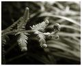
Preludeby sherComment: I kind of know the shot you're after ... I just wish you had more grace in that unfolding of the fern. In purely design terms, it's a favourite image of mine is this - the tonality and the depth of field are expertly done, and the composition, but that sense of the spring of the new isn't really here for me. |
| Photographer found comment helpful. |
| 04/02/2005 06:38:30 PM |
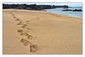
...and as the sea washes the shore, it turns every day into a new beginning.by andriComment: I would wish for a less blatant composition, perhaps: a wider-angle lens and a less forced concentration on the sand: there's just enough horizon to feel forced to appreciate the natural setting, but it's placed so as to be entirely subsidiary to the image: there's a hint of sunrise in your title, and not so much in your image. |
| Photographer found comment helpful. |
| 03/22/2005 05:38:37 PM |
Light Before the Stormby ArtanComment: I think you'll win, out of what i've seen so far. Minor gripes about verticality of tower, placing of figure, and 'storm' in your title - it looks like a pleasant summer's evening, colour-wise. The figure is a masterful necessity to a sense of scale in the image. Where is this? What is this? It looks like it should be a Landmark Trust property (qv if you don't know them) - but not one that is familiar. More than anything, I think you'll win because it's just nearly impossible to vote this down for anything. |
| Photographer found comment helpful. |
| 03/22/2005 05:31:20 PM |
Symbol for the Timesby secondglantzComment: Nearly ideal - though i could wish for more detail brought out of the shadow side of his(?) face. Photographically, as presented, I also think you could privilege him in fame more strongly - it looks like the body angle would sit well in a composition that moved him to the right solidly - and would give the buyers somewhere for their text, also. |
| Photographer found comment helpful. |
| 03/22/2005 05:28:26 PM |
Nature vs Machineby dwterryComment: I think you'll get hit by the quality police for this one - sharpening artefacts, and blocky sense of compression. It's a strong image though, which might allow some poorness of quality. I think you could successfully have allowed a bit more space around the main subjects however - never forget how easily the eye is lead out of your frame ... |
| Photographer found comment helpful. |
| 03/22/2005 05:25:50 PM |
Mouseby tazzaComment: An interesting study, certainly. All mouse shots remind meof a shot I once missed ... ah well. My problem with this is with the lack of much cable being visible - seen from this weird angle (though effective), I think it needs something like that to really say 'MOUSE' to the stock world. Being picky, of course. cool texxture and light, though I would perhaps have edited up the foreground to w whiter point. |
| Photographer found comment helpful. |
Home -
Challenges -
Community -
League -
Photos -
Cameras -
Lenses -
Learn -
Help -
Terms of Use -
Privacy -
Top ^
DPChallenge, and website content and design, Copyright © 2001-2025 Challenging Technologies, LLC.
All digital photo copyrights belong to the photographers and may not be used without permission.
Current Server Time: 08/22/2025 08:29:26 AM EDT.