| Image |
Comment |
| 04/18/2005 04:57:52 PM |
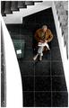
Kjetil Rekdalby terjeComment: One of the very few occasions when I could imagine such very direct light being of benefit - that evocative, perfectly appropriate emphasis on that jaw - he doesn't exactly look like he's shy about it, huh? Nice work, that I fear may get disregarded as an error; but I hope not. |
 Photographer found comment helpful. Photographer found comment helpful. |
| 04/18/2005 04:56:02 PM |
Knowledgeby TranquilComment: As it is, and as it occurs: angular, taking a moment to absorb, apparently structured, but needing interpretation, and making some sense of the chaos. Signature stuff, I think. |
| Photographer found comment helpful. |
| 04/18/2005 04:53:54 PM |
my brother you're madby whiteroomComment: High marks from me. Dynamic, genuine, enthused, and a marvellously instant composition. Highly engaging, and very real. I wouldn't change a thing. |
| Photographer found comment helpful. |
| 04/18/2005 04:51:12 PM |
Hypnoticby duncesComment: I wish I knew what this reminds me of; highly stylised, effective, sensual. I would only wish that this were granteda touch more clarity. Good stuff. |
| Photographer found comment helpful. |
| 04/18/2005 04:49:47 PM |
bo&rodyby messerschmittComment: far bettter than amny of the children photographs in this challenge. I like the candid sense, the toning. a pity, perhaps, about the overlapping hat, but the sense of mood is infectious, and the exposure/processing spot on, for me. |
| Photographer found comment helpful. |
| 04/18/2005 03:08:09 PM |
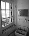
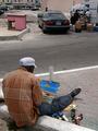
Not Even Suitable For The Homelessby notonlineComment: Good. Though your framing of the scene really is very tight - space limitations, or choice? Would love those three elements to have more space to breathe within frame. A good sense of composition, that apart, shown here. |
| Photographer found comment helpful. |
| 04/18/2005 03:05:20 PM |
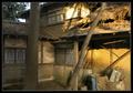
Desertedby MAKComment: This ought, by rights, to have a heap of things wrong with it compositionally. But i thin it works - not least because the light is so well caught. The framing is good, also - an excellent sense of presentation. |
| Photographer found comment helpful. |
| 04/18/2005 02:58:35 PM |
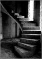
Stairs to Nowhereby TiberiusComment: Noticeably powerful in Thumbnail, this hasn't quite the same impact in this size: I think there are too amny other elements that mask the strong graphic of the stairs. I would guess that a more strongly defined sense of texture would bring out a heap more interest in this shot too - the sense of broken down concrete, and the dust and detritus, seem muted here. The composition is quite strong, though maybe just a bit obvious? I wonder if something more daring might have added effect? |
| Photographer found comment helpful. |
| 04/18/2005 04:49:03 AM |
|
| Photographer found comment helpful. |
| 04/18/2005 04:44:17 AM |
Breeze by PhilosComment: Oh I wonder whose shot this is? It brings to mind questions of style, content, experimentation, At what point does such a fixed-seeming approach become rather humdrum? I admire your single-mindedness, and at the same time I wonder at the lack of variety of approach - have you truly found your perfect approach to your vision? I don't know ...
Of course, it goes without saying all the necessary compliments on the technical prowess. And I'm sure you'll win this challenge.
And just in case it isn't Manny - well, it's the most profound imitation one could imagine. |
| Photographer found comment helpful. |
Home -
Challenges -
Community -
League -
Photos -
Cameras -
Lenses -
Learn -
Help -
Terms of Use -
Privacy -
Top ^
DPChallenge, and website content and design, Copyright © 2001-2025 Challenging Technologies, LLC.
All digital photo copyrights belong to the photographers and may not be used without permission.
Current Server Time: 08/22/2025 06:13:29 AM EDT.