| Image |
Comment |
| 05/17/2005 07:05:12 PM |
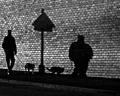
One man and his dogby sidpixelComment: Love the compositional parallels here. For my ideal, I would have had the contrast a little less heavy - or perhaps that's sharpening: the brick0wok has become unreal, and the strangth of the composition would have been enhanced, I would think, by keeping this in the real world more. It's still a highly interesting shot, however. |
 Photographer found comment helpful. Photographer found comment helpful. |
| 05/17/2005 07:02:56 PM |
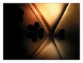
Border Lineby Dax-Comment: I'm no big fan of the near-abstract, strangely enough, although there are very strong qualities of light which i like here very much. Compositionally, I would wish you'd been able to keep more light to image left - I understnd the need for this crop, I think, but the darkness there dominates so. |
| Photographer found comment helpful. |
| 05/03/2005 06:31:55 AM |
Piece of fireby vasilkovayaComment: Excellent light here - really strong sense of detail in those textures. There is a slight impression of having clipped colour channels, but to get that intensity must be a matter of compromise somewhere, I guess. Minimalism? I don't know ... it's a kind of straightforward approach to the challenge, really, and I'm finding that this trick of using a perfectly isolated subject only partially in frame to be lacking great impact. Your light and colour make up for a lot of that, however. |
| Photographer found comment helpful. |
| 05/03/2005 06:26:57 AM |
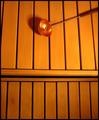
The Master of the Saunaby greslizzzComment: I think we miss the grain of the wood in this shot. It has many strong elements to it - but part of minimalism, for me, should be the subtlety of variation - and the patterns of the grain would make an ideal addition to this one. Your ladle would retain it's strength as obvious subject, the heavy lines of the gaps between battens would give a grand and basic framework, and the regression would be more complete, to my eye. it has the look of your having over-done certain channels - the way the colour has lost detail below and to the right of the ladle suggests over-exposure is to blame. |
| Photographer found comment helpful. |
| 05/03/2005 06:23:05 AM |
Jump!by Art RoflmaoComment: Strong details and tones. It seems that placement of subject just outside of strong areas of frame is a defining feature of this challenge: interesting, given the details. |
| Photographer found comment helpful. |
| 05/03/2005 06:15:31 AM |
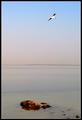
Escapeby muur88Comment: The shot works, i think - both for the challenge and for the 'true' meaning of the word. There's a distinct impression of your having had to work pretty hard in post to get that sharpness around the bird. |
| Photographer found comment helpful. |
| 05/02/2005 07:51:05 PM |
When Less is Moreby DianaBComment: I'm not sure that this works for me: sure, it absolutely meets the challenge description - but it isn't within the spirit of minimalism for me - it wasn't as simple as all this, I don't think; it isn't absence of information, rather the precise control of very limited, but nevertheless very important, information - yur big high-key background is simply a photographic nothingness. Accomplished shooting, doubtless, but ... |
| Photographer found comment helpful. |
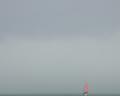
| 05/02/2005 07:44:15 PM |
Sea Mistby PeterCComment: Impeccable composition - very clever to use that slight drift from the very strong lines of frame to impose a near-invisibility on your subject, and yet maintaining great detail, and wonderful tonality through the frame. It would, i suspect, be a hit as a print. It diesn't actually speak of minimalsim in the srtistic sense, but certainly within our challenge description, it does: the subject is too uncomplicated for the art guys, I would say. |
| Photographer found comment helpful. |
| 05/02/2005 07:41:22 PM |
Buttonby ckdakeComment: Impenetrable, I find this. Your distribution of focus seems perverse, and it lacks much sense of grace, photographically. That may well be absolutely as you intended ... |
| Photographer found comment helpful. |
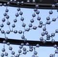
| 05/02/2005 07:38:26 PM |
Ball Reflectionsby bobgaitherComment: This has those elements of repetition and subtle variation that I associate with minimalism, absolutely. It lacks, however, an overall sense of simplicity: also a strong element; that may only be an impossibility of framing it against a more simple background - those big lines hurt the composition for me. |
| Photographer found comment helpful. |
Home -
Challenges -
Community -
League -
Photos -
Cameras -
Lenses -
Learn -
Help -
Terms of Use -
Privacy -
Top ^
DPChallenge, and website content and design, Copyright © 2001-2025 Challenging Technologies, LLC.
All digital photo copyrights belong to the photographers and may not be used without permission.
Current Server Time: 08/21/2025 02:57:59 PM EDT.