| Image |
Comment |
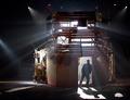
| 05/31/2005 06:57:25 AM |
30 triesby saloonstudiosComment: The sharpening halo around this image is quite strong - a smaller radius of USM would work wonders, I should think; though of course it might just be a camera setting. It's a reasonably interesting silhouette - and certainly catches the right moment compositionally. I think I'd have preferred a perfect silhouette, rather than the very dark sense of the guy's face and clothes there is here. |
 Photographer found comment helpful. Photographer found comment helpful. |
| 05/31/2005 03:56:34 AM |
Ladybugby Mal37Comment: This is a fine shot, and finely executed too, in both shooting and processing. Beautiful? Well, yes, in her way - and certainly in your revelation of detail. I wonder if she won't prove to 'real' for most folks - not red enough, not the easy fantasy of what the bug should be. I hope it does well, though - certainly scores well from me. |
| Photographer found comment helpful. |
| 05/31/2005 03:49:26 AM |
Red Roseby AlanBesComment: With such an obvious subject, you put yourself in a position of having to produce an absolutely exceptional photograph to score well, I would think. The immediate problems are a lack of detail - that fine edge of a sense of texture, caused by what looks like poor compression artefacts. I like the idea of softening the image beyond the red rose, but that only draws attention to the detail thing there. The composition is good - nice to fill the frame, and the colour range is effective; but I fear this just isn't going to stand out in the mix. |
| Photographer found comment helpful. |
| 05/24/2005 06:37:27 PM |
|
| Photographer found comment helpful. |
| 05/24/2005 06:36:27 PM |
The Closetby dustin03Comment: Beautifully done. I have an intense feeling of having seen this before. There's really not much to criticise at all, I'm sure you've absolutely achieved your imagined shot - other than that I think you might have made more play of the shadow areas - it pays, i think, not to forget the range of points at which your audience set 'black' on their screens. |
| Photographer found comment helpful. |
| 05/24/2005 06:33:48 PM |
First Lightby pgattComment: Interesting stuff. I wonder if you couldn't successfully have pushed the composition into a more blatantly graphic shot? Placing the horizon a touch higher up frame, and including a touch more of the foreground shore, and the conjunction of fore- and back-ground would have added a strong pair of lines to the shot, making the silhouette stronger, and not really losing much of the impact of the blueness, I wouldn't imagine. find here, the foreground hat you have included pretty weak, not serving much effective purpose. It has strong potential, I think, however. |
| Photographer found comment helpful. |
| 05/24/2005 06:28:47 PM |
Kauaiby charliebakerComment: The near-square composition works for this shot, I think. It's not a particularly dpc-type landscape, being only un-obviously processed, but it's nevertheless effective. It perhaps suffers a little from division of subject: is the tonality of the beach and the shallow water, or the mountain and the cloud, the primary point of your shot? That's not necessarily a bad thing, though it does make the shot a lot more complicated to view (again, not a bad thing), but in dpc terms I think you'll suffer for it - had you concentrated more solidly on one or the other, you'd score higher, I think. I'm not sure that I wouldn't personally prefer a more organised hierarchy of interest, either. |
| Photographer found comment helpful. |
| 05/23/2005 03:52:36 PM |
Sanctuaryby shabbychicComment: Good exposure for the window; it's a shame, given the lack of restrictions on editing, that you couldn't have brought more of the interior of the church into light, so to speak. The high-light out.lines on the pews are effective, but it cries out for some more detail to make it more than just an image of painted glass, to my eye. |
| Photographer found comment helpful. |
| 05/23/2005 03:50:10 PM |
Kissed by the Evening Lightby gaurawaComment: The title feels familiar - is this a reference to another shot here? I quite like the compromise you've made between the texture of the veil-thing and the face: your depth of field is effective. |
| Photographer found comment helpful. |
| 05/23/2005 03:47:04 PM |
Mesmerizedby mrsmaxsmartComment: Nice evocation of mood - though I would have trie to bring out more depth of shading in the child's face, which has regressed a touch into a near-monochrome plane here. |
| Photographer found comment helpful. |
Home -
Challenges -
Community -
League -
Photos -
Cameras -
Lenses -
Learn -
Help -
Terms of Use -
Privacy -
Top ^
DPChallenge, and website content and design, Copyright © 2001-2025 Challenging Technologies, LLC.
All digital photo copyrights belong to the photographers and may not be used without permission.
Current Server Time: 08/21/2025 06:30:59 PM EDT.