| Image |
Comment |
| 04/14/2003 11:07:13 PM |
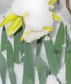
Falling Snowflakesby ladpupmoeComment: There arn't many snowflakes "falling" in this shot, and the orientation of the daffodils(?) is very distracting. I think I would have cleared the flower of the snow and brought it closer to the center view.
|
 Photographer found comment helpful. Photographer found comment helpful. |
| 04/14/2003 10:12:18 PM |
rainby jblharshawComment: Might have been more interesting to see a bird or person through the rain-drops.
(is this through a car window?) You have captured the droplets, and mood realy well. |
| Photographer found comment helpful. |
| 04/13/2003 04:13:32 AM |
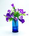
Wash Colors Separatelyby scab-labComment: Good selection of subject. The focus and lighting is working well to intensify the colours and give a great sence of texture. |
| Photographer found comment helpful. |
| 04/13/2003 04:08:33 AM |
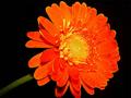
orange flowerby ivanaComment: Good intensity of the colour of study. The water drop in the middle is a bit out of place perhaps, and mabe a bit more ambiant light on the stem would make it less of a distraction an more a part of the picture. |
| Photographer found comment helpful. |
| 04/13/2003 03:48:08 AM |
ruinby GinaRothfelsComment: Good subject for a 'statement', but it's not very comfortable to look at. The red is a bit too harsh, and a border could have helped. |
| Photographer found comment helpful. |
| 04/13/2003 03:33:44 AM |
Colors of Springby willtataComment: Perhaps stronger & diffused light would have intensified the colours some more - as is, it looks a bit 'dead' to me. |
| Photographer found comment helpful. |
| 04/13/2003 03:28:38 AM |
Blossom in Colourby anon-y-mouseComment: I think the white background is a bit bright. I think I would have liked to see a greater range of colours. |
| Photographer found comment helpful. |
| 04/12/2003 11:47:32 PM |
Eye Colorby fyjimoComment: This has a great range of colours. Makes me feel uncomfortable though. |
| Photographer found comment helpful. |
| 04/12/2003 11:16:44 PM |
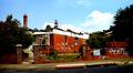
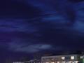
Colors of the Nightby hauntedcrimsonComment: Great shot of the sky. But I don't like the inclusion of the building - its messy, blury, and gives a crooked line to the bottom of the photo. Perhaps a Tree-top Line would have been better. |
| Photographer found comment helpful. |
| 04/11/2003 03:28:18 AM |
Four Corner Standoffby DougPazComment: nice structure. perhaps the shaddows could have been more even, or less obvious on the yellow background - they distract a bit from the overall 'structure'. |
| Photographer found comment helpful. |
Home -
Challenges -
Community -
League -
Photos -
Cameras -
Lenses -
Learn -
Help -
Terms of Use -
Privacy -
Top ^
DPChallenge, and website content and design, Copyright © 2001-2025 Challenging Technologies, LLC.
All digital photo copyrights belong to the photographers and may not be used without permission.
Current Server Time: 07/31/2025 01:11:27 PM EDT.