| Image |
Comment |
| 03/08/2007 01:33:31 PM |
|
 Photographer found comment helpful. Photographer found comment helpful. |
| 03/08/2007 01:29:19 PM |
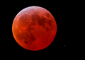
Red Moon Eclipse by CyMaNComment: best one of these by far. very well done. composition with the single star is spot on. |
| Photographer found comment helpful. |
| 03/08/2007 01:27:02 PM |
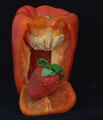
Chocolate Strawberryby sirmallocComment: this comes across as very unappetizing to me. not sure if it is the color of the chocolate (perhaps darker would have been better, the brown looks either like mud or rot) or if it is the lack of focus in the cut out area which makes the chocolate and the berry seem slimy. the not clean cut edge also doesn't work. good idea, but for me it just doesn't come across. - 5 |
| Photographer found comment helpful. |
| 03/08/2007 01:19:51 PM |
Xtra Redby bigfellaComment: too much sharpening and saturation. for me, the processing spoils what could have been a very nice image. |
| Photographer found comment helpful. |
| 03/08/2007 01:11:10 PM |
red parrotby tnunComment: the reflections don't work for me. perhaps you were going for the idea of the bird missing the sky, but I think you would have needed to get closer or for that to translate effectively. |
| Photographer found comment helpful. |
| 03/08/2007 01:10:16 PM |
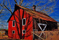
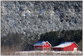
The Little Red House in the Valleyby GatorguyComment: what an odd effect. the trees in the upper background look like they are falling forward on the house, like a wave. the textures here are interesting, but wish the landscape wasn't quite so compressed and that the tree branches in the front were not obscuring the house. |
| Photographer found comment helpful. |
| 03/08/2007 01:06:43 PM |
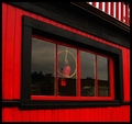
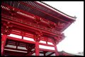
Redby krglComment: nice composition. wish the sky wasn't so blown out, especially since its resulting in detail loss on the right edge of the structure. |
| Photographer found comment helpful. |
| 03/08/2007 01:05:20 PM |
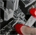
Careful...by skasubaComment: cool idea. however, the effect gets ruined for me by the shadows under the shoes (although perhaps this is just an incredibly enormous woman ;) and the choice of the painted wood beam. think you were going for the idea that it was a metal beam, like on a building under construction, but if you could have figured out how to make this look more like a high ledge it would have made the illusion better. |
| Photographer found comment helpful. |
| 03/08/2007 12:57:21 PM |
Blood eyeby dahvedComment: disturbing. the shallow dof really adds to the effect here. - 8 |
| Photographer found comment helpful. |
| 03/08/2007 12:56:20 PM |
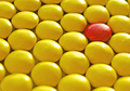
Alone in a crowdby sabphotoComment: lighting seems a bit harsh, and a deeper dof might have worked better here. but I like the composition and the colors are very pleasing. - 6 |
| Photographer found comment helpful. |
Home -
Challenges -
Community -
League -
Photos -
Cameras -
Lenses -
Learn -
Help -
Terms of Use -
Privacy -
Top ^
DPChallenge, and website content and design, Copyright © 2001-2025 Challenging Technologies, LLC.
All digital photo copyrights belong to the photographers and may not be used without permission.
Current Server Time: 08/10/2025 01:57:44 AM EDT.