| Image |
Comment |
| 10/08/2009 04:47:46 PM |
The Big Sleepby h2Comment: I like this - the white dots look like little stars as though she's floating through space :) |
 Photographer found comment helpful. Photographer found comment helpful. |
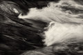
| 10/06/2009 04:41:34 PM |
In the Suavity of a Waveby zeuszenComment: Heck - I thought this was one of mine! Just the sort of thing I love to take :) It's abstract yet clear as to what it is - I love it! |
| Photographer found comment helpful. |
| 10/06/2009 04:39:38 PM |
$&^_aby chipucComment: A lovely simple image, really like the colours and the composition (not keen on the title) :) |
| Photographer found comment helpful. |
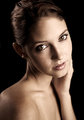
| 10/06/2009 04:38:17 PM |
Nicolletteby njsabsComment: A beautiful portrait of a beautiful girl :) If I was going to nit pick - I'm not keen on the arm/hand, I think either being able to see fingers on the cheek or not have it at all might be better. But overall a great image :) |
| Photographer found comment helpful. |
| 10/05/2009 06:34:29 AM |
|
| Photographer found comment helpful. |
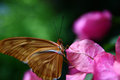
| 08/31/2009 12:09:17 PM |
Complimentaryby drick172Comment: Hi Daniel from the Critique Club
You did an awful lot right for this image - the eye is invariably the point of critical focus and you worked on that. The background is pleasantly uncluttered, as you planned with your shallow depth of field.
Unfortunately the composition lets the image down, no harm in not including some of the wing if the subject of your image is the butterfly's eye, however losing just a bit of the wing looks careless rather than planned. The area of focus is underexposed for proper appreciation, and whilst not necessarily always a problem, the central placement weakens the composition in this instance. Outside of basic editing you could selectively lighten the eye area and maybe with a closer crop (possibly the left third) you could have a very lovely image there :)
In relation to a 'pink' challenge, there was certainly some lovely pink there although maybe not the main subject of the picture.
In summary, an image to re-edit to reveal it's full glory :):)
Hope that helps, feel free to PM me with any questions or comments. |
| Photographer found comment helpful. |
| 08/17/2009 03:25:23 AM |
|
| Photographer found comment helpful. |
| 08/13/2009 05:08:47 AM |
Levitating Squaresby robineggComment: Critique Club
Hi Robin :)
First impressions
A dynamic, colourful image.
After some time with the image
You've created an image full of magic that fits in well with the theme, the set up and composition are good. Whilst the lights do add a great deal to the image I can see that all those circles within the confines of a square challenge could have lost you a few points. You mention focus, specifically the cube, it's difficult to tell but with the image at this size the focus seems fine and any drop off in sharpness is probably due to the small depth of field that you would have got with an aperture of f1.8.
A commenter mentioned the blurry hand and that is probably more of an issue, motion blur would have been fine but this looks like movement blur of a hungry husband expected to keep still for 1/50sec ;)
Overall
A creative image that has worked well, you were constrained by time and the prospect of basic editing, so you can only improve on this already good image.
:) |
| Photographer found comment helpful. |
| 08/12/2009 05:17:54 PM |
Flyingby posthumousComment: Oh, I thought the flower was dreaming of being a tree, I can see his dream, blurrily behind him.... |
| Photographer found comment helpful. |
| 08/12/2009 04:56:06 PM |
Morning Coffeeby gbautista87Comment: Critique Club
Hi Garret :)
First impressions
Interesting depth of field, nice tones.
On reflection
Still lovely tones, good composition and meets the circle challenge well. The shallow depth of field works well to emphasise the focus of your image. The loss of detail in the hands is unsettling, a commenter mentioned noise reduction and I agree that it does look like that has been heavily applied, however as it's not in your PP notes it must be as a result of the shallow DOF and the overhead flash. The other unsettling thing is the lack of catchlight in the coffee, again it could be explainable by the set up, but the two things combined give an unreal feel to the image. Sorry if that sounds like I think the image is fake, just sometimes a paticular set up of lighting, aperture etc works better than others. Some of your commenters liked the softness so you can see we're in the area of subjectivity here ;)
Overall
A nicely toned and composed image that fits the challenge well. The softness of parts of the image will appeal to some and not to others.
:) |
| Photographer found comment helpful. |
Home -
Challenges -
Community -
League -
Photos -
Cameras -
Lenses -
Learn -
Help -
Terms of Use -
Privacy -
Top ^
DPChallenge, and website content and design, Copyright © 2001-2025 Challenging Technologies, LLC.
All digital photo copyrights belong to the photographers and may not be used without permission.
Current Server Time: 06/22/2025 12:44:39 AM EDT.