|
|
|
Showing 3401 - 3410 of ~4213 |
| Image |
Comment |
| 05/12/2003 12:13:03 AM | Primary Paintby marboComment: Wonderful lighting and tones. Yellow seems an afterthought, though. Very striking image! Nice work. |  Photographer found comment helpful. Photographer found comment helpful. |
| 05/12/2003 12:11:07 AM | Primary Friendsby sagestudioComment: Stunning. Having the girls' backs remind us of the color challenge. Lots of emotion in this shot make the colors seem to symbolize the emotions and joy of these young girls. Just super work! | | Photographer found comment helpful. |
| 05/12/2003 12:07:00 AM | | | Photographer found comment helpful. |
| 05/12/2003 12:06:22 AM | | | Photographer found comment helpful. |
| 05/12/2003 12:05:49 AM | | | Photographer found comment helpful. |
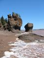
| 05/11/2003 12:20:11 AM | Walk on the Ocean Floorby KimInNBComment: Lines and contrasts really make the eye move through and then around the photo! Light seems a bit harsh and "ordinary,", but composition is wonderful. | | Photographer found comment helpful. |
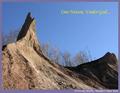
| 05/11/2003 12:17:13 AM | Chimney Bluffsby wdebeau1Comment: The lines here really draw the eye around the photo. To me, this image doesn't look "pretty" enough for me to want to go there, and it doesn't quite look sarcastic enough to see this as a joke. Hmmm. I'll consider myself stupid and give you a decent score! | | Photographer found comment helpful. |
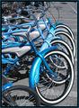
| 05/09/2003 10:43:02 PM | Rental Bikesby friscaComment: Greetings from the Critique Club!
I concur with all of the compliments below!
This was a memorable image from the challenge, so I'm thrilled that I have the opportunity to look at it in more detail! First and foremost arises to my eye the patterns created by the parked bikes. This obviously shows your good skill and seeing such patterns and capturing them well. The point of view is very effective at revealing the pattern without it becoming either lost or boring or trite.
I find the photo's mood to be lively and fun, though there tends to be a hint of tongue in cheek about it (and I can't explain why), and you make the bikes look fun to ride. Their quirky style, additionally, is enhanced by your point of view and composition, and makes them even more engaging and enticing.
Your explanation as to the desaturation is nice, but I don't find it all that necessary. The photo speaks for itself rather nicely. The blue is a nice color to isolate, and really makes the bikes pop. This may be where the tongue in cheek-ness lies, too. By isolating the blue color, you hint that this pattern and these bikes are unusual and possess a kind of special-ness that defies the rest of the mundane world around them.
To improve the shot, hmmm. You already mentioned the removal of the lower left bike, and some folks below noted that a tighter crop would be nice, but I'm not sure. I agree with your cropping inasmuch as the bikes really need the handle bars to be bikes. Otherwise, they would just become patterns and lines, and the fun of the photo is that these are special and unique BIKES, not isolated patterns. On the other hand, the parking lot beyond isn't all that interesting, and that is where the patterns ultimately lead the eye. Perhaps if you'd come at a later or earlier time, when shadows would help you. I'm kind of a light fanatic anyway, and can't help but think that the blue on the bikes would be that much more saturated and enhanced were the sun to be lower in the sky. However, you'd have to be careful not to sacrifice the fun mood of the photo. Wow. Complex!
Just goes to show you what a tough shot this is, and how appropriate the choices were that you made while there.
This is a really pleasing, skillfully executed image. Congratulations!
Keep up the good work!
David | | Photographer found comment helpful. |
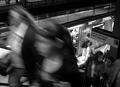
| 05/09/2003 03:24:06 PM | 14th Street - Union Squareby christoComment: Greetings from the Critique Club!
I concur with all of the compliments below!
Wow! This image is all about transportation! As I look at the photo, my eye first rests on the train itself as it has the most light. Then all kinds of interesting things happen, I want to see the whole image at once. The blur of the escalator traffic, the interesting tones and lines--all add up to make a really engaging image! There are a lot of comments below that say what I would say, but I will add that the tones here create a very nice mood of engaging scientific study, if that makes any sense.
The point of view you've taken here is very detached, almost as if you were looking at this scene in a microscope. Yet, your scientific mood does not get dull or uninteresting. And the point of view is that from someone who is vastly interesting and intriqued. You have a lot of things appropriately out of focus here as has been noted, but look at what IS in focus: we get a peek into the train, the sign, the man at lower left--all of these elements are so different and so interesting! It makes for very entertaining study and reflection.
You manage here to comment not just on "transportation," but you capture the essence of transportation, too.
Sorry, but I can't think of any improvements. Someday, I may be able to take a shot like this one, and when I do, I'll be very pleased...
Keep up the good work!
David | | Photographer found comment helpful. |
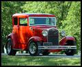
| 05/09/2003 02:05:12 PM | '31 Vickyby crabappl3Comment: Greetings from the Critique Club!
I concur with all of the compliments below!
This is a marvelous image in which this vehicle is both glorified and put into its nostalgic rural/suburban context. The colors here work with each other well, and the lighting is calm and soothing, just like our memories of the days in which these cars were running (if you don't count the Depression!). Your point of view is low, which adds a sense of excitement and drama. It is also splotched with shadows, which I love because they serve to add interest and make the whole scene more "natural," even though we know that the car is "posing." Your point of view also emphasizes the 3-D of the car.
The red is the most saturated color--it might be nice to try some more saturated greens, however, the red really sticks out nicely the way it is. The tones are very pleasant here and really make the photo easy to look at. The border is well used here. It does not attract attention to itself, but it does serve to guide our senses to the car and set your photo off from the bland gray of the site.
Really nice work! I look forward to seeing more of your excellent work in the future!
David | | Photographer found comment helpful. |
|
Showing 3401 - 3410 of ~4213 |
Home -
Challenges -
Community -
League -
Photos -
Cameras -
Lenses -
Learn -
Help -
Terms of Use -
Privacy -
Top ^
DPChallenge, and website content and design, Copyright © 2001-2025 Challenging Technologies, LLC.
All digital photo copyrights belong to the photographers and may not be used without permission.
Current Server Time: 08/17/2025 01:53:58 PM EDT.
|