| Image |
Comment |
| 06/21/2007 07:02:34 PM |
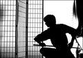
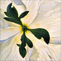
Drawby v5planetComment: As Zen philosophy is a core principle in Bushido, I think this image would have been perfect for the challenge with the right title. Getting the title right here would have been the tricky part, the image itself is quite nice! |
 Photographer found comment helpful. Photographer found comment helpful. |
| 06/20/2007 10:52:39 PM |
|
| Photographer found comment helpful. |
| 06/20/2007 12:45:49 AM |
|
| Photographer found comment helpful. |
| 06/20/2007 12:18:01 AM |
|
| Photographer found comment helpful. |
| 06/18/2007 02:56:10 PM |
From Vine To Wineby loriprophotoComment: Nice idea - but the lighting is overly flat. It appears that you have one very strong key light dead center & slightly in front of the setup. From the harsh shadows, it would be safe to say that zero diffusion was used as well. For a set-up like this, 2 side lights positioned low might have been a better choice and you can achieve diffusion of light by bouncing strong light sources off of large white or silver objects (poster board, bed linens or even walls). If you really & truly had only one light to work with, then positioning it off to the side about 45 degrees would have created more modeling of your subjects features...Diffusing the light and increasing the size of the light source (both of which can be achieved by bouncing) softens shadows and highlight reflections - producing a more pleasant effect.
The background color here was a poor choice as well - there are too many primary colors going on at once! A shade or tone of one of the colors already present would have been more ideal. One can tell that you made the effort to produce a still life of sorts - which is a great step forward in photography - but do a little google searching online & research the finer points of lighting & color!
Good luck... |
| Photographer found comment helpful. |
| 06/18/2007 02:29:25 PM |
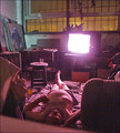
the night before rehabby tapcityComment: compelling scenario & storytelling - the tech in me finds the lens flare & ghosting unappealing as it doesn't do justice to the big picture here. I would have tried to get much higher & shoot down more to avoid those issues AND the stumbling framework of furniture (the chair doesn't bother so much as the blurry diagonal in the foreground. Good luck! << 7 >> |
| Photographer found comment helpful. |
| 06/18/2007 02:25:44 PM |
|
| Photographer found comment helpful. |
| 06/18/2007 11:13:27 AM |
exitby rozComment: Roz - this should have finished MUCH higher than it did - I thought this was an excellent image... |
| Photographer found comment helpful. |
| 06/18/2007 04:20:25 AM |
|
| Photographer found comment helpful. |
| 06/18/2007 04:18:33 AM |
Running Freeby bre53Comment: As usual art & charm were out to lunch during the voting.... this was my only '10' in this challenge & most certainly should have done better! |
| Photographer found comment helpful. |
Home -
Challenges -
Community -
League -
Photos -
Cameras -
Lenses -
Learn -
Help -
Terms of Use -
Privacy -
Top ^
DPChallenge, and website content and design, Copyright © 2001-2025 Challenging Technologies, LLC.
All digital photo copyrights belong to the photographers and may not be used without permission.
Current Server Time: 08/23/2025 07:15:44 PM EDT.