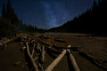
DPChallenge: A Digital Photography Contest You are not logged in. (log in or register
 
Browse Settings
Currently viewing:
Memberbassbone

Show comments:

Per page:

Order:

Comments:


Comments Made by bassbone
Pages:   ... [168] [169] [170] [171] [172] [173] [174] ... [1365]
Showing 1701 - 1710 of ~13643
Image Comment
Architecture
09/09/2012 11:08:53 AM
Architecture
by antje1777

Comment:
I really like it the way it is right now. I gave it a 7 during voting - absolutely loving the birds.

I can see where nam is going and upping the contrast to expand the tonal range, but I like the richness of the grays throughout. I actually tried it, and had I been able to 'see this shot', I would have like entered a much more pimped up and contrast-y version.
Photographer found comment helpful.
River-w-Milky-Way
09/09/2012 06:18:04 AM
River-w-Milky-Way
by glockguy

Comment:
Al, first off...that is one amazing sky! Where was this taken?

Things I see about the image:
1) the sky is the real subject of this image IMO and I think it needs to have more than 25-50% of the real estate. Did you take any other images where the sky is a much bigger portion of the scene? This iamge seems to be looking straight ahead up the river bed, and I think some looking up more would even be more dramatic.

See the recent Blue Ribbon winner for what I am talking about - the sky is the star - and the horizon is very low indeed.


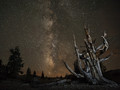
2) As with many landscapes, centered horizons seem to be give a very static look. Placing the horizon at the bottom third would help out with point 1.

2) the foreground seems a bit cluttered to me. I can see why the logs are of interest to you, but the bottom of the image is distracting to the overall scene. One way to fix this would be to crop the bottom of the image a bit. This might also help you with removing the centered horizon.

3) I do like how you framed the sky and edges of the scene with the pine trees on each side. , but it seems like there was even more 'height' in the trees that you could have used to extend it up to the sky more.

4) The image is quite a bit underexposed. A minor adjustment of Levels (see below) can bring a lot more finish to the image, allowing the foreground to be seen while preserving the night time feel.

I hope you don't mind but tried a quick edit on this by adjusting the levels (moved the midpoint from 1.00 to 1.15 and whites from 255 to 200.) This allowed the stars in the sky to be a bit brighter and the foreground to brighten as well. Second, I tried a crop to frame the sky with the pines even more and cropped out the low foreground to move the horizon down a bit. And third, I added a bit more sky into the image to show see what it might look like with a higher perspective. The crop isn't great and it is a bit elongated in the horizontal direction, but it gives you the idea.


Message edited by author 2012-09-09 06:53:02.
Photographer found comment helpful.
HotelBaren
09/09/2012 05:53:33 AM
HotelBaren
by PGerst

Comment:
Really good work to give this a polished and finished look. The colors are vibrant but not overcooked, the centering of the sign works nicely and the crop works pretty well. If it were my photo, I would have liked cropped out the very left edge so the right and left edges matches up a bit better.

It is just too bad you didn't have some awesome character (or set of characters) sitting at the tables....
Photographer found comment helpful.
IMG_9464
09/09/2012 05:50:14 AM
IMG_9464
by PGerst

Comment:
Paul - I really like this one. I remember seeing this series after you shot them and this was one of the ones I liked best. The DOF is really solid to focus us on the couple and to give the background a really nice smooth warm glow. The expressions are charming and it is always a good idea to put the major focus of the image on the young woman...she is the star of the show (not to say the guy is not a star, but you know what I mean!). Nice job.
Photographer found comment helpful.
Travelling Buddy
09/08/2012 03:57:20 PM
Travelling Buddy3rd Place
by Ammie

Comment:
awesome!
Photographer found comment helpful.
Obey
09/08/2012 02:43:03 PM
Obey
by JamesDowning

Comment:
excellent composition
Photographer found comment helpful.
Grand Haven Light
09/08/2012 02:16:38 PM
Grand Haven Light
by bmartuch

Comment:
Bob
First off, I love these lighthouses and especially your composition and delivery of these shots. The lines are excellent, and the low angle light to add shadows works great.

With that said, I see a couple things that probably cost you (I didn't vote on this challenge so I can't tell you how I felt at the time).

I understand why you interpreted your composition as 'off centered', with the light at the end being your subject. However, for the viewer, I think the subject is the entire pier and light, so in many ways, it is mostly centered, albeit riding across the image rather than dead center. In fact, the focus point is dead straight ahead rather than the light which is slightly out of focus due to the DOF.

In addition, the clear blue cloudless sky is working against you where the sky adds almost nothing to the image.

Finally, I think the strong border (the white line framing the thick black border) makes the frame look very think and overwhelming.

It is a very good solid shot, but it actually isn't your best work on these lights.
Photographer found comment helpful.
showing its age
09/07/2012 02:02:08 PM
showing its age
by bmartuch

Comment:
I like the angles a lot, especially how you were able to keep the top window almost constant throughout.

I think the windows and the brick facing are gorgeous. The area where I am not sold on is the grass in the lower left. I wonder if a different perspective to only show the building may have had more impact, especially with the geometric focused crop.

To 'show the age' and have the natural surrounds still present, a more standard crop may have been in order. I think you were trying to do both at the same time and I am not sure it worked completely. Still, it got a 6 during voting from me.
Photographer found comment helpful.
Feathered and friend
09/07/2012 01:16:37 PM
Feathered and friend
by Melethia

Comment:
so incredibly charming
Photographer found comment helpful.
Below the Glacier
09/07/2012 11:23:41 AM
Below the Glacier
by Brent_S

Comment:
a breathtaking location, so expertly captured
Photographer found comment helpful.
Pages:   ... [168] [169] [170] [171] [172] [173] [174] ... [1365]
Showing 1701 - 1710 of ~13643


Home - Challenges - Community - League - Photos - Cameras - Lenses - Learn - Help - Terms of Use - Privacy - Top ^
DPChallenge, and website content and design, Copyright © 2001-2025 Challenging Technologies, LLC.
All digital photo copyrights belong to the photographers and may not be used without permission.
Current Server Time: 08/25/2025 05:16:07 PM EDT.