| Author | Thread |
|
|
09/09/2012 11:08:53 AM |
I really like it the way it is right now. I gave it a 7 during voting - absolutely loving the birds.
I can see where  nam is going and upping the contrast to expand the tonal range, but I like the richness of the grays throughout. I actually tried it, and had I been able to 'see this shot', I would have like entered a much more pimped up and contrast-y version. nam is going and upping the contrast to expand the tonal range, but I like the richness of the grays throughout. I actually tried it, and had I been able to 'see this shot', I would have like entered a much more pimped up and contrast-y version. |
|
 Photographer found comment helpful. Photographer found comment helpful. |
|
|
09/09/2012 06:48:25 AM |
|
Nothing for me to critique, fab shot. |
|
| Photographer found comment helpful. |
|
|
09/09/2012 06:20:31 AM |
Yeah, this is a superb image and had it not been a free study would have been up there in the winners enclosure.
So many good images in 240ish although must admit in my eye this should have been higher. |
|
| Photographer found comment helpful. |
|
|
09/08/2012 07:23:27 PM |
|
I meant I thought the blacks could be blacker and the whites whiter. I know it's impossible to take this kind of shot without lens distortion. I was suggesting that you might be able to correct more of that distortion with a transform tool in post-processing. I gave it a try on the tones and the distortion. I used levels and the skew tool in Elements 7. The warp tool would also have been useful but is not available in Elements. |
|
| Photographer found comment helpful. |
|
|
09/08/2012 07:23:14 PM |
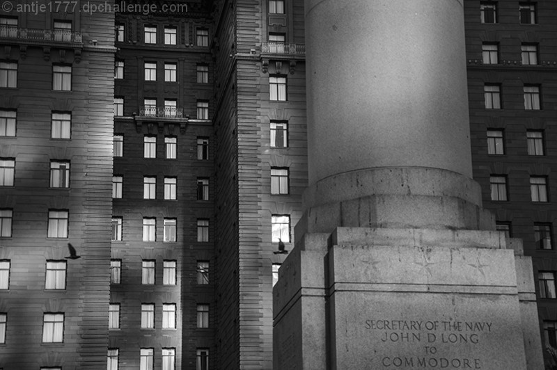
For the critique thread:
I like that the column and its base are off center and I also like the bird flying into the frame on the left. There may be another bird in the center, but I can't tell. You have some lovely comments, but for me the image is boring. Since the perspective is head on here, I feel all the verticals and horizontals should be parallel to the frame. I would like a wider tonal range (feels flat to me) and more texture, but these are personal preferences. |
|
| Photographer found comment helpful. |
|
|
09/08/2012 02:07:39 PM |
Honestly, I love this. It reminds me of a still from a classic movie or something. My only guess as to why it didn't score well is because it's in a FS. In an architecture challenge I could easily see this ribboning.
I think one unfortunate thing about FSs is that people will sometimes speed vote because of the large number of entries. I could see people taking a quick glance at this shot and giving it a 5 without noticing things like the birds and the awesome light show.
My only critique would be that it might look a little better if the words on the pillar were'nt cramped all the way down at the very bottom. But, that is just a tiny nitpick.
|
|
| Photographer found comment helpful. |
Comments Made During the Challenge  |
|
|
09/07/2012 08:31:17 PM |
|
I almost missed the birds! Wonderful light show here. |
|
| Photographer found comment helpful. |
|
|
09/07/2012 05:11:10 PM |
|
I like the processing in this image good composition and sharpness i like how there is a comparison between Architectures and the lighting adds too the image ..Well done |
|
| Photographer found comment helpful. |
|
|
09/05/2012 09:50:37 AM |
|
wow, those bird make this, awesome indeed! |
|
| Photographer found comment helpful. |
|
|
09/01/2012 10:16:31 AM |
I'm going through the entries, stopping at those images I feel have had the benefit of an unconventional eye and dwelling a little longer to try to see and appreciate what you saw. This is one of those images.
Positives: Love the hook here - I see the column and then the building and then the birds! On spotting them the image comes instantly alive. It's like a visual magic trick. I love that. Once I was hooked, I found the windows compelling - imagining the stories behind each of them.
Critical stuff: Nothing really.
Overall: So much more than the sum of its parts. That's the trick of a really compelling image. |
|
| Photographer found comment helpful. |
Home -
Challenges -
Community -
League -
Photos -
Cameras -
Lenses -
Learn -
Help -
Terms of Use -
Privacy -
Top ^
DPChallenge, and website content and design, Copyright © 2001-2026 Challenging Technologies, LLC.
All digital photo copyrights belong to the photographers and may not be used without permission.
Current Server Time: 07/03/2026 01:58:36 PM EDT.