| Image |
Comment |
| 02/01/2003 06:13:44 AM |
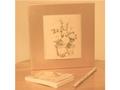
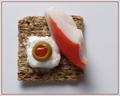
Subtle Squareby BJComment: Composition: Photo frame angle looks slightly wrong.
Technical: Nice colour and lighting. Focus isn't great, but this doesn't detract from the pic too much. Was the white area around the pic intentional?
Meets challenge: Yes
Overall impression: 6 |
 Photographer found comment helpful. Photographer found comment helpful. |
| 02/01/2003 06:11:14 AM |
Schaumburg Clock Towerby pitsamanComment: Composition: Would have cropped the sky either side of the tower fairly tight myself.
Technical: Not perfect focus, but I guess that's due to distance.
Meets challenge: Yes
Overall impression: I like architecture, but is lacking interest slightly, for me. Shape of the pic really gives a snapshot quality (sorry). Always worth considering cropping. 6 |
| Photographer found comment helpful. |
| 02/01/2003 06:08:07 AM |
Vivid Symmetryby ChrisW123Comment: Composition: Nicely symmetric
Technical: Good colour and uniform lighting.
Meets challenge: Yes
Overall impression: Maybe a secondary subject bottom left would look good? 7 |
| Photographer found comment helpful. |
| 02/01/2003 06:06:37 AM |
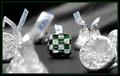
Las Vegas Checkersby keoneComment: Composition: Good, but needs rotating slightly ccw? Would have looked better symmetric I think.
Technical: A little more lighting at the top/back of the photo may have made a stronger impact.
Meets challenge: Yes
Overall impression: Could have been excellent, but lacked sheen. 6 |
| Photographer found comment helpful. |
| 02/01/2003 06:03:33 AM |
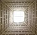
SkyLight ^ 2 by myqylComment: Composition: Great. Can't help but wonder what an off-centre crop would look like..
Technical: Excellent focus, contrast and lighting (didn't see Windows & Doors submission)
Meets challenge: Yes
Overall impression: One of those pics you just keep looking at. 8 |
| Photographer found comment helpful. |
| 02/01/2003 05:59:24 AM |
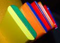
Dare to Be Squareby karmatComment: Composition: Good. Really like the background and table surface
Technical: Fantastic focus, good use of colour, nice border. Looks like you've sharpened after you added the border not before (white line between pic and border). Best to do it before added the border.
Meets challenge: Yes
Overall impression: Technically great and aesthetic too! 8 |
| Photographer found comment helpful. |
| 02/01/2003 05:55:57 AM |
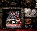
Clark Parkby JPRComment: Composition: Excellent
Technical: Great focus. Maybe slightly dark, but I don't think it's detrimental to the pic.
Meets challenge: Yes
Overall impression: Nice idea and shot, good tech. 8 |
| Photographer found comment helpful. |
| 02/01/2003 05:54:35 AM |
Krabby magnetic9999Comment: Composition: Great
Technical: Excellent focus and lighting/shadow. Pic seems slightly dark? Good choice of border.
Meets challenge: Yes
Overall impression: Really good, but would have preferred it slightly lighter personally. 7 |
| Photographer found comment helpful. |
| 02/01/2003 05:44:53 AM |
Fifteen?by steinarknutsenComment: Composition: Good. Would have been tempted to centralise the letters horz (less space near E).
Technical: Good colour and lighting. Focus seems slightly off around R and E? Seems slightly noisy?
Meets challenge: Yes
Overall impression: Focus lets it down slightly, but otherwise, great pic. 7 |
| Photographer found comment helpful. |
| 02/01/2003 05:42:09 AM |
MULT COLORby kevinswopeComment: Composition: Excellent. As soon as I saw this pic I turned my head 45 degrees to try and work out what they are.
Technical: Excellent. Not completely sure about the orange background. Maybe a darker colour?
Meets challenge: Yes
Overall impression: I love interesting photos, and you've got this one pretty spot on. 9 |
| Photographer found comment helpful. |
Home -
Challenges -
Community -
League -
Photos -
Cameras -
Lenses -
Learn -
Help -
Terms of Use -
Privacy -
Top ^
DPChallenge, and website content and design, Copyright © 2001-2025 Challenging Technologies, LLC.
All digital photo copyrights belong to the photographers and may not be used without permission.
Current Server Time: 08/26/2025 02:29:01 PM EDT.