| Image |
Comment |
| 02/04/2003 12:38:32 PM |
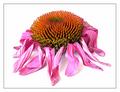
Shrivelledby JeanComment: Composition: The red part seems to make the pic a little 'top heavy'. Excellent otherwise.
Technical: Fantastic colour, contrast, lighting and border. Good DOF.
Meets challenge: Yes
Overall impression: At least a top 10 in my book. 9 |
 Photographer found comment helpful. Photographer found comment helpful. |
| 02/03/2003 02:27:11 PM |
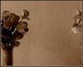
?cat or flower cliche? - well I take the golden middleby miss parkerComment: Composition: Flowers are excellent. Would have preferred slightly more cat?! Having a cat myself, I appreciate the problems!
Technical: Nice use of colour and contrast. Bold decision to use the high sharpening, but it really suits the pic. Might have thickened the white border slightly and got rid of the very thin black border.
Meets challenge: Yes
Overall impression: Lovely photo lacking only in animal cooperation! 7 |
| Photographer found comment helpful. |
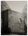
| 02/03/2003 02:17:27 PM |
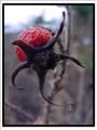
When Roses Are Not In Bloomby Ricky CleaveComment: Composition: Excellent
Technical: Fantastic DOF apart from bottom part of the subject is slightly out of focus. White border is different width top/bottom compared with left/right.
Meets challenge: Yes
Overall impression: Good take on the challenge. 8 |
| Photographer found comment helpful. |
| 02/03/2003 02:15:07 PM |
Waiting for Romanceby Harz_JoergComment: Composition: Good
Technical: Can't quite tell the filtering you've used, but it looks slightly strange. It looks like you've used sharpening and then smoothing? Border may have looked stronger with the red line black, making it twice as thick.
Meets challenge: Yes
Overall impression: Excellent idea and shot, but post-processing seems a little overdone. 6 |
| Photographer found comment helpful. |
| 02/03/2003 02:12:24 PM |
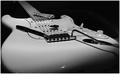
""My child, pet and best friend"by slamminComment: Composition: Good. Top-right looks slightly blank, although this is offset by bottom-left.
Technical: Excellent focus. Looks slightly over-sharpened, particularly around the part the strings are connected to and the scratch plate (?). Good use of B&W I think. Border seems a little thin on my screen.
Meets challenge: Bit iffy. :-)
Overall impression: Good pic. 7 |
| Photographer found comment helpful. |
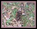
| 02/03/2003 02:08:06 PM |
Pineconeby OneSweetSinComment: Composition: Subject may perhaps have been better off-centre
Technical: Good focus. Pic seems a little busy due to the leaves. The actual subject of the pic isn't instantly obvious. Border is bold and suits the pic.
Meets challenge: Not quite sure what cliche you're trying to depict.
Overall impression: Busy pics aren't bad, but the subject(s) need to be identifiable I think. 5 |
| Photographer found comment helpful. |
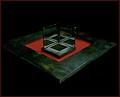
| 02/02/2003 12:00:45 PM |
The Three Sides of Squareby AnnidaComment: Composition: Near perfect, but maybe subject is a little small?
Technical: Excellent
Meets challenge: Yes
Overall impression: A really excellent pic. 9 |
| Photographer found comment helpful. |
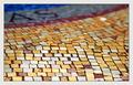
| 02/01/2003 06:19:43 AM |
squAreSby GordonComment: Composition: Good
Technical: Nice DOF. Would have liked more event lighting, particularly at the top of the pic.
Meets challenge: Yes
Overall impression: Good technically, but not sure of the balance of the pic. 6 |
| Photographer found comment helpful. |
| 02/01/2003 06:17:55 AM |
Where square people live.by Harz_JoergComment: Composition: Good. Brightness of the right face contrasts well with the darkness of the left.
Technical: Good choice of colour and contrast. Nice border.
Meets challenge: Yes
Overall impression: Technically good and nice pic. 8 |
| Photographer found comment helpful. |
| 02/01/2003 06:15:46 AM |
Technology for squaresby MarklaneComment: Composition: Good
Technical: Nice choice of layout. Focus isn't bad, but the pic seems noisy, and lack of vibrancy lets it down slightly.
Meets challenge: Yes
Overall impression: You were unfortunate to pick a very common subject, meaning you had lots of comparable competition. 6 |
| Photographer found comment helpful. |
Home -
Challenges -
Community -
League -
Photos -
Cameras -
Lenses -
Learn -
Help -
Terms of Use -
Privacy -
Top ^
DPChallenge, and website content and design, Copyright © 2001-2025 Challenging Technologies, LLC.
All digital photo copyrights belong to the photographers and may not be used without permission.
Current Server Time: 08/26/2025 02:28:51 PM EDT.