| Image |
Comment |
| 08/23/2003 03:19:38 PM |
Against the Grainby ToddhComment: Composition: Nice manual 'cropping' of subjects.
Technical: Lighting is excellent. Not keen on the DOF.
Meets challenge: Yes
Overall impression: I think the DOF lets it down quite a bit. Otherwise, a nice shot.
[ If this style of comment is useful, please leave a few yourself! www.calcaria.net/dpc.html ] |
 Photographer found comment helpful. Photographer found comment helpful. |
| 08/23/2003 03:15:41 PM |
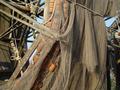
Using these will "net" you nothingby LANkrypt0Comment: Composition: Nice mix of textures and colours.
Technical: Excellent focus - exposure is spot on.
Meets challenge: I guess the net is old and broken, but the shot doesn't instantly bring the past to mind.
Overall impression: Interesting shot, technically spot on.
[ If this style of comment is useful, please leave a few yourself! www.calcaria.net/dpc.html ] |
| Photographer found comment helpful. |
| 08/23/2003 03:13:27 PM |
1956by ttreitComment: Composition: Nice use of thirds both horz and vertically.
Technical: Good focus and choice of b&w.
Meets challenge: Not sure - doesn't seem to relate to the past to me - sorry.
Overall impression: Interesting shot, but for me a little off-topic.
[ If this style of comment is useful, please leave a few yourself! www.calcaria.net/dpc.html ] |
| Photographer found comment helpful. |
| 08/23/2003 03:12:25 PM |
Onwardby moodvilleComment: Composition: Would have prefered the white stone slightly more to the right. I may have tried crouching down more to fit more stones in the shot horizontally, unless there was stuff in the b/g.
Technical: Nice use of b&w. Good focus.
Meets challenge: Yes
Overall impression: Nice shadow, but composition lets it down a little.
[ If this style of comment is useful, please leave a few yourself! www.calcaria.net/dpc.html ] |
| Photographer found comment helpful. |
| 08/22/2003 06:12:19 PM |
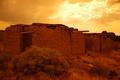
Ruins at Galesteoby Firstrich1Comment: Composition: Nice use of horz thirds.
Technical: Nice focus. Like the minimal shadows.
Meets challenge: Yes - sepia filter #005 I believe. ;-)
Overall impression: Looks a little too orange for me - but very resourceful with the filter. :-)
[ If this style of comment is useful, please leave a few yourself! www.calcaria.net/dpc.html ] |
| Photographer found comment helpful. |
| 08/22/2003 06:08:11 PM |
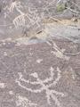
Petroglyphsby ArtifactsComment: Composition: Nice attempt with foreground/background.
Technical: Unfortunately the colour similarity leaves it a little flat, which is a shame, given the interesting subject.
Meets challenge: Yes
Overall impression: Very interesting subject.
[ If this style of comment is useful, please leave a few yourself! www.calcaria.net/dpc.html ] |
| Photographer found comment helpful. |
| 08/22/2003 06:05:09 PM |
Yesterday's Gameby jimmythefishComment: Composition: Nice inclusion of subjects. I think I'd try to get an object more on a third, however.
Technical: Nice focus. Background matches the foreground colour a little too much.
Meets challenge: Yes.
Overall impression: Nicely done.
[ If this style of comment is useful, please leave a few yourself! www.calcaria.net/dpc.html ] |
| Photographer found comment helpful. |
| 08/03/2003 04:48:18 AM |
Real Refreshmentby joannadivaComment: Composition: I'm not too keen on the point of view. If it was possible to get a show without reflections I think it would be better square-on to the cans.
Technical: Focus seems slightly off.
Meets challenge: Yes
Overall impression: Composition greatly affects the image, which I'm not too keen on personally.
[ If this style of comment is useful, please leave a few yourself! www.calcaria.net/dpc.html ] |
| Photographer found comment helpful. |
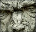
| 08/03/2003 04:44:07 AM |
Gargoyleby MikeOComment: Composition: Nice composition and cropping.
Technical: I like the focus and colourisation. Did you try a b&w? I think the border is a little thick and darkens the photo unnecessarily. Don't forget DPC adds a 1px black border, making yours slightly thicker.
Meets challenge: Yes
Overall impression: Nice amount of detail and interesting subject.
[ If this style of comment is useful, please leave a few yourself! www.calcaria.net/dpc.html ] |
| Photographer found comment helpful. |
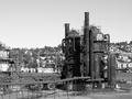
| 08/03/2003 04:30:42 AM |
Blacksmithby JPRComment: Composition: Interesting composition. There isn't one main focal point, which some viewers may not like. For me it adds to the interest of the photo as a whole.
Technical: Nice colour and contrast. The b&w wall looks surprisingly good against the wooden door/windows.
Meets challenge: Yes
Overall impression: Very nice photo. Well done.
[ If this style of comment is useful, please leave a few yourself! www.calcaria.net/dpc.html ] |
| Photographer found comment helpful. |
Home -
Challenges -
Community -
League -
Photos -
Cameras -
Lenses -
Learn -
Help -
Terms of Use -
Privacy -
Top ^
DPChallenge, and website content and design, Copyright © 2001-2025 Challenging Technologies, LLC.
All digital photo copyrights belong to the photographers and may not be used without permission.
Current Server Time: 08/26/2025 07:44:06 PM EDT.