| Image |
Comment |
| 07/19/2008 01:19:54 AM |
Antioxidant Richby krafty1Comment: A really nice and interesting shot. I'd like to see a bit more room at the top but nevertheless this still caught my. (Especially the transparent handle of the glass with just enough detail to see it. |
 Photographer found comment helpful. Photographer found comment helpful. |
| 07/17/2008 01:55:46 AM |
|
| Photographer found comment helpful. |
| 07/15/2008 01:10:42 AM |
DSC_9129.jpgby PedroComment: Where in Alberta did you get to Pedro? This doesn't look like Calgary! |
| Photographer found comment helpful. |
| 07/13/2008 03:05:29 AM |
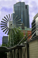
IMGP6956-Round and Square.jpgby wehrmacherComment: This is one of my personal favorites to shoot in Eau Claire market (the windmill). I've never had any luck working the buildings into the background. This definitely works.
Just to let you know, the vanes used to be orange so when you converted it to b/w with the channel mixer and set the red channel to 100 they were practically white. |
| Photographer found comment helpful. |
| 07/13/2008 03:02:11 AM |
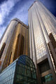
IMGP6841-Calgary Cityscape.jpgby wehrmacherComment: Nice shot of the Husky towers. I've seen them in all sorts of lighting conditions but I never get a chance to shoot them with that kinda of sky. (i.e. I am jealous!) |
| Photographer found comment helpful. |
| 07/10/2008 02:24:24 PM |
Waves of Grainby tfarrell23Comment: Love this shot. Sharp where it needs to be. Soft and glowing otherwise. I love the monochrome conversion - it really works well with this shot. Composition is interesting especially in the portrayal of depth. |
| Photographer found comment helpful. |
| 07/08/2008 11:32:29 PM |
|
| Photographer found comment helpful. |
| 07/04/2008 07:59:26 PM |
Out on the lake.....by cowboy221977Comment: A little small. By about half actually (you can go up to 640 px). The bigger the image the easier it is for the viewer to see (and therefore appreciate) the details in your shot. |
| Photographer found comment helpful. |
| 07/04/2008 12:24:13 PM |
Fresh Startby LadyKComment: Greetings from the critique club!
As mentioned by previous commenters its a nice simple clean image. I don't see the spots that the one commenter spoke on however.
The idea works however I am wondering how it would look if the line was longer and perhaps coming more out of one of the corners.
The shadow of the pencil does work well with extending the line.
The orange of the pencil is a bit oversaturated and tends to take your eye away from the line.
The border is effective in this case as it serves to define the image space.
Focus is good and sharpness is okay. I am wondering if maybe f/8 would have helped add a bit more sharpness. Not sure about where the "sweet spot" for this lens would be but with the angle of the pencil a bit more DOF might have helped sharpen the upper part.
In terms of the challenge? Perhaps a bit cliche but the idea is also fairly well executed. |
| Photographer found comment helpful. |
| 07/03/2008 04:32:31 PM |
|
| Photographer found comment helpful. |
Home -
Challenges -
Community -
League -
Photos -
Cameras -
Lenses -
Learn -
Help -
Terms of Use -
Privacy -
Top ^
DPChallenge, and website content and design, Copyright © 2001-2025 Challenging Technologies, LLC.
All digital photo copyrights belong to the photographers and may not be used without permission.
Current Server Time: 08/19/2025 04:48:59 AM EDT.