| Image |
Comment |
| 12/06/2009 11:49:17 PM |
- Gotcha -by MilesWComment: wow! terrific capture. Too bad its cropped in so tightly but beggars can't be choosers. |
 Photographer found comment helpful. Photographer found comment helpful. |
| 11/30/2009 02:41:23 PM |
The Church's Powerby kdkavanaghComment: Greetings from the Critique Club!
The building looks interesting with a lot of good images to be shot. As previous commenters indicated the image needs to be levelled.
I'd almost want to crop down to a stone work in the arch or other details. Otherwise you need to step back and get more of the church. As it was shot it looks a little too tight.
I also see that you shot at f/4 on a tripod. There's nothing wrong with that but you'll get better sharpness if you shoot around f/8 to f/11. Use a larger aperture if you want a shallower depth of field. (e.g if you got even close and focused on the detail in the arch the focus would fall off nicely).
In terms of the challenge? Yup its centrally composed. I think that was the easy part of the challenge. The hard part was a) finding a subject that was suitable for that sort of composition b) framing the subject where the composition was effective.
Overall? not a bad shot at all. A heck of a lot better than my first challenge entry on this site and better than most first timers. Welcome to DP challenge and I hope to see more of your images!
|
| Photographer found comment helpful. |
| 11/30/2009 02:33:23 PM |
homeland pollutionby reezyComment: Greetings from the Critique Club!
Interesting image that really makes you go hmmm. Its certainly has a certain edge to it and perhaps some might have felt a bit uncomfortable with it. Technically the image is solid: exposure is good and I like the fall of the light on the edges that creates the vignette.
The scene itself is a little lackluster and the window behind the subject (you?) might be considered a distraction. I think that the image might be more effective if the background more closely matched the mood you were trying to set. A guy sitting on a couch with a gas mask? weird. A guy sitting on a couch in an abandoned warehouse? Pretty damn cool. Naturally that would be a little tougher to arrange...
In terms of the challenge theme my opinion is that its just fine it works but its not as strong of connection as it might have been. Central compostion was used but the question is: Was it the best choice? Maybe maybe not.
Ovwerall a pretty solid image and one explored an interesting concept. |
| Photographer found comment helpful. |
| 11/24/2009 01:14:48 AM |
the arc of a careerby posthumousComment: Took me a moment but then "ding!" the light went on. Definitely out of the box. I guess the voters wanted something so obvious it would be like the pot of gold at the end of the rainbow being dropped on their heads.
If its any consolation it made me smile :) Message edited by author 2009-11-24 01:15:08. |
| Photographer found comment helpful. |
| 11/13/2009 04:39:11 PM |
Autumn Streamby Five_SeatComment: Great shot. Did you apply any HDR techniques to it? It looks like a scene that might have been contrasty but you've kept detail throughout. |
| Photographer found comment helpful. |
| 10/30/2009 11:00:56 AM |
Deer Point Conspiracyby JutildaComment: Well...since this has been DQ'd (temporarily I hope) I may as well add it to my favorites. I'm not sure if 40+ favs is as good as ribbon but at least you're getting recognized. |
| Photographer found comment helpful. |
| 10/08/2009 10:18:50 AM |
Pyramid Peakby delinComment: Terrific image. A little oversharpened in my opinion but that's just a matter of taste. Some blown highlights in the one cloud but that's minor. I've seen a lot of comments saying this is HDR but I thought I should ask if it is or not. If it is its been done well. (I dislike HDR where is has the haloing and the cartoony look to it which this certainly does not).
Nice vibrant colors and a great composition. I'd really like to see the processing steps for this image. |
| Photographer found comment helpful. |
| 09/22/2009 04:35:57 PM |
The Giftby NaldComment: I like this image but why HDR? The whole point is to increase dynamic range. Your scene should have had everything exposed properly to begin with. Just curious... |
| Photographer found comment helpful. |
| 09/21/2009 01:26:00 PM |
|
| Photographer found comment helpful. |
| 09/09/2009 10:13:46 AM |
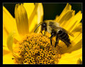
Yellowby ErikVComment: strange to have no comments. Then again it was in a free study so that might be the reason. Anyways,
I really enjoy this shot. True, we've seen a lot of bee macro shots before but I like the fact that the image is basically black and yellow. I also appreciate the fact that you chose a neutral border rather than using yellow in it. (I think that would be distracting)
Good sharpness and detail and great lighting. |
| Photographer found comment helpful. |
Home -
Challenges -
Community -
League -
Photos -
Cameras -
Lenses -
Learn -
Help -
Terms of Use -
Privacy -
Top ^
DPChallenge, and website content and design, Copyright © 2001-2025 Challenging Technologies, LLC.
All digital photo copyrights belong to the photographers and may not be used without permission.
Current Server Time: 08/06/2025 12:07:01 AM EDT.