| Image |
Comment |
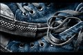
| 02/22/2010 12:45:33 AM |
used by libertyComment: Great texture captured in this image. I love the use of close up to draw attention to the details. great shot! |
 Photographer found comment helpful. Photographer found comment helpful. |
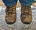
| 02/22/2010 12:44:35 AM |
Wet Merrell'sby jagarComment: I'm guessing topaz filter? Its a bit on the heavy side in my opinion |
| Photographer found comment helpful. |
| 02/22/2010 12:40:20 AM |
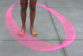
Future Olympianby benficaComment: vignette is a bit harsh for such a soft subject. Maybe going with a lightening effect rather than darkening might have worked? |
| Photographer found comment helpful. |
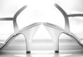
| 02/22/2010 12:39:03 AM |
|
| Photographer found comment helpful. |
| 02/18/2010 12:22:27 PM |
Plane of perspective by snafflesComment: strange. I had thought you had ribboned before. Well congratulations on the first of the many you will receive =) |
| Photographer found comment helpful. |
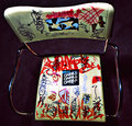
| 02/16/2010 12:07:44 AM |
Taggedby toddw62Comment: Greetings from the Critique Club
Judging from the votes this was ok image. I think it needed a setting to help it really stand out. The perspective is unique but unfortunately in this case it doesn't make the image stand out. This chair in the right setting could really work well (empty ware house or by the back of an old building comes to mind). As a subject for this challenge, this chair has a lot of potential.
Technically: Focus is ok. It might have needed a bit more depth of field. There's a couple of spots that are a bit hot and the shadows fall of strangely for some reason. (almost like dodging and burning was used with a heavy hand?)
Composition: Really not much to say here. The chair is plunked down in the middle of a square frame. Central composition and square framing work well if you want to depict symmetry and balance. With this type of subject you'd want to go for something more dynamic I think. |
| Photographer found comment helpful. |
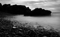
| 02/15/2010 02:23:46 PM |
Driftwoodby InsomniacComment: Greetings from the critique club!
I'm glad I've come back again to this image. I just disabled the calibration on my monitor for now because it tends to make my monitor a bit on the dark side and it really helped me appreciate this image. I still agree that the chair does get lost in the scene however based on its position in the image your eye does find it.
I personally like more contrast in my skies in monochrome but that's me being nitpicky and its still nice the way it is. It would be nice if the rocks in the background had more detail but I am guessing that wasn't an option at this time of day.
Overall a great image. I would like to see what this looked like in color. |
| Photographer found comment helpful. |
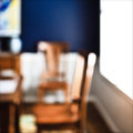
| 02/15/2010 12:13:23 AM |
that afternoonby krnodilComment: I think the OOF attempt was gutsy and worth a try. I think that the very bright window however is a distraction that might have hurt the image. I actually think that everything to the left of the window has a lot of interest and does work as an abstract in my opinion Message edited by author 2010-02-15 00:14:17. |
| Photographer found comment helpful. |
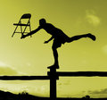
| 02/14/2010 11:56:06 PM |
Counterbalanceby myceliumComment: terrific silhouette. Interesting story told in this shot that I love. I predict that this image will do quite well. :) |
| Photographer found comment helpful. |
| 02/13/2010 01:23:44 AM |
Oh!by RetroesqueComment: looking forward to seeing how this was done... |
| Photographer found comment helpful. |
Home -
Challenges -
Community -
League -
Photos -
Cameras -
Lenses -
Learn -
Help -
Terms of Use -
Privacy -
Top ^
DPChallenge, and website content and design, Copyright © 2001-2025 Challenging Technologies, LLC.
All digital photo copyrights belong to the photographers and may not be used without permission.
Current Server Time: 08/05/2025 04:50:46 AM EDT.