| Image |
Comment |
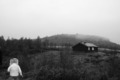
| 10/10/2006 03:47:26 PM |
Happy Thoughtsby littlegettComment: a little too much empty space for my tastes. I like the shot other than that though. |
 Photographer found comment helpful. Photographer found comment helpful. |
| 10/10/2006 03:46:52 PM |
|
| Photographer found comment helpful. |
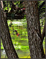
| 10/10/2006 03:45:57 PM |
Natures Windowby BrianRComment: a couple of comments on composition: there is a lot going on in this capture. My eyes don't know where to focus. Try to simplify the compositions. If the background shore was beyond the DOF, that would've helped. Also, make sure the foreground elements are in focus (unless of course they are way out of focus). Having them almost in focus is distracting. |
| Photographer found comment helpful. |
| 10/10/2006 03:42:46 PM |
also see: Jean Paul Sartreby tateComment: I like this one very much. The contrasting red text with the rest of the frame is very catching. I'd be interested to know how you got that texture into the bricks and door. very dynamic composition too. gave it a 9. |
| Photographer found comment helpful. |
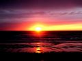
| 10/10/2006 03:41:05 PM |
A Calming Eveningby meggiemooComment: IMO, a sunset is a difficult subject to get right. Usually, the colors can help rescue a shot, but often times we rely on those colors too much. I think this is the case here. The horizon is too centered vertically, and there's not much interesting happening in the clouds (at the mercy of the weather!). I think the foreground could have been interesting, but it's very hard to tell with the contrast so high (too high). And finally, the sun is smack dab in the middle of the frame. Again, a boring composition. Not trying to mean, just give some helpful hints. Hope it was helpful. |
| Photographer found comment helpful. |
| 10/10/2006 03:37:28 PM |
Chain Gripby philupComment: nice contrast. very nicely done. I'm starting to be able to pick out certain photographers from these photos! |
| Photographer found comment helpful. |
| 10/10/2006 03:35:37 PM |
Valdresby WessyComment: crop out most of the sky, and your image gets better. in its current form, the horizon is too centered, and the blown out sky is too distracting. |
| Photographer found comment helpful. |
| 10/10/2006 03:34:02 PM |
Suspended Lifeby ShannonLeeComment: a slightly different perspective to remove most of the sky would have given you a more powerful composition. I like the rest of the photo, however. nicely done. |
| Photographer found comment helpful. |
| 10/10/2006 03:33:05 PM |
Birmingham Newsby msdoubletroubleComment: certainly high contrast. too much in my opinion. it should be more than photoshop work that gets you to meet the challenge |
| Photographer found comment helpful. |
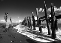
| 10/10/2006 03:31:30 PM |
Skeleton Defenceby FalcComment: I like the way you waited for the wave to come up through the fence, leaving the foamy surf to contrast with the dark tones of the fence and sand. |
| Photographer found comment helpful. |
Home -
Challenges -
Community -
League -
Photos -
Cameras -
Lenses -
Learn -
Help -
Terms of Use -
Privacy -
Top ^
DPChallenge, and website content and design, Copyright © 2001-2025 Challenging Technologies, LLC.
All digital photo copyrights belong to the photographers and may not be used without permission.
Current Server Time: 09/04/2025 02:59:51 AM EDT.