| Image |
Comment |
| 04/22/2003 12:51:45 AM |
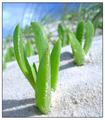
Ozzie Beach Lifeby andrewlrComment: This is my new 'Happy Place'..... Looks beautiful! Great subject, fits theme well. Excellent composition, color, and use of depth of field. (9 going on 10). |
 Photographer found comment helpful. Photographer found comment helpful. |
| 04/19/2003 10:27:24 PM |
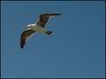
Gull.jpgby StevePaxComment: I like it! The framing/composition is great (not easy to capture, I've tried to get very similar shots myself - not as successful though). Good job! |
| Photographer found comment helpful. |
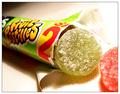
| 04/19/2003 09:00:06 AM |
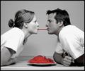
The King of Sugar Mountain by BigSmilesComment: This was a creative idea, nice originality! Well titled, really fits the challenge well. Nicely done! (One 'picky' critique I have.... The candy appears to be tilted forward... I would positioned it more 'straight up') - Won't hurt your score though!. |
| Photographer found comment helpful. |
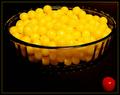
| 04/16/2003 10:43:59 PM |
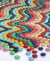
Pick Your Colorby GolferDDSComment: This had to take a bit of time to arrange..... 'A' for effort. I couldn't personally tell what filters/enhancements were used, but it does have a 'waxy' appearance (different effect) - did you use extra sharpening? Nicely composed as well. Super job! |
| Photographer found comment helpful. |
| 04/16/2003 10:41:40 PM |
Licorice Candyby SwashbucklerComment: Very vivid and sharp, certainly falls into the candy category. [Possible critique: More purple and less green would have been better - Green reminds me of the Packers....GO VIKES] - Just kidding on your choice of colors though, good job! |
| Photographer found comment helpful. |
| 04/16/2003 10:39:48 PM |
A hint of mint by marboComment: I like the title and idea. Nice clean soft shot. (Personal critque: Would have been very cool to have somehow made the mints vanish into the picture - maybe by purposely buring them out at the back via over-exposure). |
| Photographer found comment helpful. |
| 04/15/2003 08:41:16 PM |
Licorice L'Amore by dsidwellComment: Nicely composed, catchy color effect (popular technique - becoming old hat?), whites appear a bit burnt (on my monitor). |
| Photographer found comment helpful. |
| 04/15/2003 08:18:57 PM |
Fruit Pastillesby KonadorComment: I like the orientation and use of small depth of field. (Personal critique: I would have removed the fold from the towel). |
| Photographer found comment helpful. |
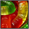
| 04/15/2003 08:06:46 PM |
as the worm turnsby falveyComment: Good title and idea, nice color and exposure. Good job! (Personal critique: I would reverse the border colors - and make them slightly narrower). |
| Photographer found comment helpful. |
| 04/15/2003 07:59:02 PM |
Uninvitedby sherComment: Creative title and idea! Composition works well, nicely focused. Good job! |
| Photographer found comment helpful. |
Home -
Challenges -
Community -
League -
Photos -
Cameras -
Lenses -
Learn -
Help -
Terms of Use -
Privacy -
Top ^
DPChallenge, and website content and design, Copyright © 2001-2025 Challenging Technologies, LLC.
All digital photo copyrights belong to the photographers and may not be used without permission.
Current Server Time: 08/29/2025 09:43:17 AM EDT.