|
|
|
Showing 331 - 340 of ~1140 |
| Image |
Comment |
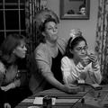
| 01/26/2005 12:15:14 AM | Game Facesby SkipComment: The boy in the mirror is a great, subtle touch in this that makes it work. I'd be very very tempted to crop this just past the nose of the person on the left (so she isn't in the photo at all) and just above the can and score pad/pencil. It is then framed by the curtains, has the focus much tighter on the person making the face, the boy is looking at her, and there is a real strong triangular composition between the remaining three heads that leads you around the scene, back up the curtain, in to the mirror, back to the woman, down her arm and so on...
You also get a bit of the board and question in the shot to give context.
Technically I really abhore neat image - skin just doesn't look this featureless. NI can be used subtly, but it takes a bit of work to not have plastic people. |  Photographer found comment helpful. Photographer found comment helpful. |
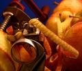
| 01/26/2005 12:11:40 AM | The Unseen Handby SkipComment: Took me a bit of time to work out what was going on here. Everything seems crammed in to the frame, with 4 or 5 distinct compositional elements battling for attention and control. Not too sure that it is as strong as a result of that clutter.
It is certainly an interesting object and the bright red colours with the blue background also have potential - but then you've got the apples and the stalks and peel and the metal all clustering in.
White balance appears a bit warm, though you mention you were experimenting with them. | | Photographer found comment helpful. |
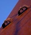
| 01/26/2005 12:09:01 AM | Kahunaby SkipComment: You've certainly got an eye for the dramatic abstract.
The blue and red work well against each other, with the dyanmic angles and the back and forth between the colours.
Might like it more if the left most bolt/ raised part wasn't cutting slightly in to the blue - it needs to be a bit more decisive, either cutting in totally, or not at all (reminicent of portrait photography, where you don't want the nose half cutting the cheek line)
Might have backed off a bit on the red saturation, but it can be addictive. | | Photographer found comment helpful. |
| 01/26/2005 12:06:44 AM | camino a la luzby SkipComment: I like this one a lot. Gritty, dramatic, graphic and un-cluttered. The yellow diagonals are obviously very
powerful but the texture running in the opposite direction is also interesting and grounds the image (literally)
Shooting early has given you great modeling from the low angled light which works well.
Again the sharpening seems quite crisp, with very sharply defined edges - works for this shot so it may be intentional.
There's an opportunity for some sort of 'reward/focal point' in the upper left - some bright colour contrast - blue, or red maybe, or some sort of textural contrast - a squashed armadillo perhaps (!) You've got a great stage here, it maybe needs one more 'actor' to make it sing. | | Photographer found comment helpful. |
| 01/26/2005 12:03:27 AM | Turn at the Dead Treeby SkipComment: Reminds me of an Ent from the Lord of the Rings, in many ways - with the almost 'arm-like' branches.
Compositionally being a bit lower might also work, to isolate the tree more against the sky and increase the size with some perspective. You might struggle to retain the sweep of the road, but getting close to the center line might really emphasize/ dramatize that sweep along with the tree- probably then becomes a portrait orientation shot too.
Technically to my eye it looks a bit over sharpened and over saturated - there is some haloing on the horizon and around the tree branches, and the yellow/brown parts of the tree appear to be oversaturated to the point of losing some detail ? (you can see this in levels in Photoshop btw) | | Photographer found comment helpful. |
| 12/26/2004 05:57:47 PM | | | Photographer found comment helpful. |
| 12/13/2004 07:25:36 AM | | | Photographer found comment helpful. |
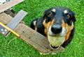
| 11/24/2004 10:18:31 AM | Read my mind!by NodeComment: Great initial impact - the dog, the eyes. The shallow DoF and fall-off to the background also add to this effect of being 'in your face' Very effective. However, the left side of the shot just doesn't work for me, with the square and pencil - they lead my eye out of the scene - particularly the bright yellow and reds in the pencil and the line shape they form pointing away from the subject and off the page to the left.
This can be helped a whole lot by cropping the shot square, around the dog. The right hand two thirds of the image are strong enough and with a centered crop the dog is the real focus of the shot.
Now following convention, you should use rule of thirds, right ? Well the reason is that if you have a subject bang in the center of the frame it takes all the attention, is very arresting, static and generally dominates the composition. In this case - that is what is happening anyway. If you compose it in a square frame by cropping the left third - you'll get an even stronger, more arresting scene. The elements in it build to that effect, the composition will enhance that and I think it'll be stronger all around.
After doing that, you are still left with the piece of wood jutting in from the left - which does still clutter it a bit, but I think this crop would make for a much stronger image - try it and see how you like it! Then maybe try and re-create this sort of image, with just the green grass background and without the other elements - try the off center and very centered/ square compositions with those as well and see which you prefer. | | Photographer found comment helpful. |
| 11/23/2004 05:09:02 PM | Remnants of the stormby NodeComment: Another shot with great initial impact. The colours and patterns are really strong and the leading lines give a lot of visual interest. Only issues I have are the high contrast, out of focus areas in the upper left and lower right, that draw my eyes. The yellow line leads off to the background, walking me through the image, but I get lost in the rear 'V' shape without really anywhere to go. This is a subject with a lot of potential.
The soft foreground and background, with only the midground in sharp focus confuses my eye a little too - I start in the out of focus region, move through the sharpness and back to out of focus again - I think I'd prefer it if it was sharp at one end or the other and lead off to either sharpness or an out of focus area. This would probably require manual focus setting on your camera, rather than using one of the AF points. You could focus and recompose but that often isn't the best way to achieve something like that. For this - I'd probably try and have the very tip of the yellow line in sharpest focus.
Also worth checking the edges again - particularly for the lighter red/ orange regions creeping in at the bottom - They could probably have been cropped out in this case. | | Photographer found comment helpful. |
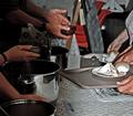
| 11/23/2004 05:04:33 PM | Soup kitchen volunteersby NodeComment: Initial impact: I like how you've abstracted this to the hands giving and getting only. Good repeating patterns in the hands and soup pans too, as well as the trays give a strong graphic element to this image.
The background might have been managed better, somehow removing or reducing the impact of the red chairs - if possible a more 'overhead' view would have assisted with this. The lighting seems a bit rough and ready - on camera flash ? It has left you with some quite harsh blown areas on the foreground sandwich and the shadows in the background.
In general, I think good seeing and a bit of work on the lighting and more attention to the background would make this a really strong image. | | Photographer found comment helpful. |
|
Showing 331 - 340 of ~1140 |
Home -
Challenges -
Community -
League -
Photos -
Cameras -
Lenses -
Learn -
Help -
Terms of Use -
Privacy -
Top ^
DPChallenge, and website content and design, Copyright © 2001-2025 Challenging Technologies, LLC.
All digital photo copyrights belong to the photographers and may not be used without permission.
Current Server Time: 07/19/2025 03:56:44 AM EDT.
|