| Image |
Comment |
| 02/07/2005 01:02:29 PM |
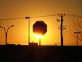
Burning signby rhalaComment: I think this may have worked better if the light was totally hidden behind the sign. |
 Photographer found comment helpful. Photographer found comment helpful. |
| 02/07/2005 01:01:54 PM |
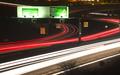
A27by marboComment: The bright lights on the signs make them hard to read. Cool grab of the trailing lights... |
| Photographer found comment helpful. |
| 02/07/2005 12:01:42 AM |
Aperture by ZoomdakComment: Congrats!!! I knew this was yours. Awesome work you do... |
| Photographer found comment helpful. |
| 02/06/2005 11:40:49 PM |
|
| Photographer found comment helpful. |
| 02/06/2005 11:39:22 PM |
|
| Photographer found comment helpful. |
| 02/01/2005 06:26:03 PM |
The Pepper Trifectaby smokeditorComment: Nice capture. Great colors and composition. Would like to see the cropping on the sides to be more balanced - one side is tighter than the other. 9 |
| Photographer found comment helpful. |
| 02/01/2005 06:22:40 PM |
Triple Threatby KDOComment: A cleaner background would have been more effective - IMO. |
| Photographer found comment helpful. |
| 02/01/2005 06:20:50 PM |
|
| Photographer found comment helpful. |
| 02/01/2005 06:17:36 PM |
Primaryby parrotheadComment: Seems a bit too saturated! The space in front of the yellow seems to put the composition off balance. |
| Photographer found comment helpful. |
| 02/01/2005 06:09:23 PM |
|
| Photographer found comment helpful. |
Home -
Challenges -
Community -
League -
Photos -
Cameras -
Lenses -
Learn -
Help -
Terms of Use -
Privacy -
Top ^
DPChallenge, and website content and design, Copyright © 2001-2025 Challenging Technologies, LLC.
All digital photo copyrights belong to the photographers and may not be used without permission.
Current Server Time: 06/18/2025 05:52:58 PM EDT.